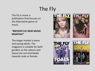
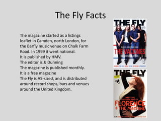
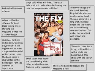
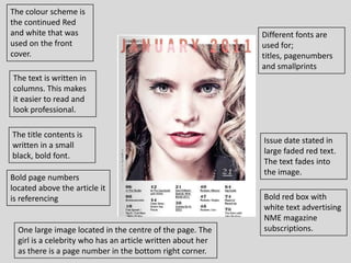
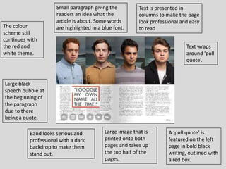
2. The Fly
The Fly is music a
publication that focuses on
the Alternative genre of
music.
“BRITAIN’S #1 NEW MUSIC
MONTHLY”
The target market is teens
and young adults. The
magazine is suitable for both
genders as the colours and
layout are not orientated
towards male or female.
3. The Fly Facts
The magazine started as a listings
leaflet in Camden, north London, for
the Barfly music venue on Chalk Farm
Road. In 1999 it went national.
It is published by HMV.
The editor is JJ Dunning
The magazine is published monthly.
It is a free magazine
The Fly is A5-sized, and is distributed
around record shops, bars and venues
around the United Kingdom.
4. Large bold white masthead. The issue
information is under the title showing the
Red and white colour date the magazine was published. The cover image is of
scheme. the band ‘Bombay
Bicycle Club’ who are
an alternative band.
They are pictured in a
Yellow puff with a
long shot. The lead
different font and
singer and the others
black writing this is
are pictured being
showing the
swarmed by fans. This
magazine is ‘free’ on
makes the band look
a sticker design
well known and
Variety of font size desirable.
and colours, ‘Bombay
Bicycle Club’ is the The main cover line is
biggest font as it has in big, bold red letters
a huge article/special with a white box
written about them. background. This
The band name is sticks with the colour
Small cover lines above
also written in the scheme.
the title showing what
bands logo. Font size
other articles there are
depends on There is no barcode because the
featured in the magazine
importance. magazine is free.
5. The colour scheme is
the continued Red
and white that was Different fonts are
used on the front used for;
cover. titles, pagenumbers
and smallprints
The text is written in
columns. This makes
it easier to read and
look professional.
The title contents is
Issue date stated in
written in a small
large faded red text.
black, bold font.
The text fades into
the image.
Bold page numbers
located above the article it
is referencing Bold red box with
white text advertising
NME magazine
One large image located in the centre of the page. The subscriptions.
girl is a celebrity who has an article written about her
as there is a page number in the bottom right corner.
6. Small paragraph giving the Text is presented in
readers an idea what the columns to make the page
article is about. Some words look professional and easy
The colour are highlighted in a blue font. to read
scheme still
continues with
the red and Text wraps
white theme. around ‘pull
quote’.
Large black
speech bubble at
the beginning of
the paragraph
due to there
being a quote.
Band looks serious and Large image that is A ‘pull quote’ is
professional with a dark printed onto both featured on the left
backdrop to make them pages and takes up page in bold black
stand out. the top half of the writing, outlined with
pages. a red box.
7. Influence on my magazine
I could use the conventions I have identified to create my
own magazine;
I need to create a colour scheme (Red and white?)
One large image that goes across both pages with text
below or above
Bold titles and different size fonts
If taking an individual image make sure the picture is a
close up shot.
A pull quote has to be featured on my double page spread.