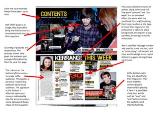
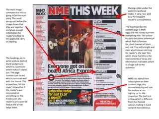
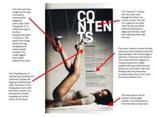
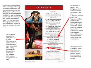
The colour scheme consists of
Date and issue number        yellow, black, white and red.
keeps the reader’s up to     The word “content” and “this
date.                        week” has an smashed
                             effect, the same with the
                             masthead (Kerrang!) implying
 Half of the page is an      their target audience, the type
 image, this shows that      of music they represent. the
 Bring me the horizon is a   yellow text is behind a black
 important/main story in     background, this creates a pop
 this magazine.              up effect, by doing it is easily
                             noticeable.

                             Red is used for the page number
A variety of pictures are    and used to stand text out, such
shown here. The              as “cover story”. All the text are
pictures shown here          clear and headings are in capital
gives the audience just      letters to suggest strong/heavy
enough information for       rock music.
them to view this page.


 The column on the
 bottom left corner is a          In the bottom right.
 message to the                   they are advertising
 audience. This creates a         their magazine. They
 personal relationship            know that the
 between editors and              content page is
 audience. The signature          important so placing
 at the bottom is                 it here is a good idea.
 effective because it             Using buzz words
 conveys individuality            such as “your” and
 also the picture conveys         “just ”which involves
 nicely because it shows          the audience and
 a face to the magazine.          implies its cheap.
Placing a date under the
The main image
                           content masthead
connotes that this is
                           makes it very clear and
going to be the main
                           easy for frequent
story. The small
                           reader’s to read/notice.
paragraph below the
image shows that
they are together        The masthead for the
and gives enough         content page is NME
information for          logo, the red stands out from
reader’s to flick to     everything else. This colour
this page and carry      fits into the colour scheme of
on reading.              which NME is famous
                         for, their themed of black
                         and red. The red is bright and
                         clear which is eye-catching
                         for reader’s. the text ‘this
                         week’ show that this is the
The headings are in      new contents of news and
white and are behind     information that week which
black background         is a huge pull to the
which is a contrasts     audience.
which makes it stand
out. The page
numbers are in red
which continues well       NME has added their
with the theme. The        subscription on their
arrows says ‘on the        content page, this
cover’ shows that if       immediately try and lure
the reader’s was           the audience into
interested on              signing up for the
something on the           magazine. The text is in
front cover, the           yellow which is different
reader’s are easier to     from the themed
find as the arrow          colours making it stand
helps them.                out and more obvious.
The main and only
   image has her legs             The “contents” is white
   cross which                    and very clear even
   represent the                  though the letters are
   magazine                       cut into 3 lines. The text
   name, Vibe. Even               is in capital so its easily
   though the ‘V’ is              read. The lay out of the
   unfilled the legs in           contents represent an
   the fore                       edgy style and this could
   background makes               also represent their type
   it stand out. This             of music.
   pose of the image
   makes her legs
   elongated and
   makes it quite              The colour scheme consists of dark
   sexually. This              colours to show mysterious yet still
   could suggest               approachable. The content page is
   their target                spilt into 2 ‘features’ and ‘fashion’.
   audience are men.           This shows that this magazine is
                               trying to expand to a wider
                               audience because they have put
                               fashion as one of their main sub-
                               heading. Not only have they
The 2 headings are in          already made audience for music
relative fancy writing, this   but also for fashion too.
continue to shows the
edgy yet sophisticated
style. The shoes of the
image goes nicely with
the colour scheme. For
example the smaller
                                  The date appears at the
headings are similar
                                  bottom of each page
colour to the shoes.
                                  number. This shows that to
                                  them the date is important.
Instantly you notice the lay out    The masthead is
of this content page. The images    behind a red
are place on the left hand side     background which
and the content is on the right.    makes the text pop.
This lay out is simple but works    The content is spilt
very well. The images have page     into
numbers. The page numbers are       3, ‘features’, ‘national
in white so its clear and easy to   affairs’ and
read, it is also relative big so    ‘departments’. Other
reader’s are easy to notice it.     than music, this
The images give the reader’s        magazine advertised
what the magazine going to be       other things such as
better but not giving too much      climate. This already
away.                               makes this magazine
                                    have a wider
                                    audience. The bottom
                                    imagine suggest
      The background                sorrow of the animal
      appears to be                 and connects with
      white, this is easy           reader’s other than
      to place                      music reader’s.
      information on as
      well as pictures. It
      makes everything
      stand out because             The page number is
      it has nothing                in red which makes it
      overpowering it.              clear. They have
      Colour scheme                 sections out the 3
      contains of                   contents by using a
      red, black and                line., this makes it
      white which are               look sophisticated
      strong colour on its          and neat.
      own .
This image takes up most
 The content shows the reader             of the content page, this
 when the magazine was issued to          shows that this is the main
 show the audience how up to              story of the magazine.
 date the magazine is. This is            Using a quote and a page
 shown at the top right hand side         number gives enough
 of the page so its not in the way        information for the
 of the content page but still clear      audience to view this
 and noticeable for reader’s to           page. The image shows 4
 see. The logo for Q is shown             men in a field dressed in
 clearly and this represents and          indie/rock clothing. This
 labels that this magazine belong         represents the target
 to Q. The text “content” is in           audience of the magazine.
 white which contrasts with the
 black background making it bold
 and stand out.

The logo Q is in red which is also the
same colour of the sub-heading and
the page number. This shows a
relation to the magazine and its
theme colour. The “oasis special” is        The review of Q is
writing gold and in a different font to     called “the world’s
the other text which shows how              biggest and best music
special this story to the magazine.         guide” this shows that
                                            using buzz words
      The content are spilt                 instantly attracts the
      into 3 groups, “the                   audience. Using
      features”, “every                     “biggest” and “best”
      month” and “review”. Q                gives the magazine its
      is trying to target a                 own unique selling
      wider audience even                   point.
      beyond music.
      Conventionally the page
      numbers are in a bolder
      colour next to the
      articles listed.

Content pages

  • 1.
    The colour schemeconsists of Date and issue number yellow, black, white and red. keeps the reader’s up to The word “content” and “this date. week” has an smashed effect, the same with the masthead (Kerrang!) implying Half of the page is an their target audience, the type image, this shows that of music they represent. the Bring me the horizon is a yellow text is behind a black important/main story in background, this creates a pop this magazine. up effect, by doing it is easily noticeable. Red is used for the page number A variety of pictures are and used to stand text out, such shown here. The as “cover story”. All the text are pictures shown here clear and headings are in capital gives the audience just letters to suggest strong/heavy enough information for rock music. them to view this page. The column on the bottom left corner is a In the bottom right. message to the they are advertising audience. This creates a their magazine. They personal relationship know that the between editors and content page is audience. The signature important so placing at the bottom is it here is a good idea. effective because it Using buzz words conveys individuality such as “your” and also the picture conveys “just ”which involves nicely because it shows the audience and a face to the magazine. implies its cheap.
  • 2.
    Placing a dateunder the The main image content masthead connotes that this is makes it very clear and going to be the main easy for frequent story. The small reader’s to read/notice. paragraph below the image shows that they are together The masthead for the and gives enough content page is NME information for logo, the red stands out from reader’s to flick to everything else. This colour this page and carry fits into the colour scheme of on reading. which NME is famous for, their themed of black and red. The red is bright and clear which is eye-catching for reader’s. the text ‘this week’ show that this is the The headings are in new contents of news and white and are behind information that week which black background is a huge pull to the which is a contrasts audience. which makes it stand out. The page numbers are in red which continues well NME has added their with the theme. The subscription on their arrows says ‘on the content page, this cover’ shows that if immediately try and lure the reader’s was the audience into interested on signing up for the something on the magazine. The text is in front cover, the yellow which is different reader’s are easier to from the themed find as the arrow colours making it stand helps them. out and more obvious.
  • 3.
    The main andonly image has her legs The “contents” is white cross which and very clear even represent the though the letters are magazine cut into 3 lines. The text name, Vibe. Even is in capital so its easily though the ‘V’ is read. The lay out of the unfilled the legs in contents represent an the fore edgy style and this could background makes also represent their type it stand out. This of music. pose of the image makes her legs elongated and makes it quite The colour scheme consists of dark sexually. This colours to show mysterious yet still could suggest approachable. The content page is their target spilt into 2 ‘features’ and ‘fashion’. audience are men. This shows that this magazine is trying to expand to a wider audience because they have put fashion as one of their main sub- heading. Not only have they The 2 headings are in already made audience for music relative fancy writing, this but also for fashion too. continue to shows the edgy yet sophisticated style. The shoes of the image goes nicely with the colour scheme. For example the smaller The date appears at the headings are similar bottom of each page colour to the shoes. number. This shows that to them the date is important.
  • 4.
    Instantly you noticethe lay out The masthead is of this content page. The images behind a red are place on the left hand side background which and the content is on the right. makes the text pop. This lay out is simple but works The content is spilt very well. The images have page into numbers. The page numbers are 3, ‘features’, ‘national in white so its clear and easy to affairs’ and read, it is also relative big so ‘departments’. Other reader’s are easy to notice it. than music, this The images give the reader’s magazine advertised what the magazine going to be other things such as better but not giving too much climate. This already away. makes this magazine have a wider audience. The bottom imagine suggest The background sorrow of the animal appears to be and connects with white, this is easy reader’s other than to place music reader’s. information on as well as pictures. It makes everything stand out because The page number is it has nothing in red which makes it overpowering it. clear. They have Colour scheme sections out the 3 contains of contents by using a red, black and line., this makes it white which are look sophisticated strong colour on its and neat. own .
  • 5.
    This image takesup most The content shows the reader of the content page, this when the magazine was issued to shows that this is the main show the audience how up to story of the magazine. date the magazine is. This is Using a quote and a page shown at the top right hand side number gives enough of the page so its not in the way information for the of the content page but still clear audience to view this and noticeable for reader’s to page. The image shows 4 see. The logo for Q is shown men in a field dressed in clearly and this represents and indie/rock clothing. This labels that this magazine belong represents the target to Q. The text “content” is in audience of the magazine. white which contrasts with the black background making it bold and stand out. The logo Q is in red which is also the same colour of the sub-heading and the page number. This shows a relation to the magazine and its theme colour. The “oasis special” is The review of Q is writing gold and in a different font to called “the world’s the other text which shows how biggest and best music special this story to the magazine. guide” this shows that using buzz words The content are spilt instantly attracts the into 3 groups, “the audience. Using features”, “every “biggest” and “best” month” and “review”. Q gives the magazine its is trying to target a own unique selling wider audience even point. beyond music. Conventionally the page numbers are in a bolder colour next to the articles listed.