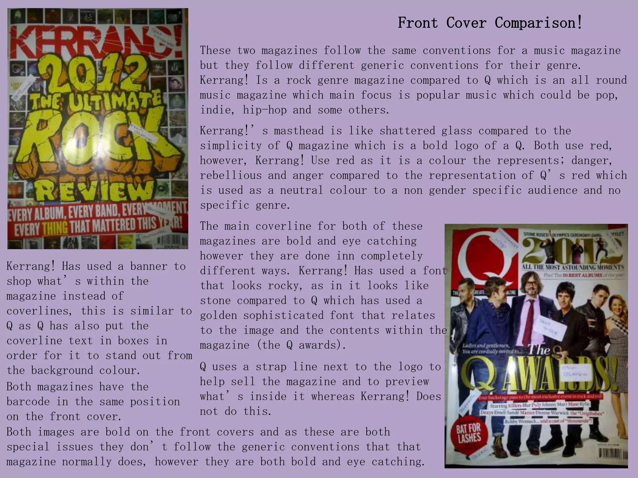
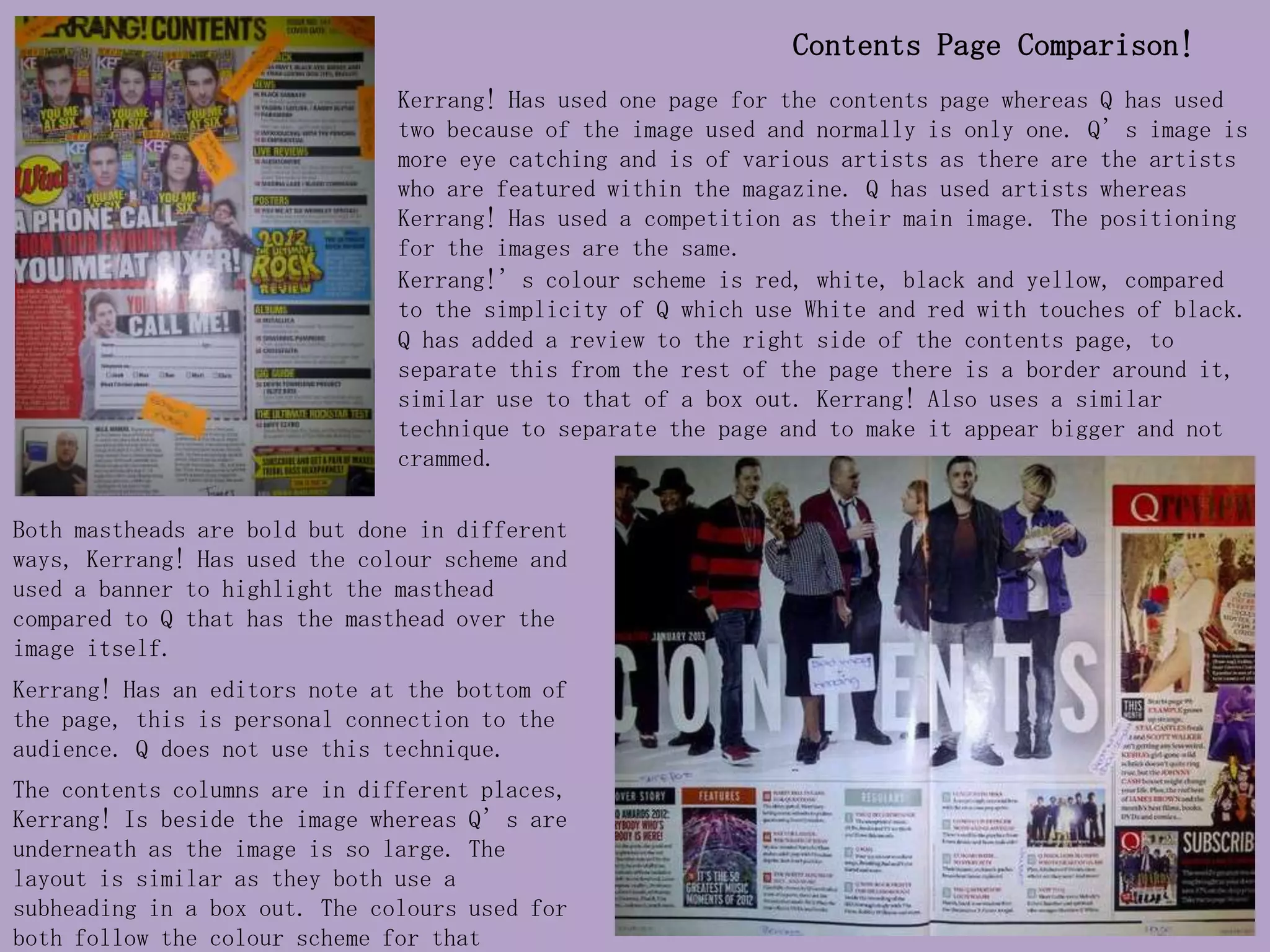
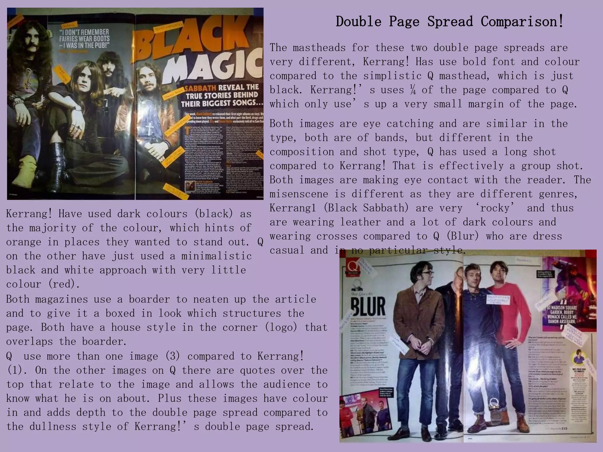
Front Cover Comparison!
                               These two magazines follow the same conventions for a music magazine
                               but they follow different generic conventions for their genre.
                               Kerrang! Is a rock genre magazine compared to Q which is an all round
                               music magazine which main focus is popular music which could be pop,
                               indie, hip-hop and some others.
                               Kerrang!’s masthead is like shattered glass compared to the
                               simplicity of Q magazine which is a bold logo of a Q. Both use red,
                               however, Kerrang! Use red as it is a colour the represents; danger,
                               rebellious and anger compared to the representation of Q’s red which
                               is used as a neutral colour to a non gender specific audience and no
                               specific genre.
                               The main coverline for both of these
                               magazines are bold and eye catching
                               however they are done inn completely
Kerrang! Has used a banner to different ways. Kerrang! Has used a font
shop what’s within the         that looks rocky, as in it looks like
magazine instead of            stone compared to Q which has used a
coverlines, this is similar to golden sophisticated font that relates
Q as Q has also put the        to the image and the contents within the
coverline text in boxes in     magazine (the Q awards).
order for it to stand out from
the background colour.         Q uses a strap line next to the logo to
Both magazines have the        help sell the magazine and to preview
barcode in the same position   what’s inside it whereas Kerrang! Does
on the front cover.            not do this.
Both images are bold on the front covers and as these are both
special issues they don’t follow the generic conventions that that
magazine normally does, however they are both bold and eye catching.
Contents Page Comparison!
                               Kerrang! Has used one page for the contents page whereas Q has used
                               two because of the image used and normally is only one. Q’s image is
                               more eye catching and is of various artists as there are the artists
                               who are featured within the magazine. Q has used artists whereas
                               Kerrang! Has used a competition as their main image. The positioning
                               for the images are the same.
                               Kerrang!’s colour scheme is red, white, black and yellow, compared
                               to the simplicity of Q which use White and red with touches of black.
                               Q has added a review to the right side of the contents page, to
                               separate this from the rest of the page there is a border around it,
                               similar use to that of a box out. Kerrang! Also uses a similar
                               technique to separate the page and to make it appear bigger and not
                               crammed.

Both mastheads are bold but done in different
ways, Kerrang! Has used the colour scheme and
used a banner to highlight the masthead
compared to Q that has the masthead over the
image itself.
Kerrang! Has an editors note at the bottom of
the page, this is personal connection to the
audience. Q does not use this technique.
The contents columns are in different places,
Kerrang! Is beside the image whereas Q’s are
underneath as the image is so large. The
layout is similar as they both use a
subheading in a box out. The colours used for
both follow the colour scheme for that
Double Page Spread Comparison!
                                             The mastheads for these two double page spreads are
                                             very different, Kerrang! Has use bold font and colour
                                             compared to the simplistic Q masthead, which is just
                                             black. Kerrang!’s uses ¼ of the page compared to Q
                                             which only use’s up a very small margin of the page.
                                             Both images are eye catching and are similar in the
                                             type, both are of bands, but different in the
                                             composition and shot type, Q has used a long shot
                                             compared to Kerrang! That is effectively a group shot.
                                             Both images are making eye contact with the reader. The
                                             misenscene is different as they are different genres,
Kerrang! Have used dark colours (black) as   Kerrang1 (Black Sabbath) are very ‘rocky’ and thus
the majority of the colour, which hints of   are wearing leather and a lot of dark colours and
orange in places they wanted to stand out. Q wearing crosses compared to Q (Blur) who are dress
on the other have just used a minimalistic casual and in no particular style.
black and white approach with very little
colour (red).
Both magazines use a boarder to neaten up the article
and to give it a boxed in look which structures the
page. Both have a house style in the corner (logo) that
overlaps the boarder.
Q use more than one image (3) compared to Kerrang!
(1). On the other images on Q there are quotes over the
top that relate to the image and allows the audience to
know what he is on about. Plus these images have colour
in and adds depth to the double page spread compared to
the dullness style of Kerrang!’s double page spread.

Primary comparison

  • 1.
    Front Cover Comparison! These two magazines follow the same conventions for a music magazine but they follow different generic conventions for their genre. Kerrang! Is a rock genre magazine compared to Q which is an all round music magazine which main focus is popular music which could be pop, indie, hip-hop and some others. Kerrang!’s masthead is like shattered glass compared to the simplicity of Q magazine which is a bold logo of a Q. Both use red, however, Kerrang! Use red as it is a colour the represents; danger, rebellious and anger compared to the representation of Q’s red which is used as a neutral colour to a non gender specific audience and no specific genre. The main coverline for both of these magazines are bold and eye catching however they are done inn completely Kerrang! Has used a banner to different ways. Kerrang! Has used a font shop what’s within the that looks rocky, as in it looks like magazine instead of stone compared to Q which has used a coverlines, this is similar to golden sophisticated font that relates Q as Q has also put the to the image and the contents within the coverline text in boxes in magazine (the Q awards). order for it to stand out from the background colour. Q uses a strap line next to the logo to Both magazines have the help sell the magazine and to preview barcode in the same position what’s inside it whereas Kerrang! Does on the front cover. not do this. Both images are bold on the front covers and as these are both special issues they don’t follow the generic conventions that that magazine normally does, however they are both bold and eye catching.
  • 2.
    Contents Page Comparison! Kerrang! Has used one page for the contents page whereas Q has used two because of the image used and normally is only one. Q’s image is more eye catching and is of various artists as there are the artists who are featured within the magazine. Q has used artists whereas Kerrang! Has used a competition as their main image. The positioning for the images are the same. Kerrang!’s colour scheme is red, white, black and yellow, compared to the simplicity of Q which use White and red with touches of black. Q has added a review to the right side of the contents page, to separate this from the rest of the page there is a border around it, similar use to that of a box out. Kerrang! Also uses a similar technique to separate the page and to make it appear bigger and not crammed. Both mastheads are bold but done in different ways, Kerrang! Has used the colour scheme and used a banner to highlight the masthead compared to Q that has the masthead over the image itself. Kerrang! Has an editors note at the bottom of the page, this is personal connection to the audience. Q does not use this technique. The contents columns are in different places, Kerrang! Is beside the image whereas Q’s are underneath as the image is so large. The layout is similar as they both use a subheading in a box out. The colours used for both follow the colour scheme for that
  • 3.
    Double Page SpreadComparison! The mastheads for these two double page spreads are very different, Kerrang! Has use bold font and colour compared to the simplistic Q masthead, which is just black. Kerrang!’s uses ¼ of the page compared to Q which only use’s up a very small margin of the page. Both images are eye catching and are similar in the type, both are of bands, but different in the composition and shot type, Q has used a long shot compared to Kerrang! That is effectively a group shot. Both images are making eye contact with the reader. The misenscene is different as they are different genres, Kerrang! Have used dark colours (black) as Kerrang1 (Black Sabbath) are very ‘rocky’ and thus the majority of the colour, which hints of are wearing leather and a lot of dark colours and orange in places they wanted to stand out. Q wearing crosses compared to Q (Blur) who are dress on the other have just used a minimalistic casual and in no particular style. black and white approach with very little colour (red). Both magazines use a boarder to neaten up the article and to give it a boxed in look which structures the page. Both have a house style in the corner (logo) that overlaps the boarder. Q use more than one image (3) compared to Kerrang! (1). On the other images on Q there are quotes over the top that relate to the image and allows the audience to know what he is on about. Plus these images have colour in and adds depth to the double page spread compared to the dullness style of Kerrang!’s double page spread.