
Recommended
More Related Content
What's hot
What's hot (15)
Similar to Front Cover Analysis
Similar to Front Cover Analysis (20)
More from perri_94
Front Cover Analysis
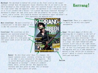
- 1. Masthead: The masthead is behind the artist on the front cover as the target audience already know the magazines layout therefore they do not need to see the whole masthead as they already know. This also could be because the artist sells Kerrang! the issue rather than the magazine itself, the masthead is in a rebellious style as it is all cracked like a mirror – or a guitar amp being connected. Kerrang!’s masthead is always the same style every time and normally the colours, black , white, red or yellow, this could be because red represents anger and blood – as Kerrang! is a rock magazine – this represents the magazine well. Competition: There is a competition Main coverlines: The main coverline is in which you can win rare signed situated next to the main image as this merchandise. is who the coverline is about. Coverlines: The coverlines on this Image: The main images of Billie Joe magazine are scattered around the Armstrong who is slightly to the left of page, this could be because the central – this could be because to make magazine is more of a rock genre and the composition more interesting – the this genre tends to not be neat and image looks like Billie Joe is performing ordered. on a stage, the light behind him adds contrast to his tone as the light shines from behind areas of his face are blacked out. As this is a rock genre this suits the magazine well as it adds darkness and mystery to him. Billie Joe is playing a guitar – which is closely associated to Banner: On this front cover there is a banner, the indie and rock music. banner contains extra contents, allowing the reader to see what is also contained in the magazine. This is yellow which goes along with the colour scheme of Barcode the magazine as kerrang!’s which are normally black, white, yellow and red. This magazine has features that have green on them, this is because Green day’s key colours are green.
- 2. Masthead: NME masthead is in front of the image as this is the house style for NME, this is red because the colour scheme for NME is red on the majority of their magazines. The masthead is always situated in Date and cover price the top left corner of the magazine. NME is abbreviated for New Musical Express, NME sounds more Image: The main image is of Carl modern than New Musical Express and thus can relate Barat, his face is brightly to a younger audience as it sound more youthful and contrast, but in comparison to his rebellious. face his t-shirt and hair are very dark. This puts emphasis onto his face and eyes as his eyes are Coverlines: The coverlines are piercing blue. He is looking directly either side of the image as the at you which engages the audience. image is the main selling point. The coverlines are in red which stand Pull Quote: The quote is above the out from the rest of the text but main coverline and is in blue where it is not as big as the main which follows NME colour scheme. coverline or masthead as it is not It is a different font to the main the selling point. The black text coverline as it looks as if its beneath is to further the coverlines hand written. point to allow the audience to get a even better idea what is contained within the magazine. Main coverlines: The main coverline is situated next to the main image as this is who the coverline is about. Cross acts a an ‘&’ or ‘plus' however this cross relates to the Barcode pull quote as it is done in a similar fashion. NME (New Musical Express)
- 3. Masthead: The masthead for Classic Rock magazine is very simplistic in a simple, easy to read font. The colour of the masthead is in white. This could be because the background colour is black and thus being white it Classic Rock contrasts with the black background and making it stand out. The ‘Rock’ is about 3 times the size of the ‘classic’ as this is to tell the target audience that this magazine is a rock magazine. The ‘classic’ is in between a stars as this can represent that the rock artists featured in this magazine are rock stars or legends. Main coverlines: The main coverline of this magazine is a dark orange, in a simple font that has Features: There are little features been edited so that the masthead such as the stiller offering a free look more appealing and rebellish. CD and with the front of the CD in Underneath is a sub coverline, this the middle bottom of the magazine. expands on the main coverline There is also another sticker giving a bit more of an insight containing the issue number, these into the article. all entice the audience as they feel like they are getting free merchandise. Coverlines: The coverlines for this magazine are neat as they are either side of the image and box out. The coverlines are in white and the sub- coverlines are in orange, the same colour as the main coverline. Image: The image is in front of the masthead as this could also represent that it is the artist that sells the magazine and not the title. The image is of Axle Barcode Rose, the lead singer of the Guns N’ Roses who is very well known among most music fans and in particular those who like the rock genre. Although Axle is looking directly to the audience you cannot see his face as it is covered by shadow which adds a rebellious mystery about him.
- 4. Masthead: The masthead for Q is very simple as it is just a capital Q in a red square box, Q stands for Q the music. The masthead is so simple as the target audience already knows the magazine as they would buy it often. The masthead is simplistic, however it stands out from the other music magazines on the shelf as the Image: The image is of Florence Welch red is very eye catching. The logo/masthead is normally as for this issue she is the main in front of the images like in this case. article, this image is a close up as you can only see her face. You cant see any clothes as her hair complements her very pale face and Coverlines: The coverlines for Q makes the magazine pop off the page. are to either side of the main area The eye make up she is wearing of the image (Florence’s automatically makes you attracted to face), these are white as they her eyes as it’s the only other match the Q and this is the colour colour on the page other than the Zane scheme. Most if not all of Q Lowe sticker. magazines have this colour scheme. Main coverlines: The main coverline of Q is at the top by Florence’s Features: There are stickers on fringe, this is the main coverline this issue of Q that point out because it is in a bigger text than the certain aspects that will be other coverlines even though it is the contained in the magazine as same colour and it relates directly to this one points out that Zane the image as any music fan would know Lowe (a well known radio 1 DJ) that the image is Florence and the main is inside. coverline says Florence. Barcode Q
- 5. Masthead: This Rolling Stone masthead is situated behind the image as you can still make out what it says because everyone who listens to any music knows or has heard of the Rolling Stones and thus even this Rolling Stone masthead that Is mostly covered you can make out says Rolling Stone. The masthead is in a respectable font as it is in a serif font. The colour is red as this magazine is the majority a rock magazine although it does contain artists of different genres, such as, Snow Patrol and Block party. The colour of the masthead changes depending on the colour of the background and the image. Sometimes the masthead is in front of the image, however on this one it is not. Image: The image is of Pink who is a mixed genre artist, she has created music Banner: There is a banner of sorts that is R&B, Pop, Pop/Rock and Rock at the top od the page in front of therefore she would entice a wide the image, it gives a small audience for this issue. The image is to insight of what other music the right slight from the centre of the artists the magazine will contain. page. She is dressed like a rebel, biker of sorts and is wearing cloths that Main coverlines: The main represent a rock artist as she also has coverline is again dark piercings. She is in front of the grey, next to pinks head in the masthead as for this issue she could be top left corner ‘the dark side selling the issue and not the magazine of pink’ entices the reader to itself as she is so well known. Pink is buy it if they want to read more looking directly at the audience which about this, it is how they sell makes the audience feel they are being their magazines with a gripping engaged with by her and this makes it insight to what's inside. feel more personal. Coverlines: The coverlines for Features: There is a yellow sticker Rolling Stone are to the left of in the right corner that the image in a dark grey in again automatically captures the audiences a serif font. eye as it is in yellow and is the Barcode only yellow on the page.
- 6. Masthead: The masthead for the magazine is very simple as it has ‘smash’ written in a handwritten font style and the ‘Hits’ is very simple white with a drop shadow of red. This makes the masthead stand out from the background. The smash is in black whereas the Hits is the Image: This image is of Adam Ant who part that stands out as this is what the magazine is takes up most of the page, there is a about and allows the audience to automatically understand border around the image in the A4 what this magazine would contain (hits). rectangle, this makes Adam Ant look as if he is popping out from the magazine and his had is in front of the border as Coverlines: The coverlines are in if he is leaning on it. Adam Ant is know the lower left corner, there is not for being eccentric and ‘out there’ specific colour scheme as there is thus all the make-up and the hair, this an explosion of colour on the page was acceptable as his genre was new-wave as the image, masthead and and post-punk, however at the time he coverlines all contain different was very ‘popular’. Punk misenscene colours. was ‘out there’ and very rebellious and goes against the norms of society on a daily basis. Adam Ant is looking very mysteriously to the audience as his Background: The background is a eyes are very dark and you can see that mix of red, blues and he is puling a natural face. purple, these colours are faded into each other, however these are warm tones and thus make help give Adam Ant a glow to his Main coverlines: The main coverline skin that may not be there is in red which matches the colour without the background. of the drop shadow from the masthead. This is in a slightly Date and cover price bigger to show that this is the main coverline and what the main story is. Smash Hits
- 7. Masthead: The masthead for Classic Pop is simple but eye catching as it is a simple white font on top of a red and Classic POP black box. The box puts emphasis on the white writing as it makes the ‘pop’ pop out from the contrasting background. Date and cover price Coverlines: The coverlines are in a Cover Image: These images are a lot simple font again that are either smaller than the main image as they side of the image of Kate Bush. are just a ‘taster’ of what is in They are situated around her neck this magazine or in an upcoming line and go in at the points of her magazine. neck. Image: This image is of Kate Bush, it is a close up as you can only see her head Main coverlines: The main coverline and neck. She looks to be wearing a head is a different font to the piece which is glittery and eye coverlines as it is a serif fonts catching. This image I similar to Q’s whereas the covrlines were a sans as it looks similar to Florence Welch as serif. It is also on Kate Bush’s Kate Bush also takes up most of the page neck which makes it stand out from with her face and hair. the coverlines. There is again a sub coverline which expands on what the main coverline. Features: There are badges in the lower left corner, this also Barcode represents a pop magazine as ‘back in the day’ people used to always wear badges of their favourite song, artist ect.