Call Girls Ludhiana Just Call 98765-12871 Top Class Call Girl Service Available
Magazine cover analysis
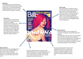
1. Main Image
The main image is of Rihanna who is
the main focus of the cover. She has a
quite serious and seductive facial
expression and is staring intently into
the camera like she is staring at the
reader and connecting with them.
There is quite low key lighting behind
her yet she is lit up well suggesting she
is most important.
By using this pull quote ‘my fans don’t
really know who I am’ it entices the
audience to buy the magazine as fans
of rihanna will be intrigued to know
what it is that they don’t know about
her.
Colour scheme
The colour scheme is very simple and
consistent. It appears very gentle and warm
looking.
The dominate colour on this cover that stands
out is red. This is meant to be a feminine
colour and would appeal more to women than
men, however her bright red lips give the
cover more of a seductive sexy feel to it which
could help appeal to a male audience.
The price and barcode are situated in the
bottom left hand corer of the magazine known
as the ‘terminal are’ it is typical to find this
here as this is the part of the cover that the
audience don’t tend to focus on.
Masthead
The masthead is in white bold sans
serif font but still fits in with the theme
of the cover. It is situated behind the
model putting the focus more on her
rather than the magazine company .
Coverlines
There are three cover lines to
the side of the main image that
each have a subhead
underneath which gives the
audience an idea on what they
can expect from the magazine.
They are in a small plain white
font which doesn’t really grab
the readers attention. Which
again puts the focus back onto
the main image of rihanna.
Main Coverline
The main coverline is the biggest font
size on the cover. I think they have
done this to grab the readers
attention. It is bold thick letters that
stand out over the other text on the
cover.