
Recommended
More Related Content
What's hot
What's hot (20)
Similar to Textual analysis 1
Similar to Textual analysis 1 (20)
Recently uploaded
Recently uploaded (20)
Textual analysis 1
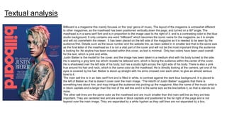
- 1. Billboard is a magazine this mainly focuses on the ‘pop’ genre of music. The layout of the magazine is somewhat different to other magazines, as the masthead has been positioned vertically down the page, and turned on a 90º angle. The masthead is in a sans serif font and is in proportion to the image used to the right of it, and is a contrasting color to the blue studio background. It only contains one word “billboard” which becomes the iconic name for the magazine, as it is simple and will not overwhelm the viewer. It has been placed on the left side of the magazine as it is needed to be seen by the audience first. Details such as the issue number and the website link, as been added in in smaller text that is the same size as the final letter of the masthead as it is not a vital part of the cover and will not be the most important thing the audience is looking for. No skyline has been included within this cover, as text is minimal. Only two colors have been used overall for the text, which is pink and white. Justin Bieber is the model for the cover, and the image has been taken in a medium shot with his body turned to the side. He is wearing a grey tank top which reveals his tattooed arm, which is facing the audience within the center of the cover. He is shadowed over the left side of his body, but has a studio light across the right side of his body. There is also a pink hue around his hair and neck, which is the came color as the masthead. He is directly looking at the camera, yet one of his eyes is covered by his hair. Bieber is stood up straight with his arms crossed over each other, to give an almost serious tone to it. The main sell line is in an italic serif font and is filled in white, to contrast against the dark blue background. It is placed to the left of Bieber so that is doesn’t cover over the main image. “The rebirth of Justin Bieber” suggests that there is something new about him, and may intrigue the audience into picking up the magazine. Also the name of the music artist is in block capitals and is larger than the rest of the sell line and it is the same size as the line before it, so that is stands out more. The other sell lines are the same color as the masthead and are much smaller than the main sell line as they are less important. They are centered text and are wrote in block capitals and positioned to the far right of the page and is not layered over the main image. They are separated by a white hyphen as they sell lines are not separated by a box. Textual analysis
- 2. The contents of the page is separated into sections by a light blue line, so that it appears more organized and is therefore easier to read. The masthead There are a total of four images on the page, with three next to each other above the top; following the ‘rule of thirds’ pattern each image was not taken in a studio so it makes the audience feel like they are getting exclusive access to the lives of particular artists. The main artist is in the center left of the page, and has a black and white filter on it. The model’s image was taken in a medium shot, and he is making direct eye contact with the camera. He is wearing a tuxedo to give a prim look about him and make him appear more professional. The sections of the contents page are made to the left of the image and have all been given subheadings which are in a thin serif font and are a larger size than the rest of the information so that it is clearer to see and lets the audience find what they are looking for easier. There is additional information that covers the left side of the page and the typography of the masthead for it is the same as the “contents” masthead on the right and has a large kerning between them both. The logo has been included on the contents page at the top and is much smaller than the original logo on the front cover. By repeating the logo on the contents page, it helps it to become more memorable for new readers.
- 3. Nicki Minaj is the main focus of this double page spread, as she is a pop icon from this time. The masthead is organized into two separate typographies. The first line is written in a serif cursive font, which connotes a very feminine vibe. The color is black, which gives a contrast against the baby pink background which also emphasizes the feminine outset. The main line “Nicki Minaj” is wrote in all block capitals and has the largest font out of the entire spread so that it stands out the most to the audience. It is a darker pink color and wrote in sans serif to make it stand out against the pink background. It is positioned on the left center of the page so it is more noticeable. Nicki has a dramatic stare and is looking directly at the audience to engage the audience. She is wearing a black and white zebra dress which connotes an animalistic vibe, which matches the personality of Nicki. She has is wearing colored jewelry and is wearing an “icon” ring on her hand and it is clearly seen. The word “icon” has connotations of being special and important and could indicate that she is the most important person in regards to this article. Her makeup has a classic ‘Barbie doll’ demeanor which matches the key themes of pop princesses with the pink lipstick which has a feminine aspect, as the color pink is associated with girls. The beginning of the article is signified by a pink sans serif drop cap which is the same color as the title so it is easier for the audience to see where to begin. On the right page, there is a pull quote which stands out as it has been highlighted with the dark pink color. Inside the pull quote “the sexual stuff” line has been put in a black fill which allows it to stand out more to the audience, so it makes it seem as if they are reading some juicy information as it makes the taboo stand out.