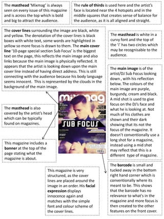
1. The masthead ‘Mixmag’ is always
seen on every issue of this magazine
and is across the top which is bold
and big to attract the audience.
The rule of thirds is used here and the artist’s
face is located near the 4 hotspots and in the
middle squares that creates sense of balance for
the audience, as it is all aligned and straight.
The main image is of the
artist/DJ Sub Focus looking
down , with his reflection
below. The colours of the
main image are purple,
burgundy, cream and black.
A mid shot is used to give
focus on the DJ’s face and
what he is looking at. Not
much of his clothes are
shown and their dark
showing that its not the
focus of the magazine. It
doesn’t conventionally use a
long shot for a magazine,
instead using a mid shot
may reflect that this is a
different type of magazine.
The cover lines surrounding the image are black, white
and yellow. The denotation of the cover lines is black
boxes with white text, some words are highlighted in
yellow so more focus is drawn to them. The main cover
line ‘10-page special section Sub Focus’ is the biggest
text on the page, this reflects the main image and also
links because the main image is physically reflected. It
appears that the artist is looking down upon the main
cover line instead of having direct address. This is still
connecting with the audience because his body language
seems innocent. This is represented by the clouds in the
background of the main image.
This magazine is very
structured, as the cover
lines are placed around the
image in an order. His facial
expression displays
innocence again and
matches with the simple
font and colour scheme of
the cover lines.
The barcode is small and
tucked away in the bottom
right hand corner which is
conventionally where its
meant to be. This shows
that the barcode has no
relevance to what's in the
magazine and more focus is
then created to the other
features on the front cover.
This magazine includes a
banner at the top of the
page stating what the
magazine is about.
The masthead is also
covered by the artist’s head
which can be typically
found on magazines.
The masthead is white in a
curvy font and the top of
the ‘i’ has two circles which
may be recognisable to the
audience.
2. The secondary image that is used on
the left and right hand side of both
contents pages relates to one of the
articles below the image. This
promotes the article and gets readers
interested if the photo is appealing.
The layout is very structured and in columns
and sections, this is similar to the front cover
which gives a sense of cohesion. This layout
may make the magazine seem serious and
professional as their content is presented
clearly just like the front cover.
The main heading/title of the contents page is big and in bold, again to
catch the reader’s attention. The font of the title ‘Contents’ isn’t the
same as the front cover as it looks more appealing, electronic-looking and
funky, this can connote that the magazine is going to be interesting as the
font is interesting and it situates where the main focus is and in this case
it’s the title of the magazine and gives a well-known colour scheme for
Mixmag.
The colours (part of the mise-en-scene) on both
secondary images contrast as one image is full of
vibrant colours: green, blue, pink, yellow, white and
black) whereas the other photo is simply black and
white. The colours represent that the article linked
with the left photo is fun and interesting and the other
may be serious. It could also suggest that one is for a
younger target audience and the black and white one
is for a older TA as the colours are more sophisticated
and that’s what older people are shown to be.
The target
audience of this
magazine could be
male/female as
both genders are
featured and
range from ages
16-35.
The promotion at the bottom
of the page underneath the
photo (right-side contents
page) advertises a free Sub
Focus CD that readers can get
and this makes people buy the
magazine because they get
something free. This may cost
the magazine now but will get
it back in the long run if more
people buy the magazine.
3. The double page spread is
actually 10 pages long, so
each photo is part of the
double page spread I will
be analysing.
2
1
3
5
4
The double page spread has columns with
straight positioning linking with the front cover
and contents page. This makes it clearer for the
audience to read and doesn’t give a confusing
illusion.
The secondary image on this double
page spread again shows the DJ
looking down and it appears he is
looking at the quote, similar to the
front cover.
The house style is simple but also exciting. The shapes (lines, squares, triangles,
rectangles) in the background relate to the alignment of everything else on the page. The
colours also link to the secondary image on the contents page. There is also quoting …
The secondary
image doesn’t
show all of the
artist’s face
which is very
mysterious and
can make the
reader want to
know what he
looks like. This
could represent
his personality
and connotes
some sort of
confidentiality
about himself.
This article has
some negative
space around
the article, this
can give a
simplistic feel as
things don’t
need to take up
all of the space
on the page.
The colours again portray as attention-grabbing and exciting because
they’re all vibrant linking to a youthful target audience maybe similar
to the Sub Focus’ age but gives a sense of formality as there is
monochrome colours that connote a classy appearance.
There is also the issue date
at the bottom of each page
which is a stereotype of a
magazine, this follows them
codes and conventions
suggesting the magazine’s
professionalism.