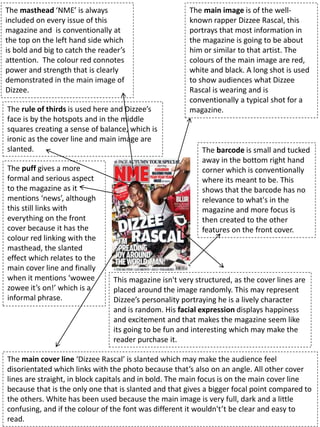
1. The masthead ‘NME’ is always
included on every issue of this
magazine and is conventionally at
the top on the left hand side which
is bold and big to catch the reader’s
attention. The colour red connotes
power and strength that is clearly
demonstrated in the main image of
Dizzee.
The main cover line ‘Dizzee Rascal’ is slanted which may make the audience feel
disorientated which links with the photo because that’s also on an angle. All other cover
lines are straight, in block capitals and in bold. The main focus is on the main cover line
because that is the only one that is slanted and that gives a bigger focal point compared to
the others. White has been used because the main image is very full, dark and a little
confusing, and if the colour of the font was different it wouldn't’t be clear and easy to
read.
The main image is of the well-
known rapper Dizzee Rascal, this
portrays that most information in
the magazine is going to be about
him or similar to that artist. The
colours of the main image are red,
white and black. A long shot is used
to show audiences what Dizzee
Rascal is wearing and is
conventionally a typical shot for a
magazine.
This magazine isn't very structured, as the cover lines are
placed around the image randomly. This may represent
Dizzee’s personality portraying he is a lively character
and is random. His facial expression displays happiness
and excitement and that makes the magazine seem like
its going to be fun and interesting which may make the
reader purchase it.
The puff gives a more
formal and serious aspect
to the magazine as it
mentions ‘news’, although
this still links with
everything on the front
cover because it has the
colour red linking with the
masthead, the slanted
effect which relates to the
main cover line and finally
when it mentions ‘wowee
zowee it’s on!’ which is a
informal phrase.
The barcode is small and tucked
away in the bottom right hand
corner which is conventionally
where its meant to be. This
shows that the barcode has no
relevance to what's in the
magazine and more focus is
then created to the other
features on the front cover.
The rule of thirds is used here and Dizzee’s
face is by the hotspots and in the middle
squares creating a sense of balance, which is
ironic as the cover line and main image are
slanted.
2. The layout is very structured and in columns,
this is contrasted from the front cover as
everything was all over the place whereas
this has loads of boxes with text inside. This
layout may make the magazine seem more
serious and professional as their content is
just as interesting as what’s on the front
cover.
The main heading/title of the contents
page is big and in bold, again to catch
the reader’s attention. The font is the
same as the front cover and therefore
all parts of the magazine link together.
The ‘NME’ part is in red whereas the
‘CONTENTS’ is in white. This situates
where the main focus is and in this case
it’s the title of the magazine and gives a
well-known colour scheme for NME.
The secondary image that
is used in the centre of the
contents page relates to
one of the articles below
the image. The slanted
picture gives cohesion
because other things were
slanted on the front cover.
The offer entices the
audiences to buy the
magazine and this
gives an advantage to
NME magazines. This
can grab the audience
and the use of the
bright colours stand
out and promote
something good, as
the colour yellow has
positive connotations.
The mode of address used by the woman
in the photo creates a relationship with
the specific target audience. Using both
female and male figures throughout their
magazine shows that its suitable for both
genders. The page numbers
The headings/sub-headings
give an appearance that
there is more content in the
magazine and that it appeals
to everyone.
3. The double page spread has columns with
straight positioning which again contrasts
from the front cover. This makes it clearer
for the audience.
The font matches the previous font
that was used on the front cover an
contents page. Its bold, big and catches
the reader’s attention. This takes up
most of the space and there is not
much information on the right side of
the double page spread.
This article has some negative space
right above the main heading, this
gives a simplistic feel as things don’t
need to take up all of the space on the
page.
The graffiti styled background already portrays
a frantic atmosphere as lots is going on. The
jacket Dizzee is wearing (part of the mise en
scene) is red and that relates to the colour
scheme throught the NME magazine.
The article uses a drop capital
which follows the magazine
convention and lets the reader
know where the start of the
text is.
The colour red connotes
danger which could link to the
graffiti background, this may
suggest something to do with
Dizzee’s past/childhood where
he was brought up.
The columns again give an informal feel
which may be aimed at teenagers or older
people.
The house style is simple but also exciting. The colours from the background give it an
edgy feel and It looks appealing to the reader. It states who wrote the article and who
got the images along with some edited pictures of beer bottles and a radio which
appeals to males aged around the same age as Dizzee.
4. Task 2d: Identify the
elements that connect the 3
different parts of the
magazine.
Text font
Slanted textColour scheme