
Recommended
More Related Content
What's hot
What's hot (18)
Similar to Codes and conventions
Similar to Codes and conventions (20)
More from Eleanorpearce4
Recently uploaded
Recently uploaded (20)
Codes and conventions
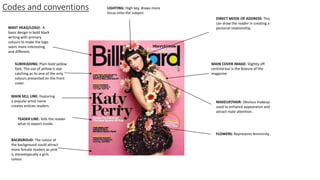
- 1. Codes and conventions MAST HEAD/LOGO: A basic design in bold black writing with primary colours to make the logo seem more interesting and different. DIRECT MODE OF ADDRESS: This can draw the reader in creating a personal relationship. BACKGROUD: The colour of the background could attract more female readers as pink is stereotypically a girls colour. SUBHEADING: Plain bold yellow font. The use of yellow is eye catching as its one of the only colours presented on the front cover. MAIN SELL LINE: Featuring a popular artist name creates entices readers. MAIN COVER IMAGE: Slightly off centred but is the feature of the magazine. MAKEUP/HAIR: Obvious makeup used to enhance appearance and attract male attention. FLOWERS: Represents femininity . TEASER LINE: Tells the reader what to expect inside. LIGHTING: High key, draws more focus onto the subject.
- 2. Codes and conventions MASTHEAD/ LOGO: Largest piece of font on the front cover and eye catching, includes pops of primary colours (red, blue and yellow). BARCODE: usually placed at the bottom right or up the right-side. Along with it will sometimes be the date or month of the edition, a price, their website and it's issue number. COLOUR: The colour purple is very eye catching as it contrasts mainly with the grey causing it to be a pop of bright colour. MAIN SELL LINE: The artist name is advertised as well as her featuring the front cover. DIRECT MODE OF ADDRESS: This can draw the reader in creating a personal relationship. SECONDARY LEAD: Sneak peak of what’s inside – makes reader want to read on.
- 3. Codes and conventions MASTHEAD/ LOGO: Largest piece of font on the front cover and eye catching, includes pops of primary colours (red, blue, green and yellow). MAIN SELL LINE: The artist name is advertised as well as her featuring the front cover. This will attract fans, males and females. DIRECT MODE OF ADDRESS: This can draw the reader in creating a personal relationship. BOLD FONT: Used to emphasise the famous landmark. BARCODE: usually placed at the bottom right or up the right-side. Along with it will sometimes be the date or month of the edition, a price, their website and it's issue number. POSE: Mouth slightly open and eyes are slightly squinted which seems seductive and will attract male attention. COLOUR: The picture itself is quite neutral and he makeup looks natural.
- 4. MASTHEAD: The masthead is the biggest and boldest font on the page which indicates to the reader what the page is. PICTURE: The celebrity (Katy Perry) is dressed up matching with the inflatable giant mushroom she is holding. This is unusual but would appeal to a female target audience. The mushroom has connotations of fantasy imagination and fairy tales which are often associated with young children and women which also suggests this is aimed at a young female audience. NEGATIVE SPACE: This is used to make the page look more sophisticated and simple. It includes everything the reader needs to know. INFORMATION: There is information on the right hand side of the page and it is very small, so its difficult to read for some people. Information is used to entice the readers. By using Katy Perry as a small sub title and her being on the contents may suggest the magazine is subjected around her which attracts a huge fan base.
- 5. CONTENTS WORD: The word ‘contents’ is used as the biggest font on the page which draws attention to the reader so they can indicate what it is. The writing is bold and not all on one line which contrasts with the background and makes it unique. MASTHEAD: The masthead is very simple as it only consists of one letter ‘V’ which represents the magazine ‘vibe’. This makes the magazine more recognisable and well known which could have an impact on its marketing. The colour is grey which is what the main colour is based around on the contents page. PICTURE: The image is of Kayne West who has an arm wrapped around his shoulder covering his chest, holding a heart which is the only colour used on the contents page. The colour red stands out on this page as it is bright and immediately attracts readers and may infer a women is trying to win his heart. SUBHEADING: The font used is stylish and elegant which relates with the colour scheme. Also its bold which easily guides the reader of what they can read into.
- 6. COLOUR SCHEME: There is a lot of colour used which helps attract its target audience which I would guess to be 11-16 year olds. Having colour draws attention to the contents especially using a contrast of colours together that stand out. LOGO: Reader can be aware of magazine there reading and it gives the brand more recognition. DIRECT MODE OF ADDRESS: Reader can make a connection. CONTENTS NUMBERS: Numbers are bright and attractive. This would easily guide young readers where to go. SUB IMAGES: Used to promote stories within the magazine corresponding with page numbers to access the story quickly. LAYOUT: Very busy, surround with lots of images which can be quite confusing. However is appealing to young readers as it is simplistic with the colours used.
- 7. MASTHEAD: The masthead includes the word ‘gospel’ suggesting she is some kind of god. This adds to it because her name is the biggest font on the page in a different colour (pink). LAYOUT: Article is vibrant and exciting. This matches Nicki’s fun personality and music style in this best way to represent her. MAIN IMAGE: Nicki is placed almost in the centre of the page with the her name positioned to the side of her. The image grabs the readers attention as she is dressed in a patterned costume with bright accessories. Her lipstick matches the colour of her name, signifying they are the same person. DIRECT MODE OF ADDRESS: Looking into the camera, gives the impression your making a personal connection with the reader which is most commonly what magazines do to attract readers. DESIGN BALANCE: The article is evenly spread across the two pages. All the text is in neat columns and overall how its laid out works well. COLOUR: Having the overall theme colour to be pink would mainly attract girls. However having Nicki being the subject would also attract her fans as well.
- 8. DIRECT MODE OF ADDRESS: By looking directly at the reader, this helps invite the reader into the article. DROP CAPITAL: Using a drop capital helps the reader where to start reading and makes it look more professional. PICTURE: The main feature is Florence from the band Florence and the machine. All the colours linked together with Florence's hair and the American flag. She is placed in front of the text showing she is more important than the text. COLOUR: The main pop of colour is red which corresponds to Florence’s hair colour which draws us to the main focus which is her.
- 9. PICTURE: Lady Gaga is takes up one side of the double page spread which resembles her significance and importance. COLOUR: The portrait of Lady Gaga has a greyscale theme which makes it look elegant, old and classy. The double page spread is made up of three colours black, white and red. Red is used on the large letter ‘L’ placed on the 2nd page of the double page spread which is the first letter of the artist’s name which again shows that this magazine is focused on her. DROP CAPITAL: There is normally only one drop capital used in an article, however there are two within this, perhaps suggesting there are two important points of this article. HEADER: There doesn’t seem to be a title, however its just the artists name. ‘lady’ is all in lower case, with a fancy font while ‘GAGA’ is all upper case, exaggerating her last name so it stands out to the reader.