1. Brand Identity and Mode of Address Analysis (Task 3)
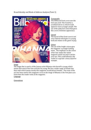
Typography
This Billboard front coveruses the
font sans serif. This fronthas a
youthfullook to it, whichwould
appeal to more younger people. The
use of the pink/red colourthat gives
this covera feminine appearance.
Layout
The layout of this front coveris not
very ordered whichgive it a young
lookand relates to the genre of pop.
Colour
The use of the bright coloursgive
the magazine a younger looking
sense. The emphasis on the colour
of her hair makes the whole
magazine stand out and it catches
your eye. This could influence the
reader to copy hair colour/stylefor
example.
Image
The image that is used is of the famous artist Rihanna who herself is young, which
means that most of her fans willalso be young. She has a wider range of female fans
than male which means mostly this magazine wouldattract females. The route of the
eye has been used in this magazine coveras the image of Rihanna is the first place you
lookwhen the reader looks at the magazine. `
Language
Conventions