
Recommended
More Related Content
What's hot
What's hot (18)
Similar to Double page spread analysis
Similar to Double page spread analysis (20)
More from marniaboyle
More from marniaboyle (14)
Recently uploaded
Recently uploaded (20)
Double page spread analysis
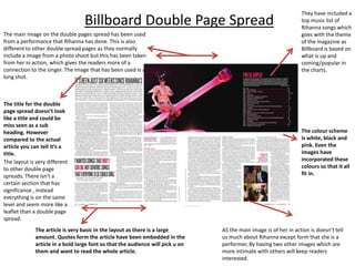
- 1. Billboard Double Page Spread The main image on the double pages spread has been used from a performance that Rihanna has done. This is also different to other double spread pages as they normally include a image from a photo shoot but this has been taken from her in action, which gives the readers more of a connection to the singer. The image that has been used is a long shot. The title for the double page spread doesn’t look like a title and could be miss seen as a sub heading. However compared to the actual article you can tell it’s a title. The layout is very different to other double page spreads. There isn't a certain section that has significance , instead everything is on the same level and seem more like a leaflet than a double page spread. The article is very basic in the layout as there is a large amount. Quotes form the article have been embedded in the article in a bold large font so that the audience will pick u on them and want to read the whole article. They have included a top music list of Rihanna songs which goes with the theme of the magazine as Billboard is based on what is up and coming/popular in the charts. The colour scheme is white, black and pink. Even the images have incorporated these colours so that it all fit in. AS the main image is of her in action is doesn’t tell us much about Rihanna except form that she is a performer, By having two other images which are more intimate with others will keep readers interested.
- 2. NME Double Page Spread The image of Lana del Rey has taken up a whole page of the article showing the significant of the double page. The image is a medium close-up which make it more intimate between the reader and the celeb. The images of Lana is in black and white as it stands out more compared to the page opposite which has quite vibrant colours. The double page spread gives of a 1950s theme so having the images in black and white adds to the effect. The colour scheme for this double page spread is blue, white and orange. A weird combination but is very vibrant and eye catching. Instead of having her name as the title, they have used the headline which was most likely used on the front cover . They have combined to different fonts and colours which makes the double page look fun, quirky and bold. This piece of text is a little intro to the actual article so that readers have a bit of background information before reading on. The article has a very simple layout which shows balance as the title is very fun and exciting. NME have included some sort of star of the month fact section which I haven't seen in other double page spreads, this is a way for readers to find out more about the artist and have fun while reading the article as it is positioned in the middle.
- 3. Q Double Page Spread The large image of Lady Gaga is on the left hand side and is on a whole page as a medium close- up. By it taking up half the article shows that the image has significance and symbolising that Lady Gaga is at large importance at the time. The fact that her name is very small in the right hand corner has a huge impact on the image and creates suspense in the page on a whole. The enlarged bright red ‘L’ is featured behind the text to emphasise the double page spread of lad gaga as the title is on the small side. This is a signature layout for Q magazine as it has been done in other in issues . They have used the red which is used ‘Q’ on the magazine which means they want the company to stand out even though the attention focused on lady gaga. The quantity of text is large meaning it could be detailed and the layout is very The image is in black and white which complements the large vibrant L next to it and makes the double page spread look sophisticated. simple columns. The layout of this double page spread is very formal and organised. It looks very sophisticated to the eye and looks like it would be aimed at an older audience . Having the fist letter larger emphasises the text and is a traditional/ formal layout meaning the interview could be more mature or serious.