1. Music Magazine Front Cover
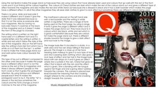
The image looks like it is located in a studio, in a
dark area and has rain drops falling in the back
ground. The image is a close up of her face
wearing dark makeup to give it a rock type of look
and she is wearing dark clothing which also gives a
rock type of effect and her hair in the image looks
black with rain drops on it and it gives an affect
where she is outside in the rain, Cheryl hair gives an
affect that is black with the rain and the affect
which is given. She is standing with her tongue
against her finger and she is giving direct address
towards the camera. The camera is placed eye
level towards her meaning that she is looking
straight ahead to the camera and she is looking
straight towards the camera.
The masthead is placed on the left hand side
with a red boarder and the writing in white
written in big letters. There are a range of fonts
being used on the front page, by using a range
if fonts it gives the page a different affect and it
makes the page stand out. They have stuck to 3
colours which are black, white and red which is
a good combination because they are colours
tat make the page stand out. There is different
shades towards the image to give a dark affect
and rock look to the image.
Using the red lipstick makes the page stand out because they are using colours that have already been used and colours that go well with the rest of the front
cover and it is just linking all the colours together. The colours of Cheryl clothes are dark which make the rest of the colours stand out and gives a different type of
affect towards the magazine and also makes the red and white stand out because she is dressed in black and it has a dark boarder which makes the page
have a different effect. In all of the other magazines they all wear dark clothes to give it a rock affect but sometimes there are different colours being used.
This type of lay out is different compared to
the other ones because it makes the page
have a different effect and it is not the
same as the rest of the Q magazines and
there is always different people on the
front cover so that it grabs the protagonist
attention. By using famous and different
people each time tit makes the
protagonist want to by it. The letter “Q” is
always in the red box sometimes the
colours and the fonts change so that it
matches to the rest of the magazine.
There is no price, date and barcode it
makes it different and it doesn’t give the
date that it was released because so
that it is not the same as everyone else
rock magazines. Also by having no
barcode means it could be at the back
of the magazine and so it doesn’t make
the front of the page to crowded.
The writing which is written on the right
hand side is in a different font and it is
capital letters and the writing is written in
white and red which follow the style of the
rest of the magazine. Also on the left hand
side the writing is Sans Seri font which has a
white on 6 of them but the last 1 is written
in red to make the make page stand out
and add some more colour towards the
page.
2. There is a barcode shown on this magazine, but
there is no price or date on the magazine which
presents that they might not want people to know
when it has come out or because it is a different
type of rock magazine.
The man in the image gives us an image that he is
smacking up “Q” or giving it an effect where the guitar
is breaking everything. The “Q” looks like it is going t
break because there is pieces falling off and giving it
an effect that it is going to fall to the floor or that
something has happened. The protagonist facial
expressions looks angry and wants to break everything,
using the guitar makes it looks like he is going to break
everything because of the way he is holding the
magazine.
This type of lay out is different compared to the
other ones because it makes the page have a
different effect and it is not the same as the rest
of the Q magazines and there is always
different people on the front cover so that it
grabs the protagonist attention. By using
famous and different people each time it
makes the protagonist want to by it. The letter
“Q” is always in the red box sometimes the
colours and the fonts change so that it
matches to the rest of the magazine. Also, in
the magazine the image is a long shot
meaning it is not a close up of the face like the
other “Q” magazines. In the magazines that I
have seen normally there is close ups of the
women's and then it is a long shot towards the
men’s.
Most of the magazines have used red, in this
one they have used the arm of the man in red
and then have the rest of the guitar black and
white, which contracts with the rest of the
magazine as there is black, red and white
included in the magazine. The writing on the
left hand side is in big bold writing and has a
red underlining for the next information to
appear. But below the “Q” there is some
writing in black and in small writing and then
there is some writing in bigger writing to grab
the audience view and to give the page a
different affect. On the right hand side the
writing there is 7 boxes in white with black
writing and there is 1 white box with writing
inside the box.
The masthead is placed on the left hand side with a
red boarder and the writing in white written in big
letters. There are a range of fonts being used on the
front page, by using a range if fonts it gives the page a
different affect and it makes the page stand out. They
have stuck to 3 colours which are black, white and red
which is a good combination because they are colours
tat make the page stand out. There is a shadow
behind the man to give it a different affect and from
his waist below it is a darker colour compar3ed to the
topper part, this is because you would need to see the
protagonist face better than anything else.
The colour of the clothes that the protagonist is wearing
is dark and a rock type of theme as by wearing dark
colours it gives a rock type of affect towards the
magazine and it means that you would know if it is a
type of rock magazine because of the themes that
have been included.
The writing on the top of the page tells us that it is the
best type of rock magazine and it makes people want
to buy it because it seems like a popular and it has a
different affect towards the rest of the magazines.
Music Magazine Front Cover
3. The masthead in the left side, It is large, with a
large white letter Q on the red background. Of
where it has been placed it is the first thing you
read, also because of how the magazine are
stacked it makes the masthead stand out.
Underneath the masthead there is a slogan which
describes the purpose of the magazine and it over
laps the masthead and the main image which
shows that it is important.
The cover lines are all in sans serif text and are
primarily in black text. They are in capital letters
which is the explanation of the cover lines being
below in he red or gold. This use of red,gold,white
and black text shows the house style of the
magazine and that it has been used through the
other magazine's.
The pull in quote is informal with the use of the
word “TIT” and also the ellipses entices the reader
making them want to read the article and it fairly
big written in black with the font of serif text to
match the colour scheme which is used
throughout the magazines.
The flash is in the top right hand and is placed
slightly behind the main image, the artists name is
big with the font of serif text with the explanation
of it below in read and black font again it is
keeping with the house that is used in the rest of
the magazines
The main image is close up of the artist,
Liam Gallagher, with his band mates in the
reflection of his sunglasses. The fact they
are merely a reflection in his glasses to
show that he is more important than the
rest of the band and he is the main focus
of the magazine.
The background is simple and makes him
stand out more and he takes up most of
the space on the cover, his expression is
limited and this adds to the effect of his
laid back person and they are trying to
present this.
The bar code is in the bottom third so it is the last thing you see, therefore the least important as it contains
the price so they aim to have gained your interest and convinced you to buy it before you actually look at
the price.
The use of the button attracts the
readers eye as well as displayed on of
the main stories featured with this
issue of the magazine.
The selling line is to promote what the magazine is
intending to engage the reader in, in this issue the
reader is aware it is all about “great” music.
The colour that the protagonist is
wearing is dark colours, by making the
protagonist wear dark colours it makes
the page stand out and by using red,
white, gold and black makes the page
stand out because the protagonist is
not wearing bright colours and it grabs
the audience view towards buying the
magazine.
Music Magazine Front Cover