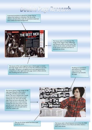
1. A personal quotation is placed in a larger font to capture the audience’s attention. The use of the colours, red and white, make the quotation stand out more within the black background.<br />The house style is Rock themed. As it is from the NME magazine it shows a lot of black and white which is their main theme. The use of a drop capital has been used to set the scene.The layout shows a large image on the right page filling the whole space creating a effortless and orderly theme. The text is limited into a small area in the bottom left hand corner making the arty side of the double page stand out more efficiently. The text is split into four small columns making the text seem easier to read and the words ‘Lily Allen’ have been highlighted in red and made bold to catch the readers eye. Heading is in quotations and styled in a creative way to draw the audience’s eye towards the page.20764505441950The layout of the rock magazine uses a whole page to contain the large image of the rock star to draw the audience’s eye into the pages. This gives a straightforward and organized look in comparison to the right hand side page which is filled with the text, heading and more pictures.-742950774700The house style is rock themed. The image of the singers with ruffled hair and themed outfits sets the scene. The colours of red, white and black relates to the classic rock look and there is minimal use of text.<br />Watermark of the print ‘USA’ in broad, large, sans serif writing, setting the scene of the pages.<br />-72390050165<br />The magazine has used a stand first to introduce the article.The layout shows a large image on the left, filling the whole page. The positioning of the model is quite ‘sexual’ as she is showing her bare legs and wearing high shoes whilst sat on a themed table. The image could tell us that the suitable audience would be teenage girls.There is a large amount of text, sectioned into three columns to make the read seem suitable. The name ‘Florence Welch’ has also been highlighted in blue to attract the audience’s eye to who is featuring in the text.The use of a drop capital has been used.<br />The use of color coordination is applied by using mainly deep colors such as oranges, browns and blacks.A catchy phrase is featured to sell the page and attract the audience to read about the famous celebrity.<br />A stand first has been used to introduce the interview. A large, ‘sans serif’ mast head is used to attract the audiences eye. The use of her name as well as the pictures shows clearly which celebrity is being interviewed.The layout features two large images. The layout of these images is unusual because the text is placed over these images. One photograph is placed on the right page, filling all of the space. The positioning and facial expression of Jamelia comes across very natural. The second image is placed on the top half of the left hand page. There appears to be a lot of text but as this is an interview it interests more people. 1895475583565<br />The double page spread features mainly text which spreads in columns across the page. In the text there are sub headings asking questions for the article. The title for the page is very simple in white writing. The layout of this double page spread is quite dull. The colours of the page are mainly dark colours such as browns which doesn’t emphasize any creativeness. The one image on the page is the background of the article which is partly visible as an empty space. On the right hand side a boy stands in the corner. The clothes he is wearing are baggy and also contains a hat, which could show his personality. Also the way he is standing is rather dull and lazy. This picture relates well to the article to set the scene and atmosphere.17907005781675Quotations have enlarged and stand out from the rest of the text to grab the audience’s attention. By having these quotations the readers will hopefully want to read on and find out what their talking about.The colouring of most of the objects is all co-ordinated together, making the pages look more sophisticated and professional.The title for this page is ‘the teenagers’ which is clearly stated in the middle of the pages in sans serif font. I think this name relates well to the targeted audience which shows teenagers will probably be interested in this magazine. -733425323850The page mainly contains pictures over text so visually there is a lot to look at. The main image is on the left page of three young men. The atmosphere of this image is chilled out and relaxed as the location is on a bed and they seemed very content. The layout is quite busy because of the colouring. The colours are wacky and bright so this adds to the scene. Because of the men being young and relating to the other bands on the page I would say the targeted age group for this magazine is late teens or anyone interested in rock/boy bands. Little signs and headings are featured throughout the page giving a more fun and creative look. These little signs also make the magazine much more interesting to look at. There are a few images on this double page spread but the main focus is text. The image of the three boys is generally there to give the viewers an idea of who is being talked about and who these people are. Because the boys are young I would say the targeted audience is probably teenagers from the ages of 13-17. Other images are on the page to relate to the article and the main picture on the left page is behind the text so is more subtle but still appearing on the page. The layout of this double page spread is original and stands out from the rest. The whole double page spread comes across quite busy and noisy because of the constant new things to look at. The title of ‘The usual suspects’ stands out clearly as this is in bright red and is in sans serif font type. The words ‘we’re ready to rock’ also stand out clearly and gives me the impression that this double page spread is to do with boys and rock. 16668756124575This paragraph of text could be used as a stand first to explain to the reader what this page is all about. The title of the article is also clear and stands out from the rest of the page. The colouring of the letters matches the outfits of the models.The arrows signal to read the column of writing on the side and the colour of the writing also co-ordinates with the clothing the model are wearing.On the page there seems to be quite a lot of text, displayed in a long column. This gives the viewers a chance to read about the people on the other page. The layout of this image is quite unusual as it continues onto the next page. The fact that the three men are surrounding the single women makes it look like a much more powerful image. The image is also going up in height order adding slight humor to the photograph because of the different heights. The way the models are styled is a different look and could also come across quite unusual.-619125285750The only image on this double page spread is a large, close up image of a young lady. The way she is smiling gives off a happy feeling. As she is out of the girl band ‘pink’ she could be more popular with the viewers depending on whether they like this band or not. Because of the image and the girl band in general I would say the targeted audience is generally more for girls around the ages of 14-18. The styling of her hair and the general way she looks could also be a stereotype teenage girls would want to follow.The layout of this double page spread is very simple and plain showing only black and white as colours. The main image is placed on the left page. The image is quite unusual and takes up the whole of the left page. The facial expression and body language of the girl is quite odd which could makes the reader wonder what the text is about.Use of a drop capital has been used and a standfirst has been added to explain what the text is going to be about. The colouring and background of the page is quite simple featuring only black and white on the left page. There appears to be quite a lot of text in columns on the left page.The title of the article is ‘self obsession’ which is placed across the left page in sans serif font. The title also colour coordinates with the layout.-3282953454406267455634355There is a large amount of texts placed in a plain background in columns across the page.<br />