Preventing and ending sexual harassment in the workplace.pptx
Abcd
1. Amira Abdi 12OF
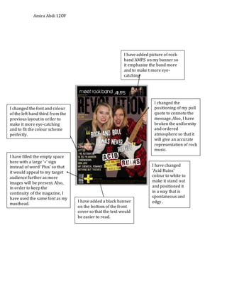
I have added picture of rock
band AMPS on my banner so
it emphasize the band more
and to make t more eye-
catching
I changed the font and colour
of the left hand third from the
previous layout in order to
make it more eye-catching
and to fit the colour scheme
perfectly.
I have filled the empty space
here with a large '+' sign
instead of word ‘Plus’ so that
it would appeal to my target
audience further as more
images will be present. Also,
in order to keep the
continuity of the magazine, I
have used the same font as my
masthead.
I changed the
positioning of my pull
quote to connote the
message. Also, I have
broken the uniformity
and ordered
atmosphere so that it
will give an accurate
representation of rock
music.
I have changed
'Acid Ruins'
colour to white to
make it stand out
and positioned it
in a way that is
spontaneous and
edgy .I have added a black banner
on the bottom of the front
cover so that the text would
be easier to read.
2. Amira Abdi 12OF
I have removed the large,
black boxes on my final
draft. Without it, my
magazine looks much
lighter and more readable.
I changed the colour to
white of the ‘Main
Features’ and made it
smaller. Also, I have
added the date which
makes this magazine a
more of a complete and
professional look.
I used the same font as my
masthead from my front cover
to keep the continuity and
professional look.
I changed colour of
my text to white so
that it stand out and
used a font called
Cooper Black as it is
bold and represents
my chosen theme of
music well.
I’ve asked my model
to make an aggressive
expression to
highlight the main
theme of this
magazine, which is
rock.
I have added an army
design so that my layout
will link to the name of
my magazine. This link
also enhances the rock
theme as it is suggestive
of rebellion and change,
which will appeal to my
target audience.
3. Amira Abdi 12OF
I have added a drawing of
a skeletal rock band as a
combination of using up
the extra space and as the
featuring band's logo.
Most rock magazines like
Kerrang and Rock Sound
have the logo present in
their magazine and I
decided to do so as it has
been proven successful.
I have included the page
number and magazine name
at the bottom of both pages of
my double page spread. This
will make it easier for buyers
to find and creates a more of a
professional look.
I have changed the colour of
the quotation marks to fit in
with the main colour of the
magazine. I chose this colour
and slightly skewed
positioning because it is
spontaneous and edgy and as
a result will appeal to my
target audience.
I added a shape of a
lightning bolt in
between my masthead
to connote the rock
genre chosen for my
magazine. It matches
the All Ages font and
completes the rock
theme of this page.