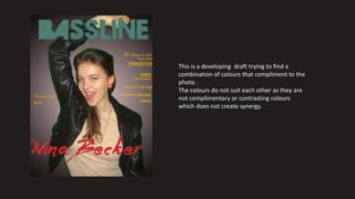
1. This is a developing draft trying to find a
combination of colours that compliment to the
photo .
The colours do not suit each other as they are
not complimentary or contrasting colours
which does not create synergy.
2. Here I tried to use the rock colours red, black and white
as said on my colour scheme post. However I still believe
these colours do not suit the photograph (Nina).
Because she looks like a bubbly fun person but the
colours shows the opposite.
3. After looking at a few more magazine I realized that what is missing is the synergy in the colours.
Here are a few examples of the celebrity being well blended with the background using filters.
With white being one of the main contrasting colour for the text.
4. Here I tried to blend Nina to the Background By changing different filters and
adjustments.
5. These are my final three drafts which will be evaluated by my target
users to select which will be my final cover picture.
The chosen picture was the last one I agree with their opinion as it
looks more colourful then the first and second picture.
6. - I changed the Masthead from the original
(stripped) to a one plain colour without any patterns
and duplicated so it appears highlighted. I used a
lighter colour behind so the darker colour to
standout more.
- As seen in the examples cover the, the letters
would be white coloured font.
- From my feedback I realized my cover looks very
empty and to improve this I should include more
cover lines.
7. Here I added more cover
lines and changed colour of
the font, The colours
compliment Nina's photo
and gives more variation,
less boring. The signature of
singer is now 3D and bigger
as well as a colour which
demonstrates her femininity.
Here my target audience
could choose how they
wanted the signature
placement, horizontally or
stars position. It was chosen
the one beneath each other
placement, I agree with their
chosen option as it seemed
to be more settling and calm
to have the signature lower
down it does not interrupt
the flow of her energy and
the larger font is more
impressive.
8. October 2016
www.bassline.co
m
£3,99
Now I placed the final concepts (barcode,
date, website and price)
The barcode I changed from the usual
white background formula as the white
colour would drag too much attention
from the rest of the cover. The date
unreasonable it was simply selected in
the year 2016 as the trends searched
was 2016’s predictions and the month
was simply an expected date where the
magazine would be predicted to be ready
and printed for distribution.
The original website was placed in an
common are for music magazine.
Surround the
masthead-
The price was
chosen by the
suggestion of
my target
users as well
as what is an
average music
magazine cost.
9. My last feedback was “ it
looks too formal” to
consider this and improve I
changed a few types of font
and font sizes. And to show
the posters that will inside
the magazine.
Poster