
Recommended
More Related Content
What's hot
What's hot (19)
Viewers also liked
Viewers also liked (14)
Similar to Lana Del Rey's mysterious close-up image on magazine doublespread
Similar to Lana Del Rey's mysterious close-up image on magazine doublespread (20)
More from paduaanne
Recently uploaded
Recently uploaded (20)
Lana Del Rey's mysterious close-up image on magazine doublespread
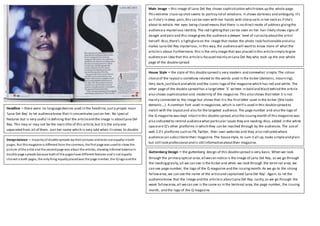
- 1. Main Image – this image of Lana Del Rey shows sophistication which takes up the whole page. This extreme close-up shot seems to portray lotof emotions. It shows darkness and ambiguity.It’s as if she’s in deep pain,this can be seen with her hands with sharp nails in her neck as if she’s about to exhale. Her eyes being closed means that there is no direct mode of address givingthe audiencea mysterious identity. The red lightingthat can be seen on her hair likely shows signs of danger and pain and this image gives the audience a deeper level of curiosity aboutthe artist herself. Also,there’s a lightglareon the image that makes the photo look fashionableand also makes Lana Del Rey mysterious, in this way, the audiencewill wantto know more of what the articleis about.Furthermore, this is the only image that was placed in this articlesimply to give audiencean idea that this articleis focused mainly on Lana Del Rey who took up the one whole page of the doublespread. House Style – the style of this doublespread is very modern and somewhat simple.The colour choiceof the layoutis somehow related to the words used in the kicker (demonic, mourning). Very dark,justblack and white and the iconic logo of the magazine which has red and white. The other page of the double spread has a largeletter ‘S’ written in bold and black behind the article also shows sophistication and modernity of the magazine. This also shows thatletter S is not mainly connected to the image but shows that itis the firstletter used in the kicker (She looks demonic…). A common font used in magazines,which is serif is used in this doublespread to match with the layoutand also for the targeted audience. The page number and also the logo of the Q magazine was kept intactin this double spread,also the issuingmonth of this magazine was also indicated to remind audiencewhat particular issues they are reading.Also, added in the white spaceare Q’s other platforms in which they can be reached through by the audiences.The useof web 2.0’s platforms such as FB,Twitter, their own websites and they also indicated where audiencecan subscribeto their magazine. The housestyle, to sum itall up,looks simpleand plain but still look professional and is still informativeabouttheir magazine. Guttenberg Design – the guttenberg design of this doublespread is very basic.When we look through the primary optical area,all wecan notice is the image of Lana Del Rey, as we go through the readinggravity,all we can see is the kicker and when we look through the termi nal area,we can see page number, the logo of the Q magazine and the issuingmonth. As we go to the strong fallowarea,we can see the name of the artistand capitalised ‘Lana Del Rey’. Again, to let the audienceknow that the image and the articleis aboutLana Del Rey. Lastly,as we go through the weak fallowarea,all wecan see is the same as in the terminal area,the page number, the issuing month, and the logo of the Q magazine. Headline – there were no languagedevices used in the headline, justa proper noun ‘Lana Del Rey’ to let audienceknow that it concentrates juston her. No special features but is very useful in defining that the articleand the image is aboutLana Del Rey. This may or may not be the main title of this article,but itis the only one separated from all of them. Just her name which is very odd when itcomes to double page spreads. Designbalance – majorityof double spreads laytheir pictures andtexts out equallyinboth pages. But thismagazine is different from the common, the first page was usedto show the picture ofthe artist and the secondpage was about the articles, showing informal balance in double page spreads because bothof the pageshave different features andis not equally sharedinboth pages, the onlything equallyplacedwas the page number, the Q logoandthe issuingmonth.
- 2. Main Image – this is a medium shot of Lily Allen from NME magazine. She is standingin a very striking position and the direct mode of address shows an intense expression for the audience with a bit of her smileshown. She looks very casual on her top which also foll ows thecolour scheme of this double page spread. Her messy hair and dark make up also follows thecolour scheme of NME and also to make the layoutof the double spread consistently,also her position shows tough nature and femininity insideher. The image takes up the whole right page of the double spread and slightly takes up the center left of the page. Just likeLana Del Rey from Q magazine, itis also theonly image on this double spread makingher the center of attention in this articleand for the audienceto know that this is about her which may persuadeher fans to buy this magazine. Her casualty in this spread will makethe audiencerelate to an ordinary person rather than a celebrity which makes it different story with Lana Del Rey’s double spread. House Style – the house styleof this double spread is similarto Q magazinebecause they use the colour scheme of red, black and white. This colour scheme fits into the conventional styleof an indie/rock genre. The background was plain and white and so it’s different from Lana Del Rey’s background which is dark.This is made to draw the attention to Lily Allen’s image. We can see that there are 3 different fonts used to make the article.From the headline,to the subheadingand the article.The headlinetakes up almosthalf of the spaceon the left page of the doublespread which makes modernity, creativity and emphasis on the thought of the headlineitself.The overall impression for this doublespread is artistic and appealing,effective use of designs areused to highlightthe important bits in this doublespread to make the audiencebe entertained whilereadingthe article. Headline - there were no languagedevices used in the headline,justa proper noun ‘Lana Del Rey’ to let audienceknow that it concentrates juston her. No special features but is very useful in defining that the articleand the image is aboutLana Del Rey. This may or may not be the main title of this article,but itis the only one separated from all of them. Just her name which is very odd when itcomes to double page spreads. Guttenberg Design – as we look through the primary optical area in this doublespread,our attention will be drawn on the headlineitself,as we can a startingquote. As we go through the readinggravity,it’s either we will bedrawn to the subheadingor justthe casual top worn by Lily Allen, as we go to the terminal area,justlikein Q magazine, we can see the page number, the iconic logo of NME and the issuingmonth of the magazine. Going straightto the strong fallowarea,we can see Lily Allen’s hair style and make up, which makes the audiencestare at her for some time. And lastly,as go through the weak fallowarea,we can see a bitof the text about the articlealso thepage number, logo of NME and the issuingmonth.