1. Camera Shot/Angle/Editing:
Magazine Advert: Case Study 1
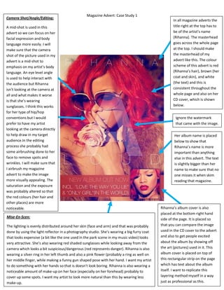
A mid-shot is used in this
advert so we can focus on her
facial expression and body
language more easily. I will
make sure that the camera
shot of the picture used in my
advert is a mid-shot to
emphasis on my artist’s body
language. An eye level angle
is used to help interact with
the audience but Rihanna
isn’t looking at the camera at
all and what makes it worse
is that she’s wearing
sunglasses. I think this works
for her type of hip/hop
conventions but I would
prefer to have my artist
looking at the camera directly
to help draw in my target
audience.In the editing
process she probably had
some airbrushing done to her
face to remove spots and
wrinkles. I will make sure that
I airbrush my magazine
advert to make the image
more visually appealing. The
saturation and the exposure
was probably altered so that
the red colours (her hair and
other places) are more
noticeable.
Mise-En-Scen:
The lighting is evenly distributed around her skin (face and arm) and that was probably
done by using the light reflector in a photography studio. She’s wearing a big furry coat
that looks expensive (a bit like the one used in the park scene in my music video) looks
very attractive. She’s also wearing red shaded sunglasses while looking away from the
camera which looks a bit suspicious/dangerous (red represents danger). Rihanna is also
wearing a silver ring in her left thumb and also a pink flower (probably a ring as well on
her middle finger, while making a funny gun shaped pose with her hand. I want my artist
to do something with her hands so that is doesn’t look boring. Rihanna is also wearing a
noticeable amount of make-up on her face (especially on her forehead) probably to
cover up some spots. I want my artist to look more natural than this by wearing less
make-up.
In all magazine adverts the
title right at the top has to
be of the artist’s name
(Rihanna). The masterhead
goes across the whole page
at the top. I should make
the masterhead of my
advert like this. The colour
scheme of this advert is red
(Rihanna’s hair), brown (her
coat and skin), and white
(the text) and this is
consistent throughout the
whole page and also on her
CD cover, which is shown
below.
Ignore the watermark
that came with the image.
Her album name is placed
below to show that
Rihanna’s name is more
important than anything
else in this advert. The text
is slightly bigger than her
name to make sure that no
one misses it when skim
reading that magazine.
Rihanna’s album cover is also
placed at the bottom right hand
side of the page. It is placed so
that you can compare the image
used in the CD cover to the advert
and also to get people excited
about the album by showing off
the art (pictures) used in it. This
album cover is placed on top of
this rectangular strip on the page
which has text about the album
itself. I want to replicate this
layering method myself in a way
just as professional as this.