Call Girls in Islamabad | 03274100048 | Call Girl Service
Beyonce's CD Cover Font and Design Inspiration
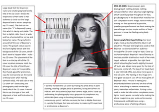
1. Large black font for Beyonce’s
name and smaller grey font for the
title of the CD cover. Shows the
importance of her name to her
audience (I could use this large
Beyonce font to attract people to
my CD cover). The dash on her
name (the “E” in Beyonce) is very
thin which is barely noticeable. The
font is slightly taller than it is wide
and has a horizontal line on top and
below her name. The grey font is
around half the size of Beyonce’s
name. The greyish colour used in
this font slightly blends with the
background of the CD cover, which I
don’t want to happen when I make
my CD cover. The placement of the
font is on the top left of the CD
cover so when someone holds the
CD cover the title of the CD and
Beyonce’s name isn’t covered by
their hands (good for promotion,
easy for everyone to see the name
of the CD even when held by
someone else). The text used in this
CD cover isn’t obstructing the
photography used on the right
hand side of the CD cover. I would
like to use this type of font and
alignment of text and font colour in
my CD cover.
MISE-EN-SCEN: Beyonce wears plain
black/greyish clothing (simple clothing
compared to her other albums), bright lighting
which is evenly spread throughout her face,
grey background in the back which matches her
skin complexion in this image, natural make up
making her look as neutral as possible,
jewellery wrapped around her hand making the
overall image not too simple and lots of hand
gestures to show her feelings using body
language.
I want to recreate this CD cover by making my artist dress in plain
clothing, wearing a bright piece of jewellery, facing the camera to
interact with the audience (eye level camera angle, with a close up)
and making the photography into a greyscale to compliment my
artists skin (also using air-brushing techniques to remove
unnecessary spots). I will also recreate the font in Adobe Illustrator
in a similar font type, font size and colour to make my CD cover look
as professional as Beyonce’s.
Camera angle/Shot type/ Editing: Eye level
angle, close up to show that the album is all
about her. This eye level angle was used so that
Beyonce can interact with her audience
through the CD cover using her eyes. Close up
to show emphasis Beyonce’s natural beauty as
much as possible to attract as much of her male
target audience as possible. Her right hand
which is touching her head is slightly trimmed
off but it also allows more space for the text of
her name on the left. The top of her head (hair)
is also trimmed off to also allow more space in
this CD cover. The framing in this image isn’t
that good because it cuts off too many parts of
Beyonce’s face. The use of editing also
emphasises Beyonce’s beauty because of the
use of airbrushing to remove unnecessary
spots, blemishes and wrinkles. Editing is also
used to make her skin colour complexion more
lighter then it would normally be by making the
whole image into a grey scale and increasing
the exposure and brightness using a
professional piece of editing software.