
Recommended
More Related Content
What's hot
What's hot (20)
Similar to Billboard music magazine
Similar to Billboard music magazine (20)
More from hanaa_m
More from hanaa_m (20)
Recently uploaded
Recently uploaded (20)
Billboard music magazine
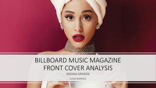
- 1. BILLBOARD MUSIC MAGAZINE FRONT COVER ANALYSIS ARIANA GRANDE CLARA BARROSO
- 2. The tittle of the magazine is Billboard and it is taking most of the space on the side to fill up the background where is not taking most of the space from main artist. However, the side of the image has been edited to be able to overlap the model’s arm on top of the magazine’s masthead. From the previous billboard front cover this was a thing that the magazine has done multiple times, so the Billboard target audience are used to have the model on the front cover overlapping with the magazine masthead, which the magazine would still be easy to identify that is a Billboard music magazine.Billboard are also changing the colour of the masthead. The masthead is mainly identified by being all in black, but they are always changing depending on who’s on the front cover. The colour pink connects to the feminine and girly idea of the magazine issue. The use of the pink on the masthead links with the tone of pink on the nails and the lips of the model, which are two different tones of pink. This would link with the idea of this particular issue being mainly aimed at females. MASTHEAD
- 3. FULL BLEED IMAGE/ PRIMARY IMAGE For this front cover for the Billboard magazine, the model on the front cover for the full bleed image is Ariana Grande. She is one of the most known R&B artist by her very talented voice and from her recent album ‘Dangerous Woman’. This magazine issue was released a few months later after her newest album being released, so this magazine may have links and connections to her newest album, as raising awareness to her fans which would be similar age to the magazine target audience. He music attracts mainly teenage girls and it’s exactly the same with this magazine target audience, this would be seen as a way of the company helping the artist to promote her music and the artist herself promoting the magazine by all the, photo shoot done on for this magazine issue and also by the use of the social media as the artist would promote the magazine’s company through her social media accounts. Ariana Grande is known for being a lover of the colour pink so the use of the colour pink on the front cover links with the uses and gratifications of the magazine with the idea of the target audience knowing the artist already and the use of the colour pink on it, by the idea of seeking information about the cover model.
- 4. MISE-EN-SCENE This shot is a mid shot and it was captured more to the side to give a clear idea and enough space to place the masthead next to it after. This shot was also captured as an eye level shot, as the model looks at the audience eye, which is easier to get the audience attention (as during capturing the shot the model would be looking directly at the camera which in this perspective would be the audience eyes). The idea that she’s wrapped in white towels, gives the reference of her just finishing of having a bath/shower. However, she also does have her make-up done so the white towels can just refer to the idea of her being portrayed in a ‘sexy’ way, especially to the male audience. The idea of being seen as ‘sexy’ still follows the idea of the way she’s holding the sunglasses and the idea their white too, linking to the white towels. The idea of the make-up being done refers of her own identity with the use of the pink and how that portrays her music by identifying her fans mainly teenage girls. THE use of all the jewellery would link to the idea of her standing out and giving ‘bling’ as her surroundings seems to be in high class place, just like you would see an R&B artist being represented on a front cover magazine just like any other.
- 5. The layout of the front cover is very simple and doesn’t include too much information on the cover lines, just like on the previous front cover magazine from Billboard, another way of the audience identifying the magazine. This music magazine incudes and music artist from different variety of types of music and various known music artists/ bands so that’s why it follows a simple layout so once the front cover is released all the audience attention from the target audience is all on the cover model, as the issue would be mainly be focused on the artist that is on the front cover, so there wouldn’t have to be much information added onto the cover lines for the audience to read. The is also not the need of mentioning the model’s/ artist mane on the front cover as Billboard is a recent magazine and Ariana Grande is a recent R&B artist with a lot of success. On the layout of the front page, the font of the masthead would always be the same for all the front cover magazines, so easy to identify the magazine from all the other publishing music magazines. The fonts used on the rest of the colour scheme used on this specific front cover would link to the layout of the image and also having links with the cover model on the front cover. LAYOUT
- 6. TYPOGRAPHY As the typography of this front cover, its all depending on the use of the different font compared to the one for the masthead, so the front page doesn’t all loo the same and it looks a bit different and easier for the audience to seek information from the small cover lines ( as they have different fonts for a purpose.) There is two different fonts used on the cover lines, this so it makes it easier for the audience to read the most important part of that cover line and the additional information for that cover line, which is shown on a different font. The idea of the line ‘Viva la diva!’ is a reference to Ariana Grande (the cover model) because of the idea she is the most important thing on he front cover, that’s one of the reasons why that specific line is the biggest one on the whole page. This recognised as typography by the idea that all font size is all the same accept for that one line which shows how much the audience needs to look at it and making it as eye catching as the full bleed image, this represents the big importance of the that one line that is bigger but still links to the primary cover line by the use of the colour compared to the secondary cover line.
- 7. The first primary cover line is the most important cover line as on this front cover it has a different colours compared to he secondary one. The colours used was black and pink which links to the use of the use of the use of the colour pink on the masthead and on the full bleed image. The primary cover line only includes three little paragraphs with information about what’s included inside the magazine. On the secondary cover line is bit different from the primary cover line. The difference between this one would be the use of the colours on the font, which is in white and also added a bit of pink, in connotation with the whole front cover and the primary cover line. The use of these cover lines is to give information about what you would find on the contents page and on the contents page, with all the information given from most of the things that is included on this specific issue, in a small brief paragraph. PRIMARY/SEONDARY COVER LINE
- 8. What register simply means, is the tone of the magazine and what type of language is being used to communicate with the audience (the magazine with the primary and secondary audience). The tone of language that is used on the front cover is informal use of text on the cover lines by the Billboard magazine having a clear idea that their magazine audience is teenagers, especially girls, so for a way for the audience to use the magazine as part of their identity on the uses and gratifications, the way the magazine itself gives the information to the audience would of have been in an informal way, which would be a way of the audience communicating with one another and promoting the magazine further, not noticing the audience itself would be promoting the magazine and the magazine target audience would get wider and bigger for the magazine becoming even more know than what it already is. REGISTER