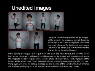
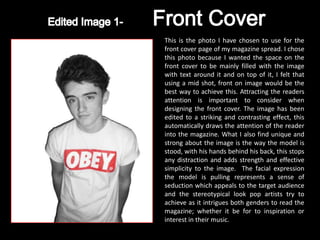
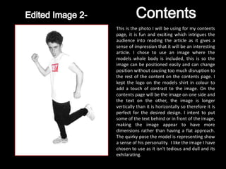
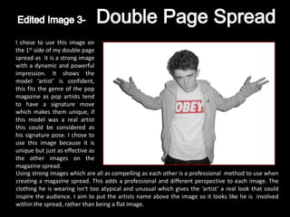
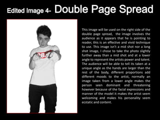
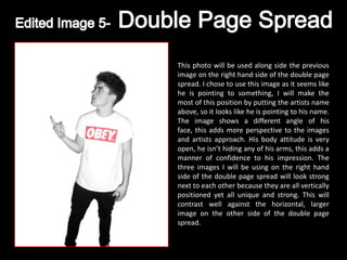
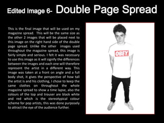
1. These are the unedited versions of the images I
will be using in the magazine spread. Presently
the images have a dull background and some
imprecise edges on the bottom of the images.
This will all be edited out and improved for the
final version of the edited images.
When editing the images I aim to put them into black and white format, but keep the ‘obey’
logo on his t-shirt red. I will do this to add contrast to the images and simultaneously relate
the images to the stereotypical colour scheme of red white and black. The background of the
images will be white, using photo shop I will edit out the background using the selection tool .
Using layers will allow me to keep the logo red and the rest of the t-shirt white. I will enhance
the shadows and highlights on each image to add a professional and strong outlook.
2. This is the photo I have chosen to use for the
front cover page of my magazine spread. I chose
this photo because I wanted the space on the
front cover to be mainly filled with the image
with text around it and on top of it, I felt that
using a mid shot, front on image would be the
best way to achieve this. Attracting the readers
attention is important to consider when
designing the front cover. The image has been
edited to a striking and contrasting effect, this
automatically draws the attention of the reader
into the magazine. What I also find unique and
strong about the image is the way the model is
stood, with his hands behind his back, this stops
any distraction and adds strength and effective
simplicity to the image. The facial expression
the model is pulling represents a sense of
seduction which appeals to the target audience
and the stereotypical look pop artists try to
achieve as it intrigues both genders to read the
magazine; whether it be for to inspiration or
interest in their music.
3. This is the photo I will be using for my contents
page, it is fun and exciting which intrigues the
audience into reading the article as it gives a
sense of impression that it will be an interesting
article. I chose to use an image where the
models whole body is included, this is so the
image can be positioned easily and can change
position without causing too much disruption to
the rest of the content on the contents page. I
kept the logo on the models shirt in colour to
add a touch of contrast to the image. On the
contents page will be the image on one side and
the text on the other, the image is longer
vertically than it is horizontally so therefore it is
perfect for the desired design. I intent to put
some of the text behind or in front of the image,
making the image appear to have more
dimensions rather than having a flat approach.
The quirky pose the model is representing show
a sense of his personality. I like the image I have
chosen to use as it isn't tedious and dull and its
exhilarating.
4. I chose to use this image on
the 1st side of my double page
spread as it is a strong image
with a dynamic and powerful
impression. It shows the
model ‘artist’ is confident,
this fits the genre of the pop
magazine as pop artists tend
to have a signature move
which makes them unique, if
this model was a real artist
this could be considered as
his signature pose. I chose to
use this image because it is
unique but just as effective as
the other images on the
magazine spread.
Using strong images which are all as compelling as each other is a professional method to use when
creating a magazine spread. This adds a professional and different perspective to each image. The
clothing he is wearing isn't too atypical and unusual which gives the ‘artist’ a real look that could
inspire the audience. I aim to put the artists name above the image so it looks like he is involved
within the spread, rather than being a flat image.
5. This image will be used on the right side of the
double page spread, the image involves the
audience as it appears that he is pointing to
reader, this is an effective and vivid technique
to use. This image isn’t a mid shot nor a long
shot image, I chose to take the photo slightly
further away than a mid shot and at a lower
angle to represent the artists power and talent.
The audience will be able to tell its taken at a
unique angle as the hands are larger than the
rest of the body, different proportions add
different moods to the artist, normally an
image taken from a lower angle makes the
person seen dominant and threatening
however because of the facial expressions and
manner of the model it makes the artist seem
welcoming and makes his personality seem
ecstatic and content.
6. This photo will be used along side the previous
image on the right hand side of the double page
spread. I chose to use this image as it seems like
he is pointing to something, I will make the
most of this position by putting the artists name
above, so it looks like he is pointing to his name.
The image shows a different angle of his
face, this adds more perspective to the images
and artists approach. His body attitude is very
open, he isn’t hiding any of his arms, this adds a
manner of confidence to his impression. The
three images I will be using on the right hand
side of the double page spread will look strong
next to each other because they are all vertically
positioned yet all unique and strong. This will
contrast well against the horizontal, larger
image on the other side of the double page
spread.
7. This is the final image that will be used on my
magazine spread. This will be the same size as
the other 2 images that will be placed next to
this image on the right hand side of the double
page spread. Unlike the other images used
throughout the magazine spread, this image is
fairly simple and serious. I felt it was necessary
to use this image as it will signify the differences
between the images and each one will therefore
represent the artist in a different way. This
image was taken at a front on angle and a full
body shot, it gives the perspective of how tall
the artist is and his clothing, I chose to keep the
same clothes on throughout the whole
magazine spread to show a time lapse, also the
colours of the top and trouser are black white
and red which is the stereotypical colour
scheme for pop artists, this was done purposely
to attract the eye of the audience further.