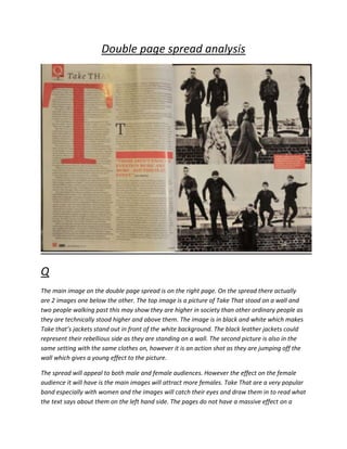
The document analyzes two double page spreads from music magazines - one from Q magazine about the band Take That, and one from Kerrang magazine about the band Raging Bull. Both spreads use large central images of the bands to attract readers' attention. The Q spread uses serif fonts and black and white photos to seem more formal, while the Kerrang spread uses informal sans-serif fonts and rock-inspired colors. The spreads aim to entice readers to learn more about the bands and music topics through prominent visuals and intriguing quotes.