
Recommended
More Related Content
What's hot
What's hot (19)
Similar to Double Page Spread Analyses
Similar to Double Page Spread Analyses (20)
Recently uploaded
Recently uploaded (20)
Double Page Spread Analyses
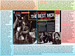
- 1. The title of the double page spread is a pull quote. This is unique as most alternative music magazines have a short title to give a basic insight into the content of the page. The pull quote connotes importance and the content as news worthy. Although the pull quote connotes a newspaper type feel to the pages, the vibrant colour scheme, cracked house style and tilted text allow the reader to see the chaotic connotation of alternative music. The fact that the pull quote is the title connotes the rebellious attitude of alternative music. The standfirst allows the reader to decide whether they want to continue reading the exclusive feature. By simply summarising the rest of the text, the reader can then decide whether or not they want to find out more. The content itself is represented as important through the “world exclusive” graphic. This encourages the reader to continue reading as no other magazine has this content. The content introduces the upcoming MCR album. Due to it not being released, the reader will feel privileged as they presented with the inside scoop to the album. The main image is a medium long shot which denotes the lead singer of MCR, Gerard Way, staring down to the floor. This connotes the pessimistic emo attitude associated with their music. Through the composition of the image, the representation of Gerard allows the reader to see how he is an important figure in the band, genre and industry. This is represented through is distance in relation to the camera. However, the fact that the drummer is also in the shot, and the other band members are in other images on the pages represents them band as a team and that they are all equally important members of the band, genre and industry. On the other hand, Gerard’s image is the background of one of the pages and therefore connotes his superiority in the band. Apart from the text and strip running down the right hand side, the page is in black and white. By having the images in black and white, emo connotations are generated. This allows the reader to understand the genre of music. Additionally, by having the text follow the scheme, it stands out against the large images. This represents the text as equally important to the large images which grab the readers attention. Moreover, by having the main image of Gerard take up the whole of one page, Kerrang! follows the bold house style as the Front Cover also has the main image taking up the whole of the page. This represents Kerrang! as reputable and professional as they follow their house styles throughout. The monochrome images also represent the band as stepping out the shadows. This mirrors the message of the text as they make a return to the music industry. The vibrant colour scheme used on the Cover is maintained, following the bold house style. The colours red, white and black are often associated with Kerrang! as they the colours most used. representation. The colours used also are a part of the brand’s identity, creating a vibrant and eye catching name for themselves. By using these colours, the reader gains a feeling of familiarity and therefore is encouraged to read on. The bold colours stand out against the monochrome background and images, following the vibrant house style. This cements the professional representation.
- 2. The double page spread has a simplistic yet busy layout, connoting the action packed lifestyle of a rock star. By having the main image take up one of the two pages, the reader can clearly see Gerard’s powerful and important representation. There are no other conventions that are positioned on him, emphasising this untouchable superstar representation. Although the left page is minimalistic with the attention on the image, the right hand page is very busy connoting the eventful life of a band. The title stretches across both of the pages however most of it is positioned on the right page. This then draws the reader’s attention to the content beneath it. The DPS is effectively split into two, with one page an image and the other text. This appeals to the target audience as there is a large image. The main age bracket of the audience, 14-18 year olds would be divided over the text. The older part of the bracket would like it as it’s laid out in a simplistic manor and conveys the necessary information whilst the younger members of the audience wouldn’t like it as it’s too bunched together and too lengthily. By having images of equal size, of the band, run across the bottom of the page, the images act as a border to the text, drawing the reader’s attention to it. The fact that the other band members are smaller images represents Gerard as the most important member of the band. The title uses a two sans serif typefaces to grab the reader’s attention. The first typeface is used for the words above and below the middle line. This typeface isn’t as eye catching as the second typeface which grabs the reader’s attention. This typeface is used for “THE BEST MCR”. The typeface is more bold and follows the cracked house style, part of the brand’s identity. By having this typeface, the reader is familiar with it, encouraging them to read on and also stands out, highlighting the reader to the famous band they have content on. This cracked house style also connotes the rebellious attitude of the band. The article itself also uses a sans serif typeface which appeals to the target audience. The fact that a sans serif typeface was used shows how the contributors and editors are fans of alternative music, like the readers. If a serif typeface had been used then it would connote how they value the industry over the band as the band are associated with a sans serif typeface. A serif typeface would look more professional yet wouldn’t follow the house style. By using a sans serif typeface throughout, we can see how Kerrang! are only trying to target their target audience, and in particular, the teenage age bracket.
- 3. Rock Sound have subverted the convention of having the title at the top of the page. Instead, they have positioned it in the bottom right hand corner. This is to connote the rebellious pop punk attitude of the band and also to draw the reader’s attention to the main image which acts as the background for the two pages. The title itself is the band’s name. This represents them as important and clearly conveys to the reader what the article is about. The standfirst introduces the feature, giving the reader a basic insight into what the content is about. By including this, the reader can then decide whether or not to continue reading the feature. The standfirst follows the colour scheme, maintaining the professional house style. The use of the white background behind the standfirst grabs the reader’s attention and stands out on the page, encouraging the reader to find out more. By directly addressing the reader in the standfirst (with “you”), the reader feels like the magazine is personal to them and therefore wants to continue reading. The pages’ layout follows the simplistic, organised house style. The main image, and only image, takes up the majority of the page, apart from the left third of the left page where the feature article is. Like Kerrang!, Rock Sound use the image as a background. This allows the colours in the colour scheme to stand out against the darker background. It also allows the reader to see the representation that the band are very popular and important in the genre and industry. The article in the left third is read first as it is one of the first things seen as the target audience read from left to right. The content itself is structured into paragraphs rather than columns. This contrasts to Kerrang! who use columns as a way to maintain organisation and structure. This would appeal to adults. By using paragraphs, one can see how the magazine targets teenagers. In addition, the pull quote separates the paragraphs, creating a well organised article, representing Rock Sound as professional. By having the main image as the background, the reader can see how the colour scheme brightens up the page. The fact that there are no other images represents A Day to Remember as superior to other bands of the genre, emphasising their status above the rest. The main image is a high angle wide shot, denoting the band looking up at the camera with the same expressions as the Front Cover. This connotes familiarity for the reader and encourages them to continue reading the feature. The high angle connotes how Rock Sound value content and the reader over the industry expectations. This is because the high angle represents the band as vulnerable whilst making the reader feel powerful. This makes them want to buy the magazine as they feel more important. Usually, the band on the cover of an alternative rock magazine are represented as more important than the reader. The fact that this is the opposite shows how they value the reader over industry expectations.
- 4. The use of direct address makes the magazine feel more personal to the reader, making it more likely that they will buy the magazine. All the band members are staring in the same space, giving it the effect that they are staring at the reader. This increases the circulation and also further conveys the idea that they value the reader over the industry expectations as Rock Sound have created a DPS which attracts the reader and makes it feel personal to them where as other magazines would make the reader idolise the stars instead of representing the stars as being on the same level. The fact that there is a lack of brand identity on these two pages also reinforces how the reader is a priority to the magazine. The content, like Kerrang!, is an inside scoop to a new album. This appeals to the reader because not only do they get a bit of background knowledge about the band, they also get unknown details about the upcoming album. The colour scheme used is the same as the one for the Front Cover. This represents Rock Sound as professional as they maintain the colour scheme, providing the reader will familiarity which makes them want to read on. The background of the image, the grassy area, represents the band as natural as well as making them stand out. In addition, the white text grab’s the reader’s attention because it’s against the black background area. The light blue colour used for the title connotes both a male and female target audience. Although blue is a masculine colour, the shade of it would appeal to girls as well. Overall, the colour scheme stands out however it would not be the biggest reason for why the reader is attracted to the magazine and maintains interest. The reader would want to look at the feature because of the main image and because of how Rock Sound have made the reader feel important. In addition, I don’t think that the connotations of alternative music can be seen in the colour scheme either. Therefore, the colour scheme is not very effective in appealing to the audience. On the other hand, the reader can see how the bold house style is maintained in this feature as the title, pull quote and standfirst all create an eye catching double page spread. Rock Sound have used several sans serif typefaces to create a bold DPS. By using these sans serif typefaces, I can see that the magazine is targeting teenagers as these typefaces appeal to them. If a serif typeface had been used then it could be suggested that the magazine would be trying to target adults. However the structure of the content contradicts the idea of attracting adults as they would prefer a well an article in columns. Additionally, by using a variety of sans serif typefaces, the pages become eye catching. By standing out, the reader can see the bold lifestyle connoted with alternative rock.
- 5. The standfirst has been used to introduce the following feature. This lets the reader decide whether they want to continue reading. After being drawn in by the title’s graffiti typeface and large main image, the informal language and expletive used, would appeal to the reader, making them want to read on. The Title of the double page spread, Still disorderly, connotes the chaotic lifestyle and rebellious attitude of the band. In using a graffiti typeface, the reader is drawn to the title as it stands out compared to the article and represents the band as rule breakers and hooligans. This representation links to the alternative music genre. By positioning the title at the top of the page, Big Cheese have chosen not to subvert the convention. The fact that the title is only two words shows how the band and their music need minimal introduction. This represents them as successful and popular as they feel like the reader will already know them. It also sums up their new music in a way that would still appeal to the reader and connote their music genre. This is because they use this kind of language and the familiarity and relatability of the language would therefore appeal to them. The layout of the double page spread differs significantly to than the DPSs of Kerrang! and Rock Sound. Big Cheese have decided to structure the page so that the conventions flow down the page. This is so the article is read before the image is looked at. This connotes how the content is more important than the band’s image. Fans should judge the band based on their music, not their appearance. This why they have a casual, normal representation. The fact that the band’s image runs across both pages represents them and each individual as important. In addition, the article takes up the same amount of space as the image, representing both as equally important. On the other hand, this equal representation is contradicted through the text flowing around the band. This represents them as untouchable. This untouchable representation makes the reader idolize the band as they are represented as normal, everyday people through the image, yet are untouchable rock stars. The content itself is a Q&A about their new upcoming album. This appears to be a common theme for content and something I’d consider doing for my Double Page Spread because it makes the reader feel like they have the inside scoop to the story, making them feel privileged. This would encourage them to buy my magazine. The colour scheme is maintained throughout the magazine, representing Big Cheese as professional. Although the Front Cover is vibrant and stands out, the colour scheme is less effective on these pages as the reader is more interested in the content and image as opposed to the vibrancy of the page. However, the red used does stand out, allowing the reading of the article easier as the reader can distinguish between question and answer. The fact that the article is in bulky paragraphs connotes an adult audience as young teenagers wouldn’t like this layout of the text. The lack of brand identity shows how Big Cheese are purely focused on the promotion of artists and how they value these artists over their own gain. The only convention that links to the brand’s identity is their name at the bottom of the pages, next to the page numbers.
- 6. The bulky paragraphs and small, professional-looking, sans serif typeface connotes an adult target audience. This is because stereotypically, bold, large typefaces in this genre of magazine appeal to teenagers. The fact that the typeface used for the article was sans serif connotes a teenage target audience as well. I think that the sans serif typeface was used because a serif typeface would connote organisation, sophistication and peacefulness, the opposite of the lively alternative rock genre. The age of the band also conveys how some adults are being targeted. This is why the colour scheme is less important as they deem content more important than vibrancy. In order to appeal to the teenagers of the audience, a graffiti typeface is used for the title. This stands out, grabbing their attention. By using this variety of typefaces, the magazine successfully appeals to several different age brackets of the target audience. The main image is a wide shot denoting the band on a sofa. The dead pan expressions connote the aggressiveness and seriousness of their new album. These connotations successfully represent the alternative music genre. Interestingly, the mise-en scene contradicts the wild lifestyle of rock stars. By sitting on a sofa, the band are represented as normal people. This is to allow the reader to relate to them as well as letting them feel equal to them. This is unusual as many alternative music magazines represent artists and bands as superior and important. The fact that Big Cheese haven’t shows how they subvert expectations. This adds a unique feeling to the magazine, making the reader want to buy it. By directly addressing the reader, by staring centrally, the reader feels like they are staring at them, making the magazine more personal to them.
- 7. Like Kerrang!, XXL use a pull quote for the title. By doing this, the content is represented as news worthy and therefore worth reading. The size of title stands out on the page as it takes up half of the right hand page, emphasizing the importance of the content. Although a standfirst is used, the title is also very effective in telling the read what the article is about. The reader can then decide whether to read it or not. The use of expletives in the title would appeal to the audience as it is language also commonly used by them. The fact that it has been censored shows how much more serious the censorship laws in America are compared to England as Kerrang!, a UK publication, uses a number of expletives which haven’t been censored. By using the expletives in XXL, the reader can seen the thuggish and intimidating representation of these artists as they use rude language. The layout of the magazine follows the minimalistic house style with emphasis on the main image which connotes the lavish rap lifestyle. Like some of the alternative music magazines that I’ve analyzed, XXL uses the main image to take up one of the two pages. This allows the reader to see the successful and bragging representation of these artists. In addition, it also represents the content as equal to the image as they take up a page each. The layout of the article connotes an adult target audience. The lengthily paragraphs wouldn’t appeal to young teenagers as they would prefer a busy layout which incorporates the text in a way that is spread out across the page, rather than being bunched all together. This layout of the article appeals to adults as it is easily navigable. However, due to the informal language used, and the genre itself, I think that the magazine would be targeting young adults. The main image maintains the intimidating representation of these rappers through the low angle shot. This low angle represents them as powerful in comparison to the reader because they are looking up to them. In extension, the reader can also see their successful representation through the gold accessories. These accessories connote their wealth and fame. This fame can also be inferred through the fact that there is no title. This represents them as famous because it connotes how they feel they don’t need a title, their image is enough to tell the reader about them. The monochrome colour scheme creates a dull looking DPS. Due to the lack of vibrancy, the gold accessories of Soulja Boy are more visible , emphasizing his wealth and fame. The colour scheme keeps the attention of the reader on the main image, representing the image as more important than the content.
- 8. The brand’s identity can be seen in the layout, as one image usually takes up one of the pages. The magazine’s URL is also next to the page numbers. This connotes their influence online as well as print. The typeface used for the title is bold and sans serif. This stands out compared to the article which is in a smaller sans serif typeface. This sans serif typeface connotes a teenage audience. The monochrome colour scheme draws attention to the main image, which also appeals to the target demographic as they aspire to be like the stars in the magazine.