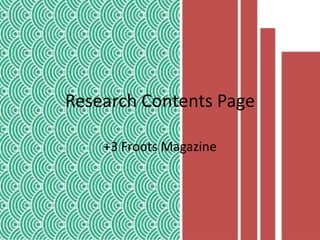
2. This is the
contents page
which I will be
analyzing. My
first
impressions
are that it Is
rather bland
and basic in it’s
layout, this
contrast with
the magazine’s
front cover
which was
vibrant, and
eye-
catching…
3. Language and
Register:
The language which is used within this contents page is of a formal register,
this is can be seen in the below screen grab, the language is of a formative
nature “unsolicited manuscripts”, the use of jargon. However this is
contrasted with at the end of this text it becomes a casual register, “Hey,
wouldn’t life be dull if we all had the same tastes in music?” This use of
colloquial language, “hey” is directly speaking to the reader making it more
personal and intimate, also this is achieved through the use of a rhetorical
question which incorporates the reader into the text.
However on the main
contents, the language is very
“short and sweet” and it has
been kept to concise
headlines of each section of
the magazine…
4. This image in itself, is the
only visible aspect of this
contents page which
provides continuity
between the front cover,
and this page. This use of
repetition of the musician
Lucy Farrell creates a
small link between these
two pages as she is seen
on the front cover, also
her hair is the same as the
front cover image, and
similar makeup.
There is no indicator as to why there is a
sheep’s head on a folk magazine contents
page, with there being no subtitle to the
image either but a link to the contents page
bullet points, Sidmouth Horse trails.
However flicking to the page indicated the
article/selection of photographs explains
that this is a new tradition in Sidmouth
about a horse trials. This could have been
done to to entice the reader into looking at
this page, however there are no other links
to folk music within this magazine, apart
from the translucent connection that it is
called “folkbeasts”
Overall I am not impressed by the lack of images
on this contents page, as the conventions of a
contents page are that they are required to have a
selection of images, not just two!
IMAGES…
5. Representations:
There aren’t any true representations within this
contents page this is mainly due to the fact that there
aren’t any images which are larger than a head shot.
This makes it very difficult to create obvious
representations within the photograph.
However the representations
which are seen within this
contents page are more subtle.
One such representation is
Farrell's hairstyle which is rather
vintage in look, which links to the
genre of the magazine, Folk and
the links to the its heritage.
The event which the image is
signifying has the
representation that it is for a
target market for middle to
upper class people as it is
about a unique festival to a
village with which the
community dress up and
perform for entertainment.
6. House style:
The house style of this magazine is the abbreviation of
the magazine’s name ‘Froots’ which has been
abbreviated to ‘FR’. The house style colours are a
burgundy colour which is repeated throughout the
magazine, in particular the contents page.
This use of the house style colour,
burgundy, ties the whole page
together, but also the whole
magazine. This use of the colour is
use to highlight key aspects of the
magazine, page numbers, and also
the magazine production date…
7. Cover
Stories:Overall there are 14 cover stories.
This number of cover stories is not
unusual for a magazine this size with
their being up to 80 pages within the
magazine. These cover stories range
from up and coming musicians within
the folk genre eg. Maarja Nuut. But
there are also cover stories which are
linked to the heritage of folk music
and it’s principles, which are about
the community, a key example of
such a cover story being the
Sidmouth Horse Trials.
8. Links To The Front Cover:
One of the main links to
the front cover is the
visual repetition of the
musician Lucy Farrell,
who is pictured on the
front cover. The smaller
links would be that her
hair is in the same style
as the front cover, along
with her makeup. This
provides continuity
between the two pages.
Additional links between the front cover and the
contents page would be the repetition of
statements on the front cover. A few example would
be the “Flemish album” repetition of the word “free”.
All these techniques link the two pages together in
a more subtle way. Another link would be the
repetition of the fact that this is the magazine’s
“400th issue”, which is then developed upon on the
contents page with the furthermore information and
specification of the issue.
9. Text Wrapping
No text wrapping has been used on
this contents page…
However there
has been a use
of a shape
overlay
10. Font Style
and Size…
This font is serif font, as it has the curls at the end of the
lettering which identifies this as serif font. Furthermore as this
is a sub heading the size of this text is marginally bigger than
that of the main body of text.
This is the main body of text which
uses san serif font, which means
without curls at the end of the
lettering. This helps to distinguish
this text from the subheadings…
11. Stuart Hall’s Theory of
Representation…
His theory is that representation is
that something with which we
associate with a certain aspect of
society through changing this you
are challenging the representation, in
this case this is in this challenged
through the unconventional front
cover image and the props used, in
case however this contents page
abides by Hall’s theory as it as the
conventional layout of a contents
page.