Download to read offline

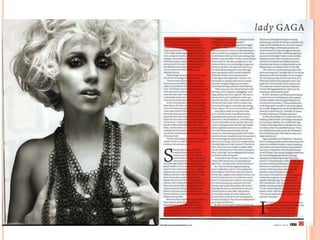
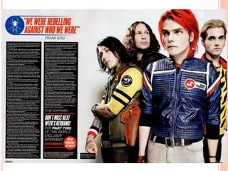

This document analyzes the page layout of two magazine articles. For the Lady Gaga article in Q Magazine, the left page features a large black and white photo of her anchoring the text. The right page uses a large red "L" corresponding to her name and the article's first letter. Columns of text are placed over the "L" with no title needed due to her fame. The My Chemical Romance article in Kerrang magazine features a colorful group photo on the left and a pull quote title incorporating the band's logo. Bold colors and fonts are used throughout to match the band's genre and leave readers anticipating the continued article in the next issue.


