1. House Style
Imagery
Design/Balance
symmetry
Rule of thirds
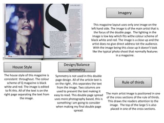
This magazine layout uses only one image on the
left hand side. The image is of the main artist that is
the focus of the double page. The lighting in the
image is low key which fits withe colour scheme of
black white and red. The image is a close up and the
artist does no give direct address tot the audience.
With the image being this close up it doesn’t look
like the typical photo shoot that normally features
in a magazine.
The house style of this magazine is
consistent throughout. The colour
scheme of Q magazine is black
white and red. The image is edited
to fit this. All of the text is on the
right page separating the text from
the image.
Symmetry is not used in this double
page design. All of the article text is
on the right , this separates the text
from the image. Two columns are
used to present the text making it
easy to read. This double page spread
uses more photography based, this is
something I am going to consider
when making my final double page
spread.
The main artist image is positioned in one
of the cross sections of the rule of thirds.
This draws the readers attention to the
image. The top of the large S is also
placed in one of the cross sections.
2. Rule of thirds
Design/Balance
symmetry
Imagery
House Style
Symmetry is not used in this design. The
article text is on the right page of the
design and is presented in three columns.
This is done to draw the readers
attention to the bottom right hand page
in the terminal area. In the primary
optical focus area we se the artists face,
this draws the readers attention. The
headline is placed above the rest of the
text and is bold, this makes it stand out
from the page.
The main focus of the image is the artist,
by positioning the artist on the left page
draws the readers attention. In the image
the artists gives direct address. The artists
is wearing all black which ties in with the
colour scheme and also the red on the
American flag fits with the colour scheme.
The American flag fits in with the theme of
the article we know this because of the
USA title placed behind the artist. The
lighting in the image is high key with
makes the artist seem more serious.
The house style of NME
magazine is consistent
throughout. The colour scheme
on this page is red white and
black. The layout of the pages
are similar, which makes the
magazine seem more formal.
This page uses rule of thirds in the way
the artist is positioned on the page. The
artist is positioned on the left hand side
along the cross sections of the rule of
thirds, by doing this the audience is
drawn towards the image.