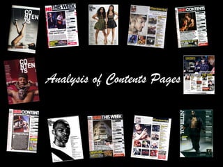
3. Contents Page 1 Analysis THE MASTHEAD The masthead has the same colour scheme as the front cover. This is to keep a consistent house style. BAND INDEX A list of the band featured have been placed on the left hand side with the page that they are on featured on, making it easy for the reader to find who they want to read about easier. THE MAIN IMAGE The main image is of a coach and a mid shot of a young girl that I'm guessing works for NME. The image had been edited slightly to make it look like a polaroid shot. This gives it a more informal look and does make it look so ‘square.’ EDITORS LETTER The editors letter gives the reader a brief description of what is in this edition of the magazine and explains the image above it. FUTURE EDITION This feature allows the reader to see what is going to come in the next issue and how to subscribe to the magazine. ARTICLE HEADINGS The article heading are in black and in clear font so that the reader can tell what is written. The page number has been written next to it on its left hand side in red to make it clear. SUB HEADINGS The sub heading are in white with a black background so that it stand out from the page. It is also clear to the reader what is under the heading. BANNER AT TOP The banner at the top makes the masthead and header ‘Contents’ stand out and make it clear to the reader what the page is.
4. Contents Layout 1 MASTHEAD BAND INDEX FUTURE EDITION EDITORS LETTER SUB HEADINGS AND ARTICLES IMAGE
6. Contents Page 2 Analysis THE MASTHEAD The masthead on the contents page has been split into 3 rows to give it an edgier look. THE MAIN IMAGE The main image is a long shot of two musicians. The image dominates the page as it takes up two thirds of the page. The facial expression on one of the artists shows attitude, which gives us the impression that she does hip hop. The other artist is pouting giving a more sexual look. IMAGE INFORMATION The magazine has included what the artists are wearing and where they can find them. This allows fans to be like their favourite artist. ACCREDITATION Here the magazine has mentioned the details on the photographer and who is in the image. ARTICLE HEADINGS The article heading are in black and in clear font so that the reader can tell what is written. The page number has been written next to it on its left hand side in red to make it clear. SUB HEADINGS The sub heading are in white with a black background so that it stand out from the page. It is also clear to the reader what is under the heading.
7. Contents Layout 1 MAIN IMAGE MASTHEAD IMAGE INFO SUB HEADINGS AND ARTICLES ACCREDITATION
9. Contents Page 3 Analysis THE MASTHEAD Surprisingly the contents page does not feature the ‘XXL’ masthead on the contents page. This is unusual as this is normally used to link the magazine pages together. THE MAIN IMAGE The main image is a long shot of the a Hip Hop artist named Rick Ross. The image dominated the page. His stance shows attitude and his clothes and tattoos show this too. ARTICLE HEADINGS The article heading are in white and in clear font so that the reader can tell what is written. The page number has been written next to it on its left hand side in yellow to make it clear. ARTICLE DESCRIPTION Below each article heading, there is a description of what the article is about and which artists are featured. THE MAIN ARTICLE The main article has been placed away from the rest of the contents and put in a larger font than the other articles. ACCREDITATION Here the magazine has mentioned the details on the photographer and who is in the image.
10. Contents Layout 3 MAIN ARTICLE INFO MAIN IMAGE MAIN ARTICLE ARTICLES AND DESCRIPTION ACCREDITATION