Cash Payment 9602870969 Escort Service in Udaipur Call Girls
.
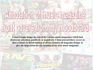
1. I used Google images to search for various music magazines which had drawn my attention, positively or negatively. I then selected three covers to then evaluate in detail looking at all key features of magazine design to give me inspiration for the creation of my own music magazine. Annotation of music magazine front covers from my moodboard
2. Rave I like how the use of colour is so intentional. They have used blue for the mast head as the same colour is in the main image. Colours limit at blue red white and green which I think looks good as they don’t all clash. How they have themed the front of the magazine to be all about Fergi is interesting. The back ground is her sort of style , it has been used clearly because this issue of rave has features revolving around her. Masthead & | Left third | Main image Barcode Main cover line Cover lines By using a famous persons name within the main cover line immediately grabs peoples eye. ‘Fergi’ has also been written in big and bold to stand out even more. I think this is strange positioned in the left third as this is usually where the most important information goes for when the magazines are stacked on shop shelves. The majority of magazines place the barcode in the right third at the bottom. I like how the colours have been alternated within the three cover lines to emphasise the more appealing information Background
3. NME Pull quote Main cover line Main image Masthead | Left third | The photography is really effective how it has been taken from above the people so when its centred on the front of this magazine its like they’re reaching out the page, makes it a bit more lively. I also think its clever how the designer has enlarged and centred the main cover line to make it stand out. I think the contrasting of the red and yellow is effective as red and yellow are colours used on many warnings signs so it immediately draws peoples attention straight to the main cover line and the pull quote above it. It seems a really simple font yet really effective as it does stand out. I like the white outlining around the bright red as it makes it come out of the page and look less flat I think this pull quote is very powerful as you don’t expect that sort of language on a magazine cover and coming from a famous band is even more shocking. Everyone likes gossip so this really easily makes viewers want to read more about it. Skyline By using well known artists in the sky line it really draws peoples attention as readers see the famous stage names and want to read up the latest info on these people. The names have also been enlarged in white and ‘joins’ in yellow with a red text box which follows the house style of red white and yellow. This is different how the image has quite a rough cut out rather than a neat edge
4. NME | Left third | I first noticed the main cover line as I really like the font as it looks like random letters cut out of a magazine which Is ironic. However, I don’t think the style links to the image very strongly, it could be the soft ‘pretty’ colours but the content itself of the main cover line goes well with the main image. Main cover line Main image The image really relates to the main cover line ‘back from the dead’ by the dark make-up and different expressions on their faces. After previously evaluating a different issue of NME I have noticed a similarity in the camera angle of the main image and how the it is positioned in the centre of the magazine cover. The simple background sends readers main focus on the image and main cover line. Background The same design and positioning of the mast head is used so people recognise the magazine easily as NME. Masthead Cover lines Again, colours are alternated between the cover lines which seems to be quite popular as its really effective highlighting a few words in a different colour using and larger size font as those few important words have an impact on viewers to make them want to read more. The bright yellow circle and inverted colours of the text ’25’ is effective as it is meant to be an advert for any extras featuring in the magazine. This is a good technique to draw readers attention.