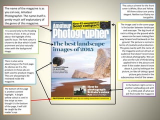
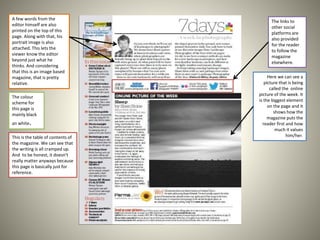
Magazine Analysis
Chosen magazine: Amateur
Photographer.
The name of the magazine is as
you can see, Amateur
Photographer. The name itself is
pretty much self explanatory of
the genre of this magazine.
It is second only to the heading
in terms of size. It lets us know
about the highlight of this
specific issue. The font colour is
chosen to be blue which is both
prominent and also naturally
mixes with the background
image.
There is also some
advertising on the front page.
As obvious as it is, the
products in these ads are
both used to produce images.
They are also going to be
reviewed inside the
magazine.
The colour scheme for the front
cover is White, Blue and Yellow.
All three colours are pretty
elegant. Neither too flashy nor
too gothic.
The image used in the cover page
is the border between landscape
and seascape. The big chunk of
rock is sitting on the ground while
waves can be seen making their
way forward and backward on the
ground. The picture is normal in
terms of creativity and production.
This goes exactly with the name of
the magazine and can attract an
audience that doesn't even know
a bit about photography. We can
also see the rule of thirds being
applied here in the picture and
even if the reader doesn't know
about it, just by looking at the
picture, an idea of taking a good
picture gets stored in the
subconscious mind of the viewer.
In the bottom right corner is
another subheading and with
it, a little peek of what we
will find inside the magazine
The bottom of the page
is another content
highlight. A bright
yellow colour is used in
the stripe so even
though it is the bottom
of the page, it will still
be caught by the
reader’s eye.
This is the table of contents of
the magazine. We can see that
the writing is all cramped up.
And to be honest, it doesn't
really matter anyways because
this page is basically just for
reference.
Here we can see a
picture that is being
called the online
picture of the week. It
is the biggest element
on the page and it
shows how the
magazine puts the
reader first and how
much it values
him/her.
The links to
other social
platforms are
also provided
for the reader
to follow the
magazine
elsewhere.
The colour
scheme for
this page is
mainly black
an white.
A few words from the
editor himself are also
printed on the top of this
page. Along with that, his
portrait image is also
attached. This lets the
viewer know the editor
beyond just what he
thinks. And considering
that this is an image based
magazine, that is pretty
relative.
This is another
extension to the
‘Online photo of the
week’ idea. The page
features the work of
one of the readers.
The whole page is
dedicated to some of
the pictures taken by
this reader.
The whole page is
covered with
pictures with just a
minimal amount of
text in between
and that too is a
little biography of
the photographer
featured on the
page.
This is an example of a double page spread. It is an article on taking pictures on ancient buildings/structures.
An brief intro along with the picture of the author is provided on the first page.
The title of the article ‘Beautiful ruins uses’ a serif font and half of is bold while the other half normal font.
At the bottom of the second page, we can see a few lenses talked about in a bit detail. These are the lenses that were used to take the pictures in this
article.

Magazine analysis

  • 1.
  • 2.
    The name ofthe magazine is as you can see, Amateur Photographer. The name itself is pretty much self explanatory of the genre of this magazine. It is second only to the heading in terms of size. It lets us know about the highlight of this specific issue. The font colour is chosen to be blue which is both prominent and also naturally mixes with the background image. There is also some advertising on the front page. As obvious as it is, the products in these ads are both used to produce images. They are also going to be reviewed inside the magazine. The colour scheme for the front cover is White, Blue and Yellow. All three colours are pretty elegant. Neither too flashy nor too gothic. The image used in the cover page is the border between landscape and seascape. The big chunk of rock is sitting on the ground while waves can be seen making their way forward and backward on the ground. The picture is normal in terms of creativity and production. This goes exactly with the name of the magazine and can attract an audience that doesn't even know a bit about photography. We can also see the rule of thirds being applied here in the picture and even if the reader doesn't know about it, just by looking at the picture, an idea of taking a good picture gets stored in the subconscious mind of the viewer. In the bottom right corner is another subheading and with it, a little peek of what we will find inside the magazine The bottom of the page is another content highlight. A bright yellow colour is used in the stripe so even though it is the bottom of the page, it will still be caught by the reader’s eye.
  • 3.
    This is thetable of contents of the magazine. We can see that the writing is all cramped up. And to be honest, it doesn't really matter anyways because this page is basically just for reference. Here we can see a picture that is being called the online picture of the week. It is the biggest element on the page and it shows how the magazine puts the reader first and how much it values him/her. The links to other social platforms are also provided for the reader to follow the magazine elsewhere. The colour scheme for this page is mainly black an white. A few words from the editor himself are also printed on the top of this page. Along with that, his portrait image is also attached. This lets the viewer know the editor beyond just what he thinks. And considering that this is an image based magazine, that is pretty relative.
  • 4.
    This is another extensionto the ‘Online photo of the week’ idea. The page features the work of one of the readers. The whole page is dedicated to some of the pictures taken by this reader. The whole page is covered with pictures with just a minimal amount of text in between and that too is a little biography of the photographer featured on the page.
  • 5.
    This is anexample of a double page spread. It is an article on taking pictures on ancient buildings/structures. An brief intro along with the picture of the author is provided on the first page. The title of the article ‘Beautiful ruins uses’ a serif font and half of is bold while the other half normal font. At the bottom of the second page, we can see a few lenses talked about in a bit detail. These are the lenses that were used to take the pictures in this article.