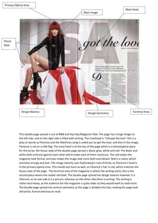
1. Primary Optical Area
Mast Head
Main Image
House
Style
Design Balance Design Symmetry Terminal Area
This double page spread is out of R&B and Hip Hop Magazine Vibe. The page has a large image on
the left side, and on the right side is filled with writing. The masthead is “USA got the love” this is a
play on words as Florence and the Machines song is called you’ve got the love, and also in the image,
Florence is sat on a USA flag. The mast head is at the top of the page which is a stereotypical place
for this to be, the house style of the double page spread is black, grey, white and red. The black and
white both contrast against each other which make each of them stand out. The red makes the
magazine look formal, and also makes the image look more bold and vibrant. Red is a colour which
connotes energy and love. The image cleverly uses Guttenberg’s rule of thirds, as Florence’s head is
in the primary optical area. This stands out more as well, as Florence’s hair is red, which matches the
house style of the page. The terminal area of the magazine is where the writing starts; this is the
second place where the reader will look. The double page spread has design balance however it is
informal, as on one side it is a picture, whereas on the other side there is writing. The writing is
rather text heavy, as the audience for the magazine is quite older so they would want to read more.
The double page spread has vertical symmetry as the page is divided into two, making the page look
attractive, formal and easy to read.
2. Design Symmetry
Primary Optical
Area Mast Head
Main
Image
Design
Balance
Font
Terminal Area House Style
This double page spread is from magazine Q. This is for a much older audience which can be seen
through the amount of writing that is used on the page. The black, red and white house style is
significant as it shows the formality and maturity of the magazine. The black and white main image
also matches the house style because is follows the colour scheme and also is aimed at an older
audience as is quite a revealing and seductive image. The primary optical area is in the top corner,
where lady Gaga is using a direct mode of address, and you see her eye is directly looking at you.
This also makes you feel as though she is with you; the terminal area is where she is covering up her
chest with her hands. This is the second place where the place where the viewer will look. It shows
the promiscuity of Lady Gaga and also entices the reader, and reaches out to her male fan base. The
design balance is very text heavy as the target audience for the magazine is an older audience. The
text layout is next to the image which makes it easy to read and attractive. The composition of the
page is divided in two, which makes the double page spread more attractive.