SlideShare a Scribd company logo
1 of 3
This is the masthead. Kerrang
do usually use different colour
schemes for different
magazines however this time
they have gone for a black and
white colour scheme. This is
effective as they are
contrasting colours therefore
stand out. Also, these colours
aren’t very vibrant to show
that the topics within the
magazine may not be very
intense or that they are a bit
lighter and soft. The masthead
is in capital letters to grab the
audiences attention and the
logo is in Sans Serif as always
This is a picture of the band
which appears to be a
medium shot. The artists
are dressed in black and the
lighting on their faces have
made them look more pale
so that they fit in with the
overall black and white
effect of the front cover.
Also, you can briefly see the
background behind them
which is a light grey colour
which adds to the setting
The pug of the magazine is
unusually obelisk shaped. The
colour scheme on this is slightly
different as although it still uses
a black background, it has a
dark red outline. This would be
a different aspect of the front
cover to get the readers
attention, which is very
effective as this is the pug’s
purpose
These are images of other artists/bands. The
images are slightly angled to make it more
appealing and are overlapping one another
as well. This has been done to appeal to the
audience as they might like one of the other
artists or may be familiar with them. This
increases the chance of the reader opening
the magazine
This showcases an article within the
magazine. The shot of the artist is a
close up, and he looks very serious and
critical which may hint that it’s not
such a light topic perhaps. Also, the
colour scheme on this part of the front
cover is completely different. It uses a
green, white and black colour scheme
and it looks very urban. This would be
very eye catching for the audience.
This is the Main headline. It uses a white and yellow colour
scheme which isn’t used a lot however can still work. The text
is slanted up slightly and the band name in the middle of the
headline is in a larger font and is in white where as the rest of
the headline is yellow. Also, the yellow text parts have an
effect put on them which makes the letters appears torn up
and damaged. This shows/symbolises the context within the
magazine
These coverlines have been placed on
top of the masthead which is very
effective as the masthead is very
catchy and appealing so this would
automatically draw the readers
attention to the text above
The contents page for
kerrang uses a black,
yellow and white colour
scheme. The masthead
is virtually in the centre
of the page which
draws attention as the
audience are familiar
with the logo.This is a very different
technique kerrang
have used which is to
place a quote or some
dialogue from
someone who is well
known to grab the
audiences attention as
they will want to know
what has been said. It
keeps them hooked.
Once again an artist has
been used to appeal to
people. This takes up half
of the contents page and
has a blue filter on it to
change up the colour
scheme or lighting so that
the reader stays hooked
The other kerrang magazines have
been advertised next to a picture
of a rock artist as they know that
the picture will appeal to people
therefore they have placed their
magazines just under this picture
The page numbers
are surprisingly
small and are in
orange, a colour
which wasn’t used
on the front cover.
However, this could
be effective as it’s
the most vibrant
colour on the page
and therefore will
draw attention and
the reader would
read the headings
next to it which may
or may not appeal
to them
With this double page
spread, Kerrang have
chosen to cover the
majority of the first page
with the music artist .
This must mean that
they are very significant
or popular and this is an
aspect which will
therefore attract people
to read the article.
The background is grey
and the artist also has a
grey fade filter placed
on his picture to make
it fit in nicely.
This is a medium shot
and the person is
looking at the camera.
This was probably
done as Kerrang
wanted the whole
page to be a picture of
him so this was the
ideal shot to take and
place on the page
The border around both pages
consists of small light white balls
which gives it a premium look to
emphasise how significant and “VIP”
the artist is so that the audience go
on to read what is written on the
second page
This is the main headline. It
consists of a white and pink
colour scheme. The
background is black to
contrast with the white and
the headline is slanted up to
give it a unique and
appealing look. Also, the
headline is a statement
from the artist on the left
hand side which would get
attention as people may
want to know what he has
to say and value his opinion.
The coverlines beneath follow
the same colour scheme
however the parts which kerrang
felt were going to catch people’s
eyes are in bright pink. This is a
very vibrant colour and there for
is effective for its intended
purpose.

More Related Content

What's hot (20)

Magazine cover analysis
Magazine cover analysisMagazine cover analysis
Magazine cover analysis
 
Making my magazine
Making my magazineMaking my magazine
Making my magazine
 
Research – magazine double page spread
Research – magazine double page spreadResearch – magazine double page spread
Research – magazine double page spread
 
Contents research 2
Contents research 2Contents research 2
Contents research 2
 
Contents page’s
Contents page’sContents page’s
Contents page’s
 
Magazine contents page analysis
Magazine contents page analysisMagazine contents page analysis
Magazine contents page analysis
 
Magazine Inner Pages Research 2
Magazine Inner Pages Research 2Magazine Inner Pages Research 2
Magazine Inner Pages Research 2
 
Double Page Spread Research
Double Page Spread ResearchDouble Page Spread Research
Double Page Spread Research
 
Shout dps analysis edited version
Shout  dps analysis edited versionShout  dps analysis edited version
Shout dps analysis edited version
 
Music magazine
Music magazineMusic magazine
Music magazine
 
Double page analyisisi
Double page analyisisiDouble page analyisisi
Double page analyisisi
 
Ancillary task editing magazine
Ancillary task editing magazine Ancillary task editing magazine
Ancillary task editing magazine
 
Design portfolio waugh
Design portfolio waughDesign portfolio waugh
Design portfolio waugh
 
Becky double page spread magazine analysis
Becky double page spread  magazine analysisBecky double page spread  magazine analysis
Becky double page spread magazine analysis
 
3. research(2)
3. research(2)3. research(2)
3. research(2)
 
3. research(2)
3. research(2)3. research(2)
3. research(2)
 
3. research(2)
3. research(2)3. research(2)
3. research(2)
 
3. research(2)
3. research(2)3. research(2)
3. research(2)
 
3. research(2)
3. research(2)3. research(2)
3. research(2)
 
3. research(2)
3. research(2)3. research(2)
3. research(2)
 

Viewers also liked

NoviCap+Investors+Guide
NoviCap+Investors+GuideNoviCap+Investors+Guide
NoviCap+Investors+Guide
Colin Duffy
 
サンプル事業計画書(加工済)
サンプル事業計画書(加工済)サンプル事業計画書(加工済)
サンプル事業計画書(加工済)
usako001
 
Computadoras
 Computadoras Computadoras
Computadoras
SamSSF
 
Evaluacion de Informatica cuarto periodo
Evaluacion de Informatica cuarto periodoEvaluacion de Informatica cuarto periodo
Evaluacion de Informatica cuarto periodo
gppygestudia
 

Viewers also liked (15)

E-Procurement
E-ProcurementE-Procurement
E-Procurement
 
アイビー茜先生に学ぶ、占い「宿曜占星術」を活かしたより良い人間関係の築き方 先生:アイビー茜
アイビー茜先生に学ぶ、占い「宿曜占星術」を活かしたより良い人間関係の築き方 先生:アイビー茜アイビー茜先生に学ぶ、占い「宿曜占星術」を活かしたより良い人間関係の築き方 先生:アイビー茜
アイビー茜先生に学ぶ、占い「宿曜占星術」を活かしたより良い人間関係の築き方 先生:アイビー茜
 
NoviCap+Investors+Guide
NoviCap+Investors+GuideNoviCap+Investors+Guide
NoviCap+Investors+Guide
 
サンプル事業計画書(加工済)
サンプル事業計画書(加工済)サンプル事業計画書(加工済)
サンプル事業計画書(加工済)
 
Alexandernarvaez origendelinternet
Alexandernarvaez origendelinternetAlexandernarvaez origendelinternet
Alexandernarvaez origendelinternet
 
Introduccion a arduino
Introduccion a arduinoIntroduccion a arduino
Introduccion a arduino
 
Computadoras
 Computadoras Computadoras
Computadoras
 
Cell cycle of Xenopus
Cell cycle of XenopusCell cycle of Xenopus
Cell cycle of Xenopus
 
Aula EBD Dia da Bíblia 2016
Aula EBD Dia da Bíblia 2016Aula EBD Dia da Bíblia 2016
Aula EBD Dia da Bíblia 2016
 
コースC 「EC運営」Ver.2.0
コースC 「EC運営」Ver.2.0コースC 「EC運営」Ver.2.0
コースC 「EC運営」Ver.2.0
 
オンラインストア運営マニュアル--これから始めたい方向け(1限目:立ち上げ~運営までの流れ・ノウハウ) 先生:佐藤 友祐
オンラインストア運営マニュアル--これから始めたい方向け(1限目:立ち上げ~運営までの流れ・ノウハウ) 先生:佐藤 友祐オンラインストア運営マニュアル--これから始めたい方向け(1限目:立ち上げ~運営までの流れ・ノウハウ) 先生:佐藤 友祐
オンラインストア運営マニュアル--これから始めたい方向け(1限目:立ち上げ~運営までの流れ・ノウハウ) 先生:佐藤 友祐
 
Marketplace Lending: Evolution, Challenges & Opportunities
Marketplace Lending: Evolution, Challenges & OpportunitiesMarketplace Lending: Evolution, Challenges & Opportunities
Marketplace Lending: Evolution, Challenges & Opportunities
 
Evaluacion de Informatica cuarto periodo
Evaluacion de Informatica cuarto periodoEvaluacion de Informatica cuarto periodo
Evaluacion de Informatica cuarto periodo
 
Nfl week 9 all picks
Nfl week 9 all picksNfl week 9 all picks
Nfl week 9 all picks
 
Amazon SESのメール受信対応でサーバー減らせた話
Amazon SESのメール受信対応でサーバー減らせた話Amazon SESのメール受信対応でサーバー減らせた話
Amazon SESのメール受信対応でサーバー減らせた話
 

Similar to Kerrang (20)

Contents analysis
Contents analysis Contents analysis
Contents analysis
 
As media 2u
As media 2uAs media 2u
As media 2u
 
Analysing music magazines
Analysing music magazinesAnalysing music magazines
Analysing music magazines
 
Recovered file 1
Recovered file 1Recovered file 1
Recovered file 1
 
Cover page analysis
Cover page analysis Cover page analysis
Cover page analysis
 
Magazine analysis
Magazine analysisMagazine analysis
Magazine analysis
 
Music magazine analysation
Music magazine analysationMusic magazine analysation
Music magazine analysation
 
Music magazine analysis
Music magazine analysisMusic magazine analysis
Music magazine analysis
 
Music Magazine Analysis
Music Magazine AnalysisMusic Magazine Analysis
Music Magazine Analysis
 
Music magazine analysation
Music magazine analysationMusic magazine analysation
Music magazine analysation
 
Mixmag analysis
Mixmag analysisMixmag analysis
Mixmag analysis
 
Double page spread of a music magazine
Double page spread of a music magazineDouble page spread of a music magazine
Double page spread of a music magazine
 
Contents analysis
Contents analysisContents analysis
Contents analysis
 
Four mixed genre contents pages
Four mixed genre contents pagesFour mixed genre contents pages
Four mixed genre contents pages
 
Magazine cover
Magazine coverMagazine cover
Magazine cover
 
Magazine covers
Magazine coversMagazine covers
Magazine covers
 
DPS
DPSDPS
DPS
 
Analysis of Music Magazines
Analysis of Music MagazinesAnalysis of Music Magazines
Analysis of Music Magazines
 
Media Coursework
Media CourseworkMedia Coursework
Media Coursework
 
Rolling stone magazine
Rolling stone magazineRolling stone magazine
Rolling stone magazine
 

Recently uploaded

1029-Danh muc Sach Giao Khoa khoi 6.pdf
1029-Danh muc Sach Giao Khoa khoi  6.pdf1029-Danh muc Sach Giao Khoa khoi  6.pdf
1029-Danh muc Sach Giao Khoa khoi 6.pdf
QucHHunhnh
 
Jual Obat Aborsi Hongkong ( Asli No.1 ) 085657271886 Obat Penggugur Kandungan...
Jual Obat Aborsi Hongkong ( Asli No.1 ) 085657271886 Obat Penggugur Kandungan...Jual Obat Aborsi Hongkong ( Asli No.1 ) 085657271886 Obat Penggugur Kandungan...
Jual Obat Aborsi Hongkong ( Asli No.1 ) 085657271886 Obat Penggugur Kandungan...
ZurliaSoop
 
Salient Features of India constitution especially power and functions
Salient Features of India constitution especially power and functionsSalient Features of India constitution especially power and functions
Salient Features of India constitution especially power and functions
KarakKing
 

Recently uploaded (20)

General Principles of Intellectual Property: Concepts of Intellectual Proper...
General Principles of Intellectual Property: Concepts of Intellectual  Proper...General Principles of Intellectual Property: Concepts of Intellectual  Proper...
General Principles of Intellectual Property: Concepts of Intellectual Proper...
 
Application orientated numerical on hev.ppt
Application orientated numerical on hev.pptApplication orientated numerical on hev.ppt
Application orientated numerical on hev.ppt
 
Holdier Curriculum Vitae (April 2024).pdf
Holdier Curriculum Vitae (April 2024).pdfHoldier Curriculum Vitae (April 2024).pdf
Holdier Curriculum Vitae (April 2024).pdf
 
This PowerPoint helps students to consider the concept of infinity.
This PowerPoint helps students to consider the concept of infinity.This PowerPoint helps students to consider the concept of infinity.
This PowerPoint helps students to consider the concept of infinity.
 
1029-Danh muc Sach Giao Khoa khoi 6.pdf
1029-Danh muc Sach Giao Khoa khoi  6.pdf1029-Danh muc Sach Giao Khoa khoi  6.pdf
1029-Danh muc Sach Giao Khoa khoi 6.pdf
 
Towards a code of practice for AI in AT.pptx
Towards a code of practice for AI in AT.pptxTowards a code of practice for AI in AT.pptx
Towards a code of practice for AI in AT.pptx
 
Spatium Project Simulation student brief
Spatium Project Simulation student briefSpatium Project Simulation student brief
Spatium Project Simulation student brief
 
Introduction to Nonprofit Accounting: The Basics
Introduction to Nonprofit Accounting: The BasicsIntroduction to Nonprofit Accounting: The Basics
Introduction to Nonprofit Accounting: The Basics
 
Mehran University Newsletter Vol-X, Issue-I, 2024
Mehran University Newsletter Vol-X, Issue-I, 2024Mehran University Newsletter Vol-X, Issue-I, 2024
Mehran University Newsletter Vol-X, Issue-I, 2024
 
Kodo Millet PPT made by Ghanshyam bairwa college of Agriculture kumher bhara...
Kodo Millet  PPT made by Ghanshyam bairwa college of Agriculture kumher bhara...Kodo Millet  PPT made by Ghanshyam bairwa college of Agriculture kumher bhara...
Kodo Millet PPT made by Ghanshyam bairwa college of Agriculture kumher bhara...
 
Graduate Outcomes Presentation Slides - English
Graduate Outcomes Presentation Slides - EnglishGraduate Outcomes Presentation Slides - English
Graduate Outcomes Presentation Slides - English
 
Making communications land - Are they received and understood as intended? we...
Making communications land - Are they received and understood as intended? we...Making communications land - Are they received and understood as intended? we...
Making communications land - Are they received and understood as intended? we...
 
SOC 101 Demonstration of Learning Presentation
SOC 101 Demonstration of Learning PresentationSOC 101 Demonstration of Learning Presentation
SOC 101 Demonstration of Learning Presentation
 
How to Give a Domain for a Field in Odoo 17
How to Give a Domain for a Field in Odoo 17How to Give a Domain for a Field in Odoo 17
How to Give a Domain for a Field in Odoo 17
 
Jual Obat Aborsi Hongkong ( Asli No.1 ) 085657271886 Obat Penggugur Kandungan...
Jual Obat Aborsi Hongkong ( Asli No.1 ) 085657271886 Obat Penggugur Kandungan...Jual Obat Aborsi Hongkong ( Asli No.1 ) 085657271886 Obat Penggugur Kandungan...
Jual Obat Aborsi Hongkong ( Asli No.1 ) 085657271886 Obat Penggugur Kandungan...
 
Unit-IV; Professional Sales Representative (PSR).pptx
Unit-IV; Professional Sales Representative (PSR).pptxUnit-IV; Professional Sales Representative (PSR).pptx
Unit-IV; Professional Sales Representative (PSR).pptx
 
Single or Multiple melodic lines structure
Single or Multiple melodic lines structureSingle or Multiple melodic lines structure
Single or Multiple melodic lines structure
 
Dyslexia AI Workshop for Slideshare.pptx
Dyslexia AI Workshop for Slideshare.pptxDyslexia AI Workshop for Slideshare.pptx
Dyslexia AI Workshop for Slideshare.pptx
 
Salient Features of India constitution especially power and functions
Salient Features of India constitution especially power and functionsSalient Features of India constitution especially power and functions
Salient Features of India constitution especially power and functions
 
Unit-V; Pricing (Pharma Marketing Management).pptx
Unit-V; Pricing (Pharma Marketing Management).pptxUnit-V; Pricing (Pharma Marketing Management).pptx
Unit-V; Pricing (Pharma Marketing Management).pptx
 

Kerrang

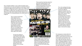
  • 1. This is the masthead. Kerrang do usually use different colour schemes for different magazines however this time they have gone for a black and white colour scheme. This is effective as they are contrasting colours therefore stand out. Also, these colours aren’t very vibrant to show that the topics within the magazine may not be very intense or that they are a bit lighter and soft. The masthead is in capital letters to grab the audiences attention and the logo is in Sans Serif as always This is a picture of the band which appears to be a medium shot. The artists are dressed in black and the lighting on their faces have made them look more pale so that they fit in with the overall black and white effect of the front cover. Also, you can briefly see the background behind them which is a light grey colour which adds to the setting The pug of the magazine is unusually obelisk shaped. The colour scheme on this is slightly different as although it still uses a black background, it has a dark red outline. This would be a different aspect of the front cover to get the readers attention, which is very effective as this is the pug’s purpose These are images of other artists/bands. The images are slightly angled to make it more appealing and are overlapping one another as well. This has been done to appeal to the audience as they might like one of the other artists or may be familiar with them. This increases the chance of the reader opening the magazine This showcases an article within the magazine. The shot of the artist is a close up, and he looks very serious and critical which may hint that it’s not such a light topic perhaps. Also, the colour scheme on this part of the front cover is completely different. It uses a green, white and black colour scheme and it looks very urban. This would be very eye catching for the audience. This is the Main headline. It uses a white and yellow colour scheme which isn’t used a lot however can still work. The text is slanted up slightly and the band name in the middle of the headline is in a larger font and is in white where as the rest of the headline is yellow. Also, the yellow text parts have an effect put on them which makes the letters appears torn up and damaged. This shows/symbolises the context within the magazine These coverlines have been placed on top of the masthead which is very effective as the masthead is very catchy and appealing so this would automatically draw the readers attention to the text above
  • 2. The contents page for kerrang uses a black, yellow and white colour scheme. The masthead is virtually in the centre of the page which draws attention as the audience are familiar with the logo.This is a very different technique kerrang have used which is to place a quote or some dialogue from someone who is well known to grab the audiences attention as they will want to know what has been said. It keeps them hooked. Once again an artist has been used to appeal to people. This takes up half of the contents page and has a blue filter on it to change up the colour scheme or lighting so that the reader stays hooked The other kerrang magazines have been advertised next to a picture of a rock artist as they know that the picture will appeal to people therefore they have placed their magazines just under this picture The page numbers are surprisingly small and are in orange, a colour which wasn’t used on the front cover. However, this could be effective as it’s the most vibrant colour on the page and therefore will draw attention and the reader would read the headings next to it which may or may not appeal to them
  • 3. With this double page spread, Kerrang have chosen to cover the majority of the first page with the music artist . This must mean that they are very significant or popular and this is an aspect which will therefore attract people to read the article. The background is grey and the artist also has a grey fade filter placed on his picture to make it fit in nicely. This is a medium shot and the person is looking at the camera. This was probably done as Kerrang wanted the whole page to be a picture of him so this was the ideal shot to take and place on the page The border around both pages consists of small light white balls which gives it a premium look to emphasise how significant and “VIP” the artist is so that the audience go on to read what is written on the second page This is the main headline. It consists of a white and pink colour scheme. The background is black to contrast with the white and the headline is slanted up to give it a unique and appealing look. Also, the headline is a statement from the artist on the left hand side which would get attention as people may want to know what he has to say and value his opinion. The coverlines beneath follow the same colour scheme however the parts which kerrang felt were going to catch people’s eyes are in bright pink. This is a very vibrant colour and there for is effective for its intended purpose.