SlideShare a Scribd company logo
1 of 3
Primary optical Area   House Style


                          Imagery


    Main Image

                        Design Symmetry


      Design Balance


                       Header


Primary Optical Area
                            Design Symmetry


          Image
          ry


                        House Style
  Design Balance
Header


Primary
Optical
Area                                                                                                                    Design
                                                                                                                        Symmetry


Design Balance                                                                                               House Style


           Main Image


            In this essay I’m going to be comparing three magazine covers, comparing how their genre affects
            their layout and design. I will be looking at three magazines, Mixmag, Rolling stones and Vibe.
            Mixmag is a house magazine, rolling stones is an alternative rock and vibe is r&b and hip hop. So
            their House style and imagery will be different. I will also be looking to see if design balance is used,
            and is the rule of thirds is applied.

            The first magazine I will be looking at is Mixmag. This is a dance magazine, so you would expect to
            see bright, vibrant colours. The house style of this page is black, yellow and white. The black and
            white both contrast against each other, and also give the magazine formality. The black signifies
            power and death; whilst the white connotes innocence and purity. The yellow stands out, and
            attracts the attention of the audience. Yellow also symbolises energy which reflects the genre of
            music being dance. The house style is incorporated into the image also, as the blond girl is wearing a
            white and black top, and is dancing which is stereotypical of a dance magazine. The primary optical
            area is the first place that the reader will look, and the magazine has cleverly got the girls head in
            this area, so this is the most eye-catching part of the contents page. In the terminal area, there is a
            page number, this is to show the reader any extra information that they want to see about this
            picture. The main page numbers for example ‘109’ is in a style which connotes a DJ deck as the 0
            looks similar to one, which is stereotypical of a music magazine. The magazine design seems quite
balanced. The text seems to frame the picture, and is not too heavy; this is a good thing as the target
audience is a younger audience, so the writing is simpler. The vocabulary used is colloquial and slang
which reaches out to the audience. The right hand side is less compact and easier to read than the
bottom of the page. This is most probably because the reader will look at that straight after looking
at the primary optical area. The black bold and larger headings separate each individual bit, so that
the audience can pick out what they want to read about and also it is eye-catching so that they are
motivated to read on. The contents page has design symmetry vertically. The picture is informally
symmetrical with the writing to the right of the page. Also, the two images at the top of the page
could be considered horizontally symmetrical to the writing at the bottom of the page.

The second magazine contents page is the rolling stones. The rock magazine follows a stereotypical
house style as the formal black red and white colours are used. This is to show the maturity of the
magazine, the red connotes energy, danger passion and love. The black and white similarly to the
first magazine contrast against one and other, making the red stand out. It also makes the three
images bolder. The black headings are larger than the other text because it captures the reader’s
eye, so that they can choose what they want to read about, giving them an idea of what is in the
magazine. The most vibrant image is the top image. This is because the person in the image is in the
primary optical area of the magazine, also the person has a direct mode of address which draws the
reader in. The second image follows the house style of the magazine as its main colours are black
and red. The magazine design is balanced as it has three images on the left side and is quite word
heavy on the right. This is because the magazine is aimed at an older audience, so the articles are
much longer and have more information in them. The composition of the design is horizontally
symmetrical, which makes it easier to read for the audience and makes the page look more formal.

The third magazine is Vibe. This r&b and hip hop magazine similarly to the rock magazine follows a
formal house style. The black red white and also grey colour scheme is used, giving the magazine a
mature feel to it. The Large V in grey behind ‘Kanye West’ (the person in the image) head is in grey
which makes the image stand out. The ‘contents’ header overlapping the V stands out, as it is in
black and is bold. This also frames the image of Kanye, in the top corner. The red in the image is
where Kanye heart is, this is to symbolise love and passion and reflects r&b music. The page is
composed so that it has horizontal symmetry which shows that the writing is on the right whereas
the image is quite large on the left. The balance of image and text is informal, as the image takes us
most of the page, whereas the writing is less heavy, which is an indication that the target audience is
younger as the text is simpler. Kanye’s head is in the primary optical area, and he has a direct mode
of address which is eye-catching to the reader, and draws them in. The picture follows the colour
scheme and house style of the page, therefore making the page balanced. The music icon in the
picture also shows that it is aimed at a younger audience as his music is aimed at a young, urban
audience.

More Related Content

What's hot

Q1. In what ways does your media product use, develop or challenge forms and ...
Q1. In what ways does your media product use, develop or challenge forms and ...Q1. In what ways does your media product use, develop or challenge forms and ...
Q1. In what ways does your media product use, develop or challenge forms and ...ciaraoakes
 
Music magazine evaluation
Music magazine evaluationMusic magazine evaluation
Music magazine evaluationJoe Melville
 
Analysis of music magazine covers
Analysis of music magazine coversAnalysis of music magazine covers
Analysis of music magazine coversHollyHayne
 
Contents Page Analysis
Contents Page AnalysisContents Page Analysis
Contents Page AnalysisAmy_Walker93
 
Magazine Analysis
Magazine AnalysisMagazine Analysis
Magazine Analysisasmediae13
 
Media foundation portfolio research
Media foundation portfolio  researchMedia foundation portfolio  research
Media foundation portfolio researcha_mcdermott
 
Double page spread analysis: Music Magazine
Double page spread analysis: Music MagazineDouble page spread analysis: Music Magazine
Double page spread analysis: Music MagazineTMGBD
 
Evidence of conventions - research into similar products
Evidence of conventions - research into similar productsEvidence of conventions - research into similar products
Evidence of conventions - research into similar productsemmafpritchard
 
AS Media Presentation - Rae Vasconcelos
AS Media Presentation - Rae VasconcelosAS Media Presentation - Rae Vasconcelos
AS Media Presentation - Rae VasconcelosSFX
 
Photography planning
Photography planningPhotography planning
Photography planningTonishaMedia
 
Evaluation question one
Evaluation question oneEvaluation question one
Evaluation question oneabbeycoleman10
 
Possible narrative frmeworks
Possible narrative frmeworksPossible narrative frmeworks
Possible narrative frmeworksjackbonser1
 
Analysis of as magazine cover, contents and
Analysis of as magazine cover, contents andAnalysis of as magazine cover, contents and
Analysis of as magazine cover, contents andTwistedangel666
 
Logo illustrator project
Logo illustrator projectLogo illustrator project
Logo illustrator projectarcarmack
 
Music Magazine Research
Music Magazine ResearchMusic Magazine Research
Music Magazine ResearchJodieAllen09
 

What's hot (19)

Q1. In what ways does your media product use, develop or challenge forms and ...
Q1. In what ways does your media product use, develop or challenge forms and ...Q1. In what ways does your media product use, develop or challenge forms and ...
Q1. In what ways does your media product use, develop or challenge forms and ...
 
Magazine analysis
Magazine analysisMagazine analysis
Magazine analysis
 
Music magazine evaluation
Music magazine evaluationMusic magazine evaluation
Music magazine evaluation
 
Analysis of music magazine covers
Analysis of music magazine coversAnalysis of music magazine covers
Analysis of music magazine covers
 
Contents Page Analysis
Contents Page AnalysisContents Page Analysis
Contents Page Analysis
 
Magazine Analysis
Magazine AnalysisMagazine Analysis
Magazine Analysis
 
Media foundation portfolio research
Media foundation portfolio  researchMedia foundation portfolio  research
Media foundation portfolio research
 
Double page spread analysis: Music Magazine
Double page spread analysis: Music MagazineDouble page spread analysis: Music Magazine
Double page spread analysis: Music Magazine
 
Evidence of conventions - research into similar products
Evidence of conventions - research into similar productsEvidence of conventions - research into similar products
Evidence of conventions - research into similar products
 
Unit 13- LO2
Unit 13- LO2Unit 13- LO2
Unit 13- LO2
 
AS Media Presentation - Rae Vasconcelos
AS Media Presentation - Rae VasconcelosAS Media Presentation - Rae Vasconcelos
AS Media Presentation - Rae Vasconcelos
 
Mix mag analysis
Mix mag analysisMix mag analysis
Mix mag analysis
 
Photography planning
Photography planningPhotography planning
Photography planning
 
Textual analysis
Textual analysisTextual analysis
Textual analysis
 
Evaluation question one
Evaluation question oneEvaluation question one
Evaluation question one
 
Possible narrative frmeworks
Possible narrative frmeworksPossible narrative frmeworks
Possible narrative frmeworks
 
Analysis of as magazine cover, contents and
Analysis of as magazine cover, contents andAnalysis of as magazine cover, contents and
Analysis of as magazine cover, contents and
 
Logo illustrator project
Logo illustrator projectLogo illustrator project
Logo illustrator project
 
Music Magazine Research
Music Magazine ResearchMusic Magazine Research
Music Magazine Research
 

Viewers also liked

Viewers also liked (15)

Sanchez o cultura
Sanchez o culturaSanchez o cultura
Sanchez o cultura
 
Report
ReportReport
Report
 
Compaq cp qstnry_isov1
Compaq cp qstnry_isov1Compaq cp qstnry_isov1
Compaq cp qstnry_isov1
 
BrandVue Design About Us Samples
BrandVue Design About Us SamplesBrandVue Design About Us Samples
BrandVue Design About Us Samples
 
College Can Last Forever - NACA 2013
College Can Last Forever - NACA 2013College Can Last Forever - NACA 2013
College Can Last Forever - NACA 2013
 
The Sun
The SunThe Sun
The Sun
 
Question 3
Question 3Question 3
Question 3
 
Focus group media
Focus group mediaFocus group media
Focus group media
 
Tecnologia
TecnologiaTecnologia
Tecnologia
 
Front covers
Front coversFront covers
Front covers
 
Ideas for pictorials
Ideas for pictorialsIdeas for pictorials
Ideas for pictorials
 
Spaeth96
Spaeth96Spaeth96
Spaeth96
 
Production diary template
Production diary templateProduction diary template
Production diary template
 
Patologías gestación veterinaria
Patologías gestación veterinaria Patologías gestación veterinaria
Patologías gestación veterinaria
 
Appeal structure in taxation
Appeal structure in taxationAppeal structure in taxation
Appeal structure in taxation
 

Similar to Contents p age

Contents page analysis 2
Contents page analysis 2Contents page analysis 2
Contents page analysis 2LaraDobsonx
 
Music and school Magazine analysis
Music and school Magazine analysisMusic and school Magazine analysis
Music and school Magazine analysishalimashalim
 
Evaluation presentation
Evaluation presentationEvaluation presentation
Evaluation presentationEmily Brown
 
As course work presentation media
As course work presentation  mediaAs course work presentation  media
As course work presentation mediabenfrancis
 
Analysis of magazine pages.
Analysis of magazine pages.Analysis of magazine pages.
Analysis of magazine pages.Pineapple_Monkey
 
Analysis of music magazines
Analysis of music magazines Analysis of music magazines
Analysis of music magazines George Eldridge
 
Contents analysis
Contents analysisContents analysis
Contents analysiskimb0ot
 
Contents analysis
Contents analysisContents analysis
Contents analysiskimb0ot
 
Magazine covers
Magazine coversMagazine covers
Magazine coversrj5453
 
Detailed analysis of a music magazine
Detailed analysis of a music magazineDetailed analysis of a music magazine
Detailed analysis of a music magazineayreslou
 
Task 2 - Detailed Analysis of Music Magazines
Task 2 - Detailed Analysis of Music MagazinesTask 2 - Detailed Analysis of Music Magazines
Task 2 - Detailed Analysis of Music Magazinesayreslou
 
Music magazine analysis
Music magazine analysisMusic magazine analysis
Music magazine analysisSashawallen
 

Similar to Contents p age (20)

Double page spread
Double page spreadDouble page spread
Double page spread
 
Contents page analysis 2
Contents page analysis 2Contents page analysis 2
Contents page analysis 2
 
As 21
As 21As 21
As 21
 
Music and school Magazine analysis
Music and school Magazine analysisMusic and school Magazine analysis
Music and school Magazine analysis
 
Question 1
Question 1Question 1
Question 1
 
Question 1
Question 1Question 1
Question 1
 
As 21
As 21As 21
As 21
 
Evaluation presentation
Evaluation presentationEvaluation presentation
Evaluation presentation
 
As course work presentation media
As course work presentation  mediaAs course work presentation  media
As course work presentation media
 
Analysis of magazine pages.
Analysis of magazine pages.Analysis of magazine pages.
Analysis of magazine pages.
 
Analysis of music magazines
Analysis of music magazines Analysis of music magazines
Analysis of music magazines
 
Contents analysis
Contents analysisContents analysis
Contents analysis
 
Contents analysis
Contents analysisContents analysis
Contents analysis
 
Music Magazine Analysis
Music Magazine AnalysisMusic Magazine Analysis
Music Magazine Analysis
 
Magazine covers
Magazine coversMagazine covers
Magazine covers
 
Detailed analysis of a music magazine
Detailed analysis of a music magazineDetailed analysis of a music magazine
Detailed analysis of a music magazine
 
Rocksound analysis
Rocksound analysisRocksound analysis
Rocksound analysis
 
Radial analysis
Radial analysisRadial analysis
Radial analysis
 
Task 2 - Detailed Analysis of Music Magazines
Task 2 - Detailed Analysis of Music MagazinesTask 2 - Detailed Analysis of Music Magazines
Task 2 - Detailed Analysis of Music Magazines
 
Music magazine analysis
Music magazine analysisMusic magazine analysis
Music magazine analysis
 

More from gemmasinclair123 (13)

1st 2nd draft stories
1st 2nd draft stories1st 2nd draft stories
1st 2nd draft stories
 
The Sun By Gemma Sinclair
The Sun By Gemma Sinclair The Sun By Gemma Sinclair
The Sun By Gemma Sinclair
 
Written summary of ideas generation
Written summary of ideas generationWritten summary of ideas generation
Written summary of ideas generation
 
Report
ReportReport
Report
 
Produce raw images
Produce raw imagesProduce raw images
Produce raw images
 
Who would be the audience for your media product
Who would be the audience for your media productWho would be the audience for your media product
Who would be the audience for your media product
 
Focus group media[1]
Focus group media[1]Focus group media[1]
Focus group media[1]
 
Image manipulation
Image manipulationImage manipulation
Image manipulation
 
Image 4
Image 4Image 4
Image 4
 
Image 3
Image 3Image 3
Image 3
 
Image 2
Image 2Image 2
Image 2
 
Image 1
Image 1Image 1
Image 1
 
Image 1
Image 1Image 1
Image 1
 

Contents p age

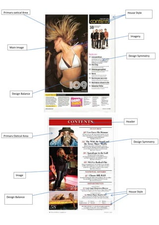
  • 1. Primary optical Area House Style Imagery Main Image Design Symmetry Design Balance Header Primary Optical Area Design Symmetry Image ry House Style Design Balance
  • 2. Header Primary Optical Area Design Symmetry Design Balance House Style Main Image In this essay I’m going to be comparing three magazine covers, comparing how their genre affects their layout and design. I will be looking at three magazines, Mixmag, Rolling stones and Vibe. Mixmag is a house magazine, rolling stones is an alternative rock and vibe is r&b and hip hop. So their House style and imagery will be different. I will also be looking to see if design balance is used, and is the rule of thirds is applied. The first magazine I will be looking at is Mixmag. This is a dance magazine, so you would expect to see bright, vibrant colours. The house style of this page is black, yellow and white. The black and white both contrast against each other, and also give the magazine formality. The black signifies power and death; whilst the white connotes innocence and purity. The yellow stands out, and attracts the attention of the audience. Yellow also symbolises energy which reflects the genre of music being dance. The house style is incorporated into the image also, as the blond girl is wearing a white and black top, and is dancing which is stereotypical of a dance magazine. The primary optical area is the first place that the reader will look, and the magazine has cleverly got the girls head in this area, so this is the most eye-catching part of the contents page. In the terminal area, there is a page number, this is to show the reader any extra information that they want to see about this picture. The main page numbers for example ‘109’ is in a style which connotes a DJ deck as the 0 looks similar to one, which is stereotypical of a music magazine. The magazine design seems quite
  • 3. balanced. The text seems to frame the picture, and is not too heavy; this is a good thing as the target audience is a younger audience, so the writing is simpler. The vocabulary used is colloquial and slang which reaches out to the audience. The right hand side is less compact and easier to read than the bottom of the page. This is most probably because the reader will look at that straight after looking at the primary optical area. The black bold and larger headings separate each individual bit, so that the audience can pick out what they want to read about and also it is eye-catching so that they are motivated to read on. The contents page has design symmetry vertically. The picture is informally symmetrical with the writing to the right of the page. Also, the two images at the top of the page could be considered horizontally symmetrical to the writing at the bottom of the page. The second magazine contents page is the rolling stones. The rock magazine follows a stereotypical house style as the formal black red and white colours are used. This is to show the maturity of the magazine, the red connotes energy, danger passion and love. The black and white similarly to the first magazine contrast against one and other, making the red stand out. It also makes the three images bolder. The black headings are larger than the other text because it captures the reader’s eye, so that they can choose what they want to read about, giving them an idea of what is in the magazine. The most vibrant image is the top image. This is because the person in the image is in the primary optical area of the magazine, also the person has a direct mode of address which draws the reader in. The second image follows the house style of the magazine as its main colours are black and red. The magazine design is balanced as it has three images on the left side and is quite word heavy on the right. This is because the magazine is aimed at an older audience, so the articles are much longer and have more information in them. The composition of the design is horizontally symmetrical, which makes it easier to read for the audience and makes the page look more formal. The third magazine is Vibe. This r&b and hip hop magazine similarly to the rock magazine follows a formal house style. The black red white and also grey colour scheme is used, giving the magazine a mature feel to it. The Large V in grey behind ‘Kanye West’ (the person in the image) head is in grey which makes the image stand out. The ‘contents’ header overlapping the V stands out, as it is in black and is bold. This also frames the image of Kanye, in the top corner. The red in the image is where Kanye heart is, this is to symbolise love and passion and reflects r&b music. The page is composed so that it has horizontal symmetry which shows that the writing is on the right whereas the image is quite large on the left. The balance of image and text is informal, as the image takes us most of the page, whereas the writing is less heavy, which is an indication that the target audience is younger as the text is simpler. Kanye’s head is in the primary optical area, and he has a direct mode of address which is eye-catching to the reader, and draws them in. The picture follows the colour scheme and house style of the page, therefore making the page balanced. The music icon in the picture also shows that it is aimed at a younger audience as his music is aimed at a young, urban audience.