
Recommended
More Related Content
What's hot
What's hot (20)
Viewers also liked
Viewers also liked (20)
Similar to Kerrang contents
Similar to Kerrang contents (20)
Recently uploaded
Recently uploaded (20)
Kerrang contents
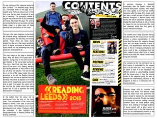
- 1. In the bottom third the colour red is reintroduced from the strip on the main cover. The Incorporation of the colour red relates to where it was used on the front cover. Portrays the link between cover mount advertisement and where it features within the publication. It also highlights the recognisable brand of Reading Festival that is being advertised. Featured image links to coverline that contained buzz words. This featured image make the article much more prominent and easy to locate for readers who are interested in this section and article. The tag line related to this image is humorous, making a comical comment about the band artwork being shown, thus, relating to the target audience of young people with a good sense of humour about music so buy the magazine as much for the entertainment element as the informative specialised subject elements. The contents list fits the right hand rule of third making it comfortable for the viewers eye to fall and rest upon, thus, causing it to be easier to read. It is also separated into different sections by using headings created with the house colours to keep the ongoing house of the magazine going but also to separate the differentiating sections of the magazine so there is no confusion and it is clearly presented. The contents strip is edge by police warning tape that also fits the house colours but also portrays a strong representation of rock music fans (the genre this magazine focuses upon and the target audience it aims to attract). This representation is that they often enjoy or thrive in dangerous situations and have a lack of fear- a stereotype that has been created through other forms of media like the music itself and videos in which these things are portrayed. The top right pug of the magazine shows the word “contents”. It is extremely large, taking up 2 horizontal thirds of the page and is created using the house colours seen on the front cover that are used throughout for any text of headings. The typography creates a slug for this particular area of the publication and makes it dominate the page. The word is surrounded by items such as skulls and beer bottles drawn in a tattoo style- all these elements hold connotations of rock music. The main image on this page is extremely large, filling two thirds of the page itself. It depicts a young group of men who would be age relatable to the young target audience. They are a band that may been seen as icons of this genre, thus, drawing attention and causing attraction to read further to find out why they are featured. The fact the red box is on top of the image implies they are something to do with the Reading Festival feature but this can also be depicted from the fact they are outside as appose to an inside studio portrait image being used and also the chair is read. Once again, this colour red is the only time the house colours have been broken and it is all to represent the same feature within the magazine. The men in the main image are in what looks like a festival setting (represented as events for young people) and also they are drinking alcohol. These drinks are being drunk straight from the can in the image- something that is a regular occurrence at festivals and music events and also something that young people are stereotyped to do. A summary message is displayed immediately after the dateline before the contents listing starts. It gives a short insight and news update as to what has recently happened within this area of the music world and also a small portrayal of what will be featured throughout. It features many band names that act as specialised language and engage the target audience as well as having an image of a rock icon and one of the most well respected artists from this genre to conjure interest and intrigue.