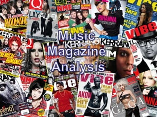
3. Says new to make more audience want to buy it as it probably has all the latest gossip and interviews from America Colours like yellow and black are used, constantly used throughout The name gives the audience an idea that it is an RnB magazine, vibe could be a word that younger audiences like teenagers for example could use to describe a song or a music video. Use of well known rapper on the market at the moment, for example Drake Informs audiences that it is the latest issue. Central image – Drake, catches the audiences eye first’ also gives audience the idea that it is music magazine as Drake is a Rapper. Have all the interesting gossip new on the left so it catches the audiences eye’s first. Maybe an American magazine as it only features American celebrities and hardly any British RnB genre magazine Mostly based around the gossip and shocking facts and interviews from celebrities mostly from America
4. The puff is over exaggerated as it says “UK’s Biggest” trying to appeal to more audiences, trying to convince them that it is the best and trigger them to want to buy it. This magazine would appeal to non conformists as it features celebrities such as Lady Gaga Exclusive Strapline Highly inappropriate – outrageous, this also shows that it is aimed at an elder audience. This magazine was originally called ‘Cue’ as in the sense of cueing a record, ready to play. But it was change to ‘Q’ so it wouldn’t be mistaken for a snooker magazine. The magazine has used Lady Gaga, a outrageous and unique celebrity in the media eye at the moment. Central Image Colour schemes are grey and black, this relates to more rock and edgy audiences The magazine is modelled after Rolling Stone Splash – largest text on cover
6. Contents is in red and white which makes it stand out, it also helps the audience realise what page they are on. It also includes the date which is a very smart way of included one of the music magazine codes and conventions. The word “Drummer” is in black and bold which makes it stand out, this will enable it to instantly catch the audiences eye. The drums on the contents indicate that the genre of the magazine could be Rock or Indie as these two genres associate and use drums in their music. The drums are a big part of their genre. The features are the things are always in the magazine, the third left layout enables the audience to easily see what the magazine has in stall The image is in black and white, this may indicate that it may be of a Rock magazine as “Rock” fans usually associate with the colours black, it is one of the main colour they wear. The puff or in this case the word “Exclusive” plays a big part as audiences see this and want to buy it as when something is exclusive it is something nobody has seen or read about before, this will trigger audiences to buy the magazine as they would want to read more about the “Exclusive” story.
7. The third left layout enables audiences to view what the magazine contains easily, it gives a clear navigation of where everything is. The NME logo indicates that the magazine may be of an Indie or Rock genre as NME fend for audience that listen to Indie and Rock music. Not having a central image is unusual as it is one of the codes and conventions of a music magazine. The magazine does not have a specific central image. The large bold page numbers help audiences to see clearer what is on each page, it also gives a nice looks to the contents making it look funky and weird, this is not a typical code and convention of a music magazine. The magazine is a carry on of the same TV channel, this will appeal to audiences as they will see this and want to buy it to maybe see more about their favourite channel and found out the latest gossip and news. The “1” is in bold, this is another puff as it is trying to say that it is the best magazine, this will trigger audiences into buying it as they will think it is the best and prefer it over something that might not say the same. The freebie/tag on triggers audiences into buying the magazine as they will see the free gift in this case a voucher and would want to buy it. They have put the add on in bold and bright colours so it easily catches the audiences eye.
9. We can see by the title of the article that it is from a rock or maybe Emo magazine as the font of the title is “Ransom Lettering” showing us that it is trying to give out an rebellious and outrageous image to the audience, it is also loud and eye - catching which gives us another reason to why it could belong to a rock or Emo magazine as “loud and outrageous” is what “Emo’s” and “Rock” fans are all about, it is part of their image. The magazine has used the celebrity “Lilly Allen” who is on the market at the moment for her loud and outrageous behaviour, this also hints that it might be of a Rock or Emo genre. The article font is small which is a typical code and convention of a music magazine, the article is also short and in colunms which is a code and convention of any magazine regardless, this helps audiences read the article better and clearer. The central image is large and eye – catching, it may be the first thing the audience look at once they open the magazine, audiences that are “Aspirers” may look at what “Lilly Allen” is wearing and may aspire to take up and try her look. We can also tell that the magazine might be British as the star persona is wearing the British colours, red, blue and white representing the Union Jack.
10. The word “The Teenagers” is in a bold black font with a bright blue highlight, this is done to make the word stand out and make it a little more eye – catching. By using a bright blue it will insure that the first thing the audiences look at is the word. Masthead/Title of article. This could also be called the “Splash” as it is the largest font on the page. By looking at the word we can instantly tell who the target audience is, as it says “The Teenagers” we assume that the audience would be anywhere aged between 12 – 18 years. We can tell by the constant use of blue and white that this might be the chosen house colour. The central image is large and takes up half of the page, this is done so it is eye catching. The article also features three individual articles very similar to the main article beside it. This will attract more audiences as they will believe there getting extra information for the same price or cheaper. We can tell this this might be of an Indie or Indie Rock genre as on the bottom their is the NME logo, we know this as NME is an institution that fends for audiences that listen to Indie Music.