
Recommended
More Related Content
What's hot
What's hot (20)
Viewers also liked
Viewers also liked (14)
Similar to Music magazines
Similar to Music magazines (20)
More from abbeycoleman10
Recently uploaded
Recently uploaded (20)
Music magazines
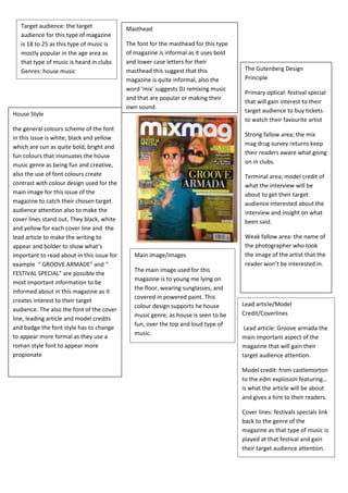
- 1. Target audience: the target audience for this type of magazine is 18 to 25 as this type of music is mostly popular in the age area as that type of music is heard in clubs Genres: house music Masthead The font for the masthead for this type of magazine is informal as it uses bold and lower case letters for their masthead this suggest that this magazine is quite informal, also the word ‘mix’ suggests DJ remixing music and that are popular or making their own sound. House Style the general colours scheme of the font in this issue is white, black and yellow which are sun as quite bold, bright and fun colours that insinuates the house music genre as being fun and creative, also the use of font colours create contrast with colour design used for the main image for this issue of the magazine to catch their chosen target audience attention also to make the cover lines stand out. They black, white and yellow for each cover line and the lead article to make the writing to appear and bolder to show what’s important to read about in this issue for example “ GROOVE ARMADE” and “ FESTIVAL SPECIAL” are possible the most important information to be informed about in this magazine as it creates interest to their target audience. The also the font of the cover line, leading article and model credits and badge the font style has to change to appear more formal as they use a roman style font to appear more propionate Main image/images The main image used for this magazine is to young me lying on the floor, wearing sunglasses, and covered in powered paint. This colour design supports he house music genre, as house is seen to be fun, over the top and loud type of music. The Gutenberg Design Principle Primary optical: festival special that will gain interest to their target audience to buy tickets to watch their favourite artist Strong fallow area; the mix mag drug survey returns keep their readers aware what going on in clubs. Terminal area; model credit of what the interview will be about to get their target audience interested about the interview and insight on what been said. Weak fallow area: the name of the photographer who took the image of the artist that the reader won’t be interested in. Lead article/Model Credit/Coverlines Lead article: Groove armada the main important aspect of the magazine that will gain their target audience attention. Model credit: from castlemorton to the edm explosion featuring… is what the article will be about and gives a hint to their readers. Cover lines: festivals specials link back to the genre of the magazine as that type of music is played at that festival and gain their target audience attention.
- 2. Masthead The word kerning is a mention as it a noise created by an electric guitar. The masthead font is broken and crake like glass suggesting that the music genre is hard core, heavy mental, loud music. Main image/images The main image is the band paramour and the image was take in a high angle shot and the clothing of the artist are quite dark colours suggesting there music is quite heavy rock type music. And looking directly into the camera and the lead singer is standing in the middle suggesting she’s the most important in the group. Also on the magazine cover that suggest is a rock, heavy mental type of magazine is other images of the different artist that are smaller on the side suggesting that they’re going to be stories and articles about them but the main focus is the main image of the band parmore. The images of the other artist look quite rough, scary and rebellious looks that supports the heavy mental look that we see. Target audience: 15 – 30 is there main target audience and the genre of this magazine is rock. As kerrang is known to be a heavy mental, rock genre magazine and interviewing that type of genre The Guttenberg design principle Primary optical: bring me the horizon poster pull out, as it will make the target audience interested on what they will get free inside the magazine and persuade them to buy the magazine. Strong fallow area: win tickets: Fans are able to see their favourite artists live and have also links back to the genre of the magazine as these types of artist only play certain festivals that suit their genre. Terminal area: special pull out cover; this will intrigue the target audience even further as not only will they get the interview of the band but a poster of the band as well. Weak fallow area: Austin carlile latest arrest this is the weaks point as it right at the bottom of the cover showing it’s the least important to keep to the audience and the magazine as the main focus is the band paramore. House style The general colours used on this cover is red, black, blue, yellow to fit in what type of music genre the band is and to make the coverlines, model credits to standout out on the white background catch their to their target audience attention. The fonts of the cover of the magazine are all bold, capital letter. Quite big fonts to stand out for the readers and also to fit the heavy mental look for the magazine. Lead article/model credit/ coverlines Leading article: Paramore they are the main focus of the magazine as they the main image cover but also the font and size of their name on the cover is just smaller than the masthead suggesting the importance of the band and also to show how popular they have become in the rock/ heavy mental genre as they are Model credit: “this is a new start” a hint on what the interview is about. Suggesting to the viewers a new album to be release or a new image of the band. Coverlines: bring me the horizon poster pull out is effective for the target audience to be interested in, as the magazine is not only offering information about paramour but also free poster of a another artist the their target audience will be interested and will persuade them to buy the article.