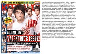
1. The front cover of the magazine is set out very messily to appeal to
the audience as they will probably be teens/young adults. The
writing on it is snappy. Short and bold to get the attention of the
target and keep them interested as if they are most likely going to
be teens then they won’t want to read lots of writing they will want
it to be short. The band All Time Low is the dominant image as
there will be a main article about them. They are also in front of the
mast head to show that they are more important and well known
that the actual magazine itself. The essential information is in the
corner of the magazine so it doesn’t the away the main focus from
the dominant image. The main sell line for the main image is very
bold and blocky this is draw people’s attention to it and get them to
buy it. The colours used are mostly red as it is the valentine’s day
special and the colour red is associated with that. The colour red
also stands out and makes it more especially as it is used for a
background colour and the colour of the masthead. The cover lines
on the front page are placed around the dominant image to make
sure that the main focus is still on them. In the top left hand corner
there is a small plug for a competition that is quite small but still
stands out. The picture of the band All Time Low has them all
wearing white shirts with a white background which could
represent the purity of love, however they have blood on their
shirts. The ‘main one’ who is standing closest to the camera has
blood on his knuckles which could be a symbol of love as blood is
red and the colour most associated with love is red. This could be a
metaphor.
2. On the contents page the heading is very bold and has lots of drawings
around it to draw your attention to it and keep it with the genre of the
magazine. The dominant image is of Fall Out Boy and all of them are
reading a Kerrang! magazine. They have been put in very bright suits to
make them all stand out from the white background and from each other.
They have some writing underneath their picture which is just a brief
introduction to them and a small teaser of what is in the article about
them. They also have their autographs underneath each band member so
you can tell which one is which and write at the end of the small
introduction there is the bands signature so you know that it is them. At
the top of the picture there is a drawing of the bands symbol so it can you
know that it is part of them and can identify them even if you just looked at
the symbol first. The title section is in bold writing and has yellow
background so it stands out more. They are bold so the reader can identify
them easier and the text underneath them about what’s actually inside the
magazine are also in bold because they can be identified easier. In the
corner of the contents there is a small picture of the band Bring Me The
Horizon, they have writing over them telling the audience that they have a
an article but it is not very big so it doesn’t take the interest away from Fall
Out Boy.
3. On this double page spread of about You Me At Six the
dominant image is of the full band. The image goes across
the full both pages and has little bits of information
layered over it so the main attention isn’t taken away
from the band. The image is taken at eye level height so
they reader is drawn to it. The image also shows each
member of You Me At Six pulling a different facial
expression which could be done to show the audience a
side of their personality. Alliteration is used in the title
‘Famous Five’ to attempt to make the reader laugh and so
its sounds less formal as the target audience will primarily
be teens. There is little information on it as people who
read it will probably be more interested in the picture and
not so much the information, and even when they do
read it they are going to want it to be short, snappy and
to the point. The title of the article is the name of the
band which shows just how important and famous they
are as they have the titled self named. The article has a
pull quote from probably one of most well known band
member which will be used to get the attention as the
readers will most likely know who that person is. The
drop cap used at the start of the article is not only a
bigger letter but a different font to capture the audiences
attention and to get them to read on. The pugs in the
corners of the double page spread are very brightly
coloured yellow so they stand out from the dark
background of the image and get the reader interested.
4. The front cover of Rock Sound has a very bright colours on. The background is a very light blue and the
text is either in blue, pink or black. This is to contrast so they stand out and they will probably stand out
on a shelf against other magazines so it’s easier for readers to find it and are more likely to find it. The
dominant image features Brendon Urie from Panic! At The Disco and Pete Wentz from Fall Out Boy. Even
though they are in different bands they are both on the front cover of the magazine and its just them not
the rest of the bands. This has been done for multiple reasons. For example they are the ones that are
the most well known out of the band and so people are more likely going t pick it up and buy it if they are
featured on the cover because people know who they are. Another reason is fans of both or just one
band will know that the members of each band are very good friends who often help out when writing
and producing their music, so if the readers see them both on the cover of the band then they may think
that they are planning on collaborating on some music so they will read it to find out. The essential
information is placed I the corner of the magazine so it doesn’t take any attention away from the main
part of the magazine. At the top there is a plug of free magazines and it shows you smaller images of the
magazines inside of the magazine. They are small so they fit at the top of the magazine without drawing
any attention away from the main parts. They are also small so the reader can see what posters are inside
and who they are from but not enough that it is very clear so they have to buy the magazine to see the
posters inside properly. The image is placed in front of the title of the magazine to show that the bands
on it are more important than the magazine itself. The main sell line for the image is in very bright colours
to show the readers who is on the front cover and who the biggest article is about just incase they don’t
know who the images are of. The cover lines are placed around the main image so they don’t draw too
much attention away from them but there sell lines are still in bright colours they just all have the same
font which is different from the title about Fall Out Boy and Panic! At the Disco. The clothing that Pete
Wentz and Brendan Urie are in are very bright to show that something good could happen between the
band and that they are friends. Underneath the main image is a sub image of someone from Bury
Tomorrow, there sell line is ‘From Death To Destiney’ and the clothes that the person is wearing is all
black which could represent the death in the sell line. The person also has a very serious look on his face
which could also represent death.
5. The dominant image of the contents page in Kerrang! is of All Time Low. In the image there is a plug as
it is a competition to win a meet and greet with them. The image of them is them all standing together
with the outline of a person between them with the text ‘This could be you!’ Underneath the image is
the editors note and signature. In the editors note there is just some information about what they had
been doing and it is used to seem more friendly with the audience like you are just talking to your
friend. Down the side of the page is the contents list. The main titles have a black box around them with
bright yellow writing in it highlighting each section. Yellow is used because it is bright and many other
parts of the contents page are in yellow so it is used to stick to a certain theme for that weeks issue.
Under each title there are subheadings of each thing in that section. They are in bold so they stand out
and the other text that provides more information are in normal text so they don’t clash with the main
parts. At the top of the contents page the title fro the page is in black and is very bold against a yellow
background. Next to it is the issue number and cover date so people who may collect them can date
them. Right in the bottom of the page is another plug to a subscription to get so many Kerrang!
magazines for cheap. This is put there to get more people to buy more of their magazines.
6. The dominant image in the article is of 5 Seconds Of Summer. The
image takes up all of the double page and the article is layered
over the image. The image has the entire band (Ashton Irwin,
Calum Hood, Michael Clifford and Luke Hemmings) on it. The
member that is the most well know (Luke) is placed in the middle
and the rest of the band is around him. All of the band member
have something to do with the article placed over a part of them
but there is a the least amount of things placed over Luke as he is
the most well known. They are all pulling different facial
expressions which could be try and show their different
personalities and could try to be humorous to the readers. A pun
is used in the title of the article ‘5 Seconds of Stunner!’ This is a
play on words as the name of the band is 5 Seconds of Summer
and is used to make the reader laugh and not sound serious so it
is a less formal article. Instead of using a drop cap at the start on
the interview there is a black arrow with a bright yellow
background to draw attention to the start of the article. The
article is written in the style of an interview with the band. The
questions are in bold, white writing and the questions are in a
formal font so the reader knows the difference between them.
They are also quite short so the reader doesn't get bored when
reading it. There is a pull quote from one of the members of the
band (Michael) which says ”We look up to bands that Kerrang!
Cover!” this could have been used to show that lots of famous
bands like and read Kerrang! which will get the target audience
more interested if they know their favourite band/artist read the
magazine and so are more likely going to sell more copies.