
Recommended
More Related Content
What's hot
What's hot (20)
Similar to Cover analysis
Similar to Cover analysis (20)
More from ngeo97
More from ngeo97 (20)
Recently uploaded
Recently uploaded (20)
Cover analysis
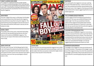
- 1. TARGET AUDIENCE AND GENRE This magazine is targeted towards younger people, mostly teens and possibly people in their early twenties. It is a magazine more specifically for people who listen to rock music. I think that by including so many pictures of artists and bands this would attract fans of such artists to buy the magazine. MASTHEAD The masthead for the magazine is very eye-catching because of the bold red colour. It seems to be very in-your- face and bold and could be representative of the bands and music in the magazine. Also because the font looks shattered this may be suggesting that the music is shatteringly loud. THE GUTENBERG DESIGN PRINCIPAL For this magazine the first thing you would look at is the top left. Then your eyes would shift down to the bottom right. From this you would learn that this edition of the magazine featured the band ‘Fall Out Boy’ and another attraction is Frank Iero’s interview. After this we would notice the Pierce the Veil segment then the posters in the bottom left. MAIN IMAGE The main image of this cover is of the band ‘Fall Out Boy’ which would attract fans of the band to the magazine and would help to sway them to buy the magazine. The band look like quite stereotypical rock artist because of their physicality and the clothes worn; also you can see tattoos on show. COVER LINES From the cover lines we know what the magazine has to offer; this includes interviews with Frank Iero and Slayer, and it tells the readers that there are posters inside which might interest them as they may be of artists they like. MODEL CREDIT The model credit on this cover is the band Fall Out Boy and from this we would know that they are the main feature of this edition of KERRANG! magazine. This means you can expect information and interviews from them inside. MAIN COVER LINE The main cover line says ‘Fall Out Boy go back to their roots’ which gives the audience the idea that inside the magazine you would get to read about the bands ideas and reasons for their current music and also if you hadn’t heard their new music then you would get an idea of what it is like. COLOURS/TYPEFACES/HOUSE STYLE The house style of KERRANG! magazine is very messy taking in to account the font used. It seems be like this possibly because the music is chaotic. The colours are very bold and the most dominant colours seen are red and yellow. These are very vibrant and usually these colours are associated with danger; so it may be suggesting that the brand and content isn’t soft. BANNERS/FLASHES/BADGES The badge on this magazine is the red circle by one of the band members. The purpose of this badge is to get fans of the magazine to buy it to enter the competition. The badge is positioned in the primary optical area so it seems that this is something that they want readers to see.