
Recommended
More Related Content
What's hot
What's hot (20)
Viewers also liked
Similar to Justin Bieber Magazine Cover Analysis
Similar to Justin Bieber Magazine Cover Analysis (20)
More from nicolanightingale
More from nicolanightingale (20)
Recently uploaded
Recently uploaded (20)
Justin Bieber Magazine Cover Analysis
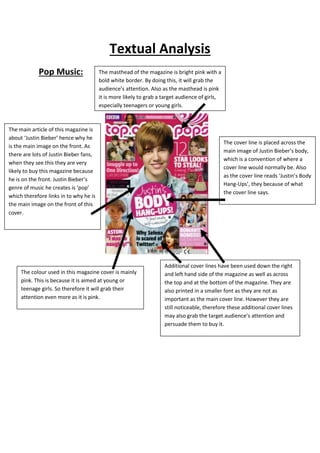
- 1. Textual Analysis Pop Music: The masthead of the magazine is bright pink with a bold white border. By doing this, it will grab the audience’s attention. Also as the masthead is pink it is more likely to grab a target audience of girls, especially teenagers or young girls. The main article of this magazine is about ‘Justin Bieber’ hence why he is the main image on the front. As there are lots of Justin Bieber fans, when they see this they are very likely to buy this magazine because he is on the front. Justin Bieber’s genre of music he creates is ‘pop’ which therefore links in to why he is the main image on the front of this cover. The cover line is placed across the main image of Justin Bieber’s body, which is a convention of where a cover line would normally be. Also as the cover line reads ‘Justin’s Body Hang-Ups’, they because of what the cover line says. Additional cover lines have been used down the right and left hand side of the magazine as well as across the top and at the bottom of the magazine. They are also printed in a smaller font as they are not as important as the main cover line. However they are still noticeable, therefore these additional cover lines may also grab the target audience’s attention and persuade them to buy it. The colour used in this magazine cover is mainly pink. This is because it is aimed at young or teenage girls. So therefore it will grab their attention even more as it is pink.
- 2. Rock Music: The masthead of this magazine is called ‘Classic Rock’ which will therefore inform the reader that this magazine is based on the genre ‘rock’. Also the masthead is very bold and in a big font size. This will make it easier for the reader to spot. Moreover artists mentioned in the additional cover lines are classic rock artists linking in with the masthead. This additional cover line informing the reader there is a free CD may persuade the reader to buy this magazine. If this was not advertised readers would not know there is a free CD. The main cover line notifies the audience that the main article in the magazine is about ‘Guns n’ Roses’. Readers who are fans of ‘Guns n’ Roses’ are more likely to buy this magazine because the main article is about them. The additional cover lines are scattered around the page mainly of the left and right hand side. The white font makes them stand out on the black background. Also the fact that they haven’t included images of the artists suggests that they are ‘classic’ rock stars that people will recognise them just from their name and that they don’t need a picture there. The fact that the magazines main colours are black and white ties in with the fact that you would link rock music with the colour black because it is seen as quite ‘dark’ and ‘heavy’ music. The white background is used so it stands out on the black background. The main image is of someone from ‘Guns n’ Roses’ which draws more attention to the magazine from their fans making them more likely to buy it. Although the background is black, he is also wearing black which links to the fact that most rock bands wear black and why the main colour used in this magazine is black. The position the artist is standing in suggests he is from rock band too because he looks laid back. The words used in this subheading are also words that you would expect to see in a rock magazine.
- 3. Classical Music: The masthead of this magazine cover is called ‘music’ and is in a very stylized font. This is because the genre of music this magazine is about is classical and as classical music is well flowing, so is the font style. The main cover line of this magazine is of a musician’s name. Also it is placed at the left hand side of the page, which may have been because they wanted the musician to be the main focus. Furthermore they may have wanted the focus to be on the violin as it is a classical music magazine. The colour scheme of this magazine is very natural and simple colours. This may be because classical music sounds very simple and natural as it often has no vocalist. The additional cover lines are mainly placed on the right hand side of the page. Also one of the additional cover lines includes an advert for another musician. This may make the audience more likely to buy this magazine if they are fan of this This magazine has a main musician. image of a musician holding a violin. The fact that she’s holding a violin suggests the magazine want the focus to be on the violin and not her. Also, the musician is wearing black which could be because they don’t want her to be the main focus and that they wanted to keep it simple and plain.