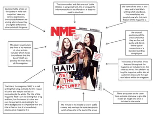
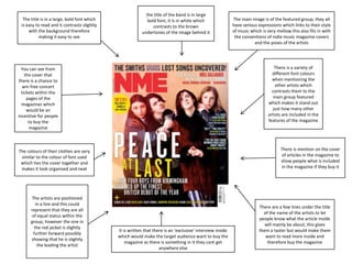
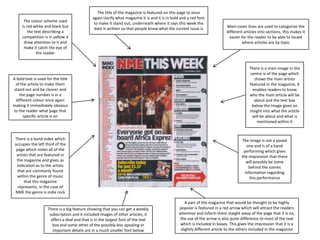
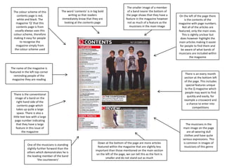
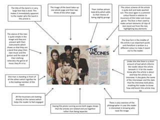
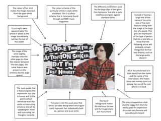
The document provides details about magazine covers and articles through descriptions of images, layouts, and design elements. It summarizes:
- Magazine covers typically feature the main artist through large images and text, with additional details like issue dates, other featured artists, and article previews to attract readers.
- Contents pages organize articles by section and page number to help readers find topics of interest. Larger images and text typically promote primary stories.
- Feature articles employ images, fonts, and colors consistent with the musician or genre to immerse readers in the tone and style. Interviews are identified along with photographers and dates.
Dynamics of Destructive Polarisation in Mainstream and Social Media: The Case...
Indie Rock Smiles: Inside HAIM's Fun and Quirky NME Cover Shoot
1.
2. Commonly the artists on
the covers of indie rock
magazines have very
serious expressions,
these artists however are
smiling which shows they
are slightly different to
other artists of this genre
The issue number and date are next to the
title but in very small font, this is because the
information should be offered but it does not
need to stand out
the unusual
positioning of the
artists show that
they are fun and
quirky and do not
follow typical
conventions of a
standard standing
straight post
This cover is quite plain
and there is no mention
of other articles
included which shows
the audience that the
band ‘HAIM’ are
possibly the main focus
of this magazine
The title of the magazine ‘NME’ is in red
writing that is big and bold, for this reason
it is clear and easy to read as it is
contrasting to the white. The title of the
magazine ‘NME’ is in red writing that is big
and bold, for this reason it is clear and
easy to read as it is contrasting to the
white background. It is important that the
title is clear so that it is immediately
obvious what magazine it is
the name of the artist is also
clear and in bold black
writing which stands out.
This immediately lets
people know who the main
feature of the magazine is.
The names of the other artists
featured throughout the
magazine are included in on the
cover to attract fans of theirs to
buy the magazine and to also let
customers know who they can
read about within the magazine.
There are quotes on the cover
from an inside interview to give the
reader an insight into what is
included in the article
The female in the middle is nearer to the
camera and overlaps the other two artists
which shows she is the lead in the group
3. The title is in a large, bold font which
is easy to read and it contrasts slightly
with the background therefore
making it easy to see
the title of the band is in large
bold font, it is in white which
contrasts to the brown
undertones of the image behind it
There is a variety of
different font colours
when mentioning the
other artists which
contrasts them to the
main group featured
which makes it stand out
just how many other
artists are included in the
features of the magazine
You can see from
the cover that
there is a chance to
win free concert
tickets within the
pages of the
magazines which
would be an
incentive for people
to buy the
magazine
There is mention on the cover
of articles in the magazine to
show people what is included
in the magazine if they buy it
The colours of their clothes are very
similar to the colour of font used
which ties the cover together and
makes it look organised and neat
The artists are positioned
in a line and this could
represent that they are all
of equal status within the
group, however the one in
the red jacket is slightly
further forward possibly
showing that he is slightly
the leading the artist
The main image is of the featured group, they all
have serious expressions which links to their style
of music which is very mellow this also fits in with
the conventions of indie music magazine covers
and the poses of the artists
It is written that there is an ‘exclusive’ interview inside
which would make the target audience want to buy the
magazine as there is something in it they cant get
anywhere else
There are a few lines under the title
of the name of the artists to let
people know what the article inside
will mainly be about, this gives
them a taster but would make them
want to read more inside and
therefore buy the magazine
4. The colour scheme used
is red white and black but
the text describing a
competition is in yellow it
draw attention to it and
make it catch the eye of
the reader
The title of the magazine is featured on this page to once
again clarify what magazine it is and it is in bold and a red font
to make it stand out, underneath where it says this week the
date is written so that people know what the current issue is
A bold text is used for the title
of the article to make them
stand out and be clearer and
the page number is in a
different colour once again
making it immediately obvious
to the reader what page that
specific article is on
There is a band index which
occupies the left third of the
page which notes all of the
artists that are featured in
the magazine and gives as
indication as to the artists
that are commonly found
within the genre of music
that this magazine
represents, in the case of
NME the genre is indie rock
There is a big feature showing that you can get a weekly
subscription and it included images of other articles, it
offers a deal and that is in the largest font of the text
box and some other of the possibly less apealing or
important details are in a much smaller font below
Main cover lines are used to categorise the
different articles into sections, this makes it
easier for the reader to be able to locate
where articles are by topic
There is a main image in the
centre is of the page which
shows the main artists
featured in the magazine, it
enables readers to know
who the main article will be
about and the text box
below the image gives an
insight into what the article
will be about and what is
mentioned within it
The image is not a posed
one and is of a band
performing which gives
the impression that there
will possibly be some
behind the scenes
information regarding
this performance
A part of the magazine that would be thought to be highly
popular is featured in a red arrow which will attract the readers
attention and inform them staight away of the page that it is on,
the use of the arrow is also quite difference to most of the text
which is included in boxes. This gives the impression that it is a
slightly different article to the others included in the magazine
5. The colour scheme of this
contents page is red,
white and black. The
magazine ‘Q’ that this
contents page is from
usually always uses this
colour scheme, therefore
making it easy for people
to recognise the
magazine simply from
the colour scheme used
The word ‘contents’ is in big bold
writing so that readers
immediately know that they are
looking at the contents page
The smaller image of a member
of a band nearer the bottom of
the page shows that they have a
feature in the magazine however
not as much of a feature as the
musicians in the main image
The name of the magazine is
featured in the left top corner
reminding people of the
magazine they are reading
There is an every month
section at the bottom left
of the page. This includes
special features unique
to the Q magazine which
people may want to find
quickly and easily, for
example a crossword and
a chance to enter into
competitions
There is the conventional
image of a band on the
right hand side of the
contents page which
takes up quite a large
space. There is also a
little text box with a large
page number indicating
that they have a large
feature in this issue of
the magazine
One of the musicians is standing
slightly further forward than the
others which demonstrates he is
the leading member of the band
‘the courteeners’
On the left of the page there
is the contents of the
magazine with page numbers.
Not all of the articles are
featured, only the main ones.
This is slghtly unclear but
does however highlight the
main articles making it easier
for people to find them and
be aware of what bands of
musicians are included within
the magazine
Down at the bottom of the page are more articles
featured within the magazine that are slightly less
important than those mentioned on the main section
on the left of the page, we can tell this as the font is
smaller and do not stand out as much
The musicians in the
main image on the page
are all wearing dull
clothes and have quite
serious expressions. This
is common in images of
musicians of this genre
6. The title of the band is in very
large font that is bold. This
makes it immediately apparent
to the reader who the band in
this article is
The image of the band takes up
one whole page and then two
thirds of the other page
Their clothes almost
look dirty which adds
to their theme of
being slightly grunge
The stance of the men
is quite simple in the
image and they are
present with their
instruments which
shows us that they are
a band that plays their
own music and the
guitars and the style of
their clothing
reiterates the genre of
music they fit in to.
The colour scheme of the article
is quite dull and looks washed
out. This once again is a common
colour found in relation to
musicians of the indie rock music
genre. The blue is then used to
make certain elements of clips of
text stand out from the rest,
highlighting key elements
The blue font in the middle of
the article is an important quote
and therefore is written in a
different colour to make it stand
out to the reader
Under the title there is a short
amount of text which informs
the reader about the article
beneath it. It let the reader
know who the article is about
and how the article is an
interview. It also gives the name
of the interviewer and the date
that the interview took place,
enabling the reader to know
how old/recent this article may
be
One man is standing in front of
all the others which signifies he
is the leading member of the
band
All the musicians are looking
directly at the camera which
helps the reader to feel engaged
Having the photo running across both pages shows
that the articles are related and are together
rather than being separate
There is also mention of the
photographer in case the reader
is interested in knowing who
took the image
7. The colour of her shirt
makes the image stand out
from the plain white
background
The colour scheme of this
particular article is read, white
and black. This is a colour
scheme that is commonly found
through out NME music
magazines
The different sized letters used
for the large clips of text gives
the impression that she is quite
rebellious and goes against
standard forms
It is straight away
apparent who the
article is about as the
image immediately
catches the eye of
the reader
The image of the
artist slightly
overlaps onto the
other page to show
the relation between
the two pages, the
same feature was
present on the
previous double page
spread
The main quote that
is featured gives the
impression that she
is honest and to the
point and will
therefore make for
quite an interesting
article as she will be
speaking her mind
and expressing her
thoughts honestly
Instead of having a
large title of the
name of the artist
one of the main
features along with
the image is the large
text of a quote. This
gives an impression
of the type of person
that she is and lets us
know that the
following article will
probably contain
things that she has
said directly, such as
the large quote
above it
All of the article text is in
black apart from her name
and the name of the
interviewer, this makes
these two names stand out
among the rest of the text
which is in black
The pose is not the usual pose that
artists are seen doing which once again
could represent her individuality both
as a person and as an artist
The blank
background makes
the text easy to read
and the image stand
out much more
The short cropped hair style
and the baggy shirt that she
wears gives the impression
she is not very feminie and
possibly quite boyish