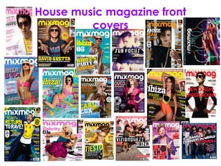
2. • Looking at the front pages of ‘Mix Mag’ which is a House and
Dance music magazine, the main similarities of the front page
is the vibrant colour schemes which are carried throughout
each monthly issue of the magazine. The colours are often
bright which attract the reader into buying the magazine, the
bright colours also connote the idea of Dance and House
music being vibrant bright and loud like the colours used.
There is also one dominant main image which is situated in the
middle of the front page, the image looks professional and
sophisticated connoting the idea that mix magazine is a high
end Dance and House music magazine. This dominant main
image is also continued throughout each monthly issue of mix
magazine, the images are often of beautiful looking women in
bikinis whom appear to be enjoying the dance and house
music featured in the magazine.
• The differences between each issue of the magazine front
pages is that the music artists featured on each issue of the
magazine are different therefore giving the audience more
choice when it comes to the different genres of music
featured in the magazine.
4. • Looking at the contents pages of ‘Mix Mag’ which is a house and
dance music magazine the main similarities between each contents
page is the dull/dark colour scheme. The main colour scheme of the
majority of the contents pages is black or grey and occasionally
white. This is unusual as there is no synergy relationship between the
front page and contents page as the front page is very vibrant and
colour and the contents page is so dull and gloomy. However, the
splash of colour comes from the main image situated on the contents
page. The image is similar to the main images used on the front page
being bright and colour full often of beautiful looking women who
appear to be dancing to the music featured in the magazine. The
layout of the contents pages are all very similar as the same layout is
continued through each monthly issue. This same layout creates the
sense of familiarity between the magazine and the target audience
as the same layout is used each month which is familiar to the target
audience. The typography used on the contents page is also the
same and continued throughout each monthly issue of the magazine.
• The only real difference amongst the different contents pages of Mix
Mag is the type of main image used. The main image is generally a
medium close up shot which looks professional and sophisticated
connoting the idea of Mix Mag being a high end magazine, however
there are other types of images used on the contents pages including
long shots and shots with a group of people in them. This has been
done as each monthly issue has a different feel to it, therefore
needing different images to connote this.
6. • As you can see from the double page spreads which I have gathered
are from Mix Mag, the main similarity is the layout of the double page
spread. One the majority of the double page spreads there is an
image which takes up one entire page with the title situated on the
other page, with the text below the title. This layout is generally
repeated throughout each monthly issue of the magazine as it
creates a recognisable relationship between the audience and the
magazine as the audience will be familiar with the double page
spread. The style of images tends to be similar on each double page
spread, with the use of a professional looking medium or close up
shot it connotes the idea that Mix Mag is a high end music magazine.
• The main differences between each double page spread is colour
scheme which varies between each different double page spread.
Some of the double page spreads have a bright vibrant colour
scheme which is simmilar to the front page. However, some of the
double page spreads have a far more plain/dull colour scheme
which relates to the plain and dull colour schemes seen on the
contents page of Mix Mag.
7. • As you can see from the double page spreads which I have gathered
are from Mix Mag, the main similarity is the layout of the double page
spread. One the majority of the double page spreads there is an
image which takes up one entire page with the title situated on the
other page, with the text below the title. This layout is generally
repeated throughout each monthly issue of the magazine as it
creates a recognisable relationship between the audience and the
magazine as the audience will be familiar with the double page
spread. The style of images tends to be similar on each double page
spread, with the use of a professional looking medium or close up
shot it connotes the idea that Mix Mag is a high end music magazine.
• The main differences between each double page spread is colour
scheme which varies between each different double page spread.
Some of the double page spreads have a bright vibrant colour
scheme which is simmilar to the front page. However, some of the
double page spreads have a far more plain/dull colour scheme
which relates to the plain and dull colour schemes seen on the
contents page of Mix Mag.