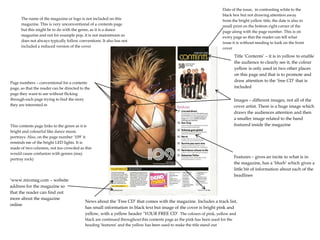
1. The name of the magazine or logo is not included on this
magazine. This is very unconventional of a contents page
but this might be to do with the genre, as it is a dance
magazine and not for example pop, it is not mainstream so
does not always typically follow conventions. It also has not
included a reduced version of the cover
Date of the issue, in contrasting white to the
black box but not drawing attention away
from the bright yellow title, the date is also in
small print on the bottom right corner of the
page along with the page number. This is on
every page so that the reader can tell what
issue it is without needing to look on the front
cover
Page numbers – conventional for a contents
page, so that the reader can be directed to the
page they want to see without flicking
through each page trying to find the story
they are interested in
This contents page links to the genre as it is
bright and colourful like dance music
portrays. Also, on the page number ‘109’ it
reminds me of the bright LED lights. It is
made of two columns, not too crowded as this
would cause confusion with genres (may
portray rock)
‘www.mixmag.com – website
address for the magazine so
that the reader can find out
more about the magazine
online
Title ‘Contents’ – it is in yellow to enable
the audience to clearly see it, the colour
yellow is only used in two other places
on this page and that is to promote and
draw attention to the ‘free CD’ that is
included
Images – different images, not all of the
cover artist. There is a huge image which
draws the audiences attention and then
a smaller image related to the band
featured inside the magazine
Features – gives an incite to what is in
the magazine, has a ‘blurb’ which gives a
little bit of information about each of the
headlines
News about the ‘Free CD’ that comes with the magazine. Includes a track list,
has small information in black text but image of the cover is bright pink and
yellow, with a yellow header ‘YOUR FREE CD’ The colours of pink, yellow and
black are continued throughout this contents page as the pink has been used for the
heading ‘features’ and the yellow has been used to make the title stand out