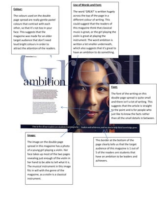
1. Image:
The image on the double page
spread in this magazine has a photo
of a young girl playing a violin. Her
face takes up most of the two pages
revealing just enough of the violin in
her hand to be able to tell what it is.
The musical instrument in this image
fits in will with the genre of the
magazine, as a violin is a classical
instrument.
Use of Words and Font:
The word ‘GREAT’ is written hugely
across the top of the page in a
different colour of writing. This
could suggest that the readers of
this magazine think that classical
music is great, or the girl playing the
violin is great at playing the
instrument. The word ambition is
written a lot smaller underneath,
which also suggests that it’s great to
have an ambition to do something.
Colour:
The colours used on the double
page spread are really gentle pastel
colours that contrast with each
other, so that it’s not too in your
face. This suggests that the
magazine was made for an older
target audience that don’t need
loud bright colours in order to
attract the attention of the readers.
Font:
The font of the writing on this
double page spread is quite small
and there isn’t a lot of writing. This
suggests that the article is straight
to the point and is for people who
just like to know the facts rather
than all the small details in between.
This border at the bottom of the
page clearly tells us that the target
audience of this magazine is 1 out of
5 of the readers are students that
have an ambition to be leaders and
achievers.