SlideShare a Scribd company logo
1 of 4
The colour of blue has been chosen because of its link to the British flag and the indie genres association with British culture. Furthermore, connotations of blue include calmness, confidence and
is stereotypically identified with males which links with the personality and presentation of indie bands. In the top right hand corner their is a box of text saying ‘The Radar Issue 2011’ This topic is
unique to NME, showing that this is an NME double page spread. This topic contains articles about new up and coming bands and the text of ‘They’ve been together for under a year, but are
already being talked up as the biggest guitar band of 2011’ supports this. The article is therefore about their recent success and rise to fame referencing their sold out gig at Oxford. It then talks
about their songs more in depth and how hardly any of them are no longer than 2 minutes long compared to other bands music that takes 2 minutes to reach the chorus. Overall, the article gives
the audience a good insight into the band's music and increased popularity.
The main image is of the band ‘The Vaccines’ and they are positioned as a group together.
They all have neutral facial expressions reflecting the indie-rock genre of music and are
using direct address to connect with the reader, making the reader feel more connected to
the magazine. The proxemics of the band show that they are close due to their close
positioning, however each band member's position varies showing that they are
independant. In addition, the presentation of the artists shows them slouching and their bad
posture is used to emphasise their nonchalant attitude and linking to the traits of indie
music which includes, calm, relaxed and chill. The main image spreads over the first page
and a quarter of the second page representing the importance of the main image. The
image features dull colours with a light but dirty backdrop, reflecting the genre of music.
The main image uses the iconography of guitars
to symbolise the indie-rock genre of music and
attract the target audience. The costume of
the artists are casual and dull reflecting
their grungy music and by wearing casual
clothes connects to the reader. The artists
hair is scruffy and messy and they have
stubble showing that they are laid back and
further emphasising the genre of music.
This is different to some issues as they have more than one image on a double page spread. On this
double page spread there is a reasonable amount of text in comparison to other NME double pages
where there is sometimes less and sometimes a lot more. To make it appear to be an NME magazine
This is a standard double page spread in NME, featuring The Vaccines as the cover artists. The
double page spreads layout and structure will tend to follow the same trends each week, however the
artists featured changes. In this double page spread the body copy is presented in the same form as
a newspaper whereas in other issues it has consisted of an interview layout. In this page spread the
main image is very large and there are no other images featured on the page.
The colours that dominate this double page
spread include black, blue and white. They
reflect the indie-rock genre of music and
therefore represent the band. These colours
are used throughout NME magazines to
maintain brand identity.
A similarity, however, that this double page
spread shares with other page spreads is the
use of coloured shapes splashed around the
page and its text. I think that this makes the
page look more intriguing and entices the
audience to read it.
There are various blue shapes used on this page
to make it more attractive and fascinating,
appealing to the reader. They have been used to
add some colour to the dull background and
make the reader more excited. The colour of
blue has been chosen because of its link to the
British flag and the indie genres association with
British culture. Furthermore, connotations of blue
include calmness, confidence and is
stereotypically identified with males which links
with the personality and presentation of indie
bands.
the brand name has been displayed in the
bottom right hand corner along with the page
number and the topic of ‘Radar’ is unique to
NME magazines.
The fonts and typefaces are very simple and easy to read. This links with the
idea of the double page spread having a simplistic look and also makes it
more enjoyable for the reader as they can easily understand it.
The title of this double page spread is made to appear bolder than the other
text. This is because it is very important as this piece of text introduces the
band and gives the reader knowledge of what the article is about. Making
the title appear bolder attracts the reader’s eye first and has therefore been
purposely done to draw the reader’s eye.
The typefaces and fonts used are usually very similar to the typefaces and
fonts used in other NME double page spreads and therefore, maintains
brand identity.
The shot is a medium shot which is a convention of magazine images
The double page uses large blue letters at the beginning of the article. This is similar to the layout of a
book or gossip magazine. The large letter has been used to stand out and make the reader read the first
sentence and ultimately the rest of the article. The article is not long in length as the target audience would
prefer to look at images than read. The colour of blue has been chosen for its link to the British flag and its
connotations. It has also been chosen to continue the colour scheme of the magazine and make
everything link and flow.
The text within the article is presented in the format of a newspaper article
making it similar to what the target audience may be used to reading. The
text is both black and blue making it more interesting and the blue has also
been used to highlight an important quote from the band and the journalist's
name ‘Jamie Fullerton’. Other quotes from the band have been used within
the articles text. The main colours of blue, black and white have been used
because they are represented in the british flag and therefore link to indie
music.
The title of this double page spread is ‘The Vaccines’ and is introducing the
band featuring. The font is very plain and simple which links to the idea of
this double page having that simplistic look and makes it appealing to its
target audience of young men that, stereotypically, don’t care about their
appearance. The black title colour also portrays the indie-rock genre and
attracts the target audience.
The title of this double page spread is
‘The Teenagers’ and introduces the band
featured in this magazines issue. The
teenagers are not a hugely known band
so having them on the ‘Radar’ section of
NME shows they are a new up and
coming band in the music industry and
this will appeal to the target audience who
will be interested in reading about them.
The word radar has been significantly
chosen due to its meaning to detect and
find something and in relation to music the
target audience would understand that it’s
based on new and upcoming bands that
have been recognised by NME. Due to
the topic of ‘Radar’ being used in every
issue a loyal NME reader would
understand the use of this word straight
away.
The title consists of bold, black text
which is highlighted blue to give it an
edgy look. The font resembles an old
school style font and so links to the band
as they are called ‘The Teenagers’
Overall, I like the title as I think the font
relates to the band and the text stands
out on the page but also blends in with
the colour scheme making the double
page spread attractive for the reader.
The main image that has been used is an image of the band featured in the article and shows their youthful laidback approach to life. The band
look young as they are in a bedroom all casually laying on top of a bed and there are posters of women sexually posing in the background
depicting a typical teenage boys bedroom. The location of a bedroom has specifically been chosen because this is where teenage boys,
stereotypically, spend all their time. The location of the bedroom therefore links to the band members and the band name. The artists’ costume is
casual with the stereotypical image of skinny jeans, t-shirt, trainers and messy hair. The artist’s costume outlines their laidback behaviour and
additionally with the position they are in shows their casual, scruffy look also relating to the fact that they are teenagers. The proxemics of the band
show that they are close but not attached to each other. Their slouching posture and individual positioning shows that they are individuals,
emphasising their independence as teenagers. The use of the colour black used within the band members costume links to the genre of indie-rock
and adds to the shadow and dark lighting of the image, emphasising the dark, grungy appearance of the band.
The main colour that dominates this double page spread is blue. This
colour is an NME magazine convention, as blue resembles indie music
and so links to the target audience of NME. The colour blue has also
been used to attract the male target audience and 4 of the 5 images
feature males signifying that this double page spread is aimed more at
males than females.
Some iconography that features in other images
on the double page includes a mic, stage lights
and graffiti. These features of iconography
connote the indie-rock music as they symbolise
music and the graffiti represents the grungy,
messy look and sound of the genre of music. The
graffiti also links back to the band being
teenagers as this is an activity teenagers are
commonly known to participate in.
The main image is positioned on the first page to be the most eye-catching part of the double page spread and
appeal to the target audience who will enjoy viewing images of their favourite bands. Having the image on the
first double page is a convention of a double page. The other images have been put into a box and made a
smaller scale. They have also been anchored with the text that states what bands are being shown in the
images. The use of the bands names such as ‘The Rascals’ and ‘Crystal Castles’ is appealing to the target
audience and draws their attention to the text. The text ‘Everyone's talking about...’ is an anchor for the images
giving the reader an understanding that the following bands are very popular at the moment.
The title is in capital letters, grabbing the
reader’s attention and introducing the band as
loud. Using capital letters is a convention of
NME magazines when introducing the band
featuring in the magazine. I like the use of
capital letters as I think it makes the text look
bolder and aesthetically pleasing.
The messy/chaotic background of
the main image connotes the
lifestyle of the target audience as it
is a convention that the readers are
likely to be very easy going and
have a ‘not caring’ attitude. This
allows the double page to connect
with the reader.
There is a puff that reads ‘NME LOVES’ that is presented in a spiky bubble and
makes the double page look more interesting and fun. The text in this bubble is
also in a different font making it unique to the rest of the text and more intriguing.
By saying ‘NME LOVES’ in the puff the reader will feel that they should also love
the band as much as the magazine as they are a loyal customer of the NME
magazine. double page. Within the box are
other bands and information
about them which will interest the
general target audience of NME. I
like the use of the box as I think it
makes the double page look more
busy and is aesthetically pleasing.
This double page spread shares
some similarities with other NME
double page spread magazines but
also has some unique aspects. The
Title of the double page is usually
the featured band and is always
presented in capitals. Furthermore,
the main image is
always spread across the first page and occasionally across some of the second page. Furthermore, shapes and text boxes are
used to highlight extra and key information such as the ‘NEED TO KNOW’ and ‘EVERYONE’S TALKING ABOUT’ boxes. In addition,
key quotes are usually highlighted and enlarged in the middle of the articles text to draw the reader’s attention and tease them into
reading the body copy. Lastly, the topic that the double page spread is within is always displayed in the top left hand corner of the
first page and is always presented in bold capitals. All these aspects of the magazine are repeated each issue to maintain brand
identity. Something that is unique about this double page includes the small puff containing the text ‘NME LOVES’. Furthermore, the
body copy is usually larger than this body copy and uses up a large amount of the second page.
The Teenagers are using direct
address to connect with the
audience. Direct address is also
used in one of the other images to
establish a connection with the
reader
There is a large boxed off section in this double page spread
that gives it a clean, crisp look making it more digestible for
the reader. The use of black connotes indie-rock music and
draws the reader's eyes to this section of the
The magazine also connects with the reader through the use
teenagers which is the age group of a large section of the ta
will feel they can identify with this article and the band featur
band. We’re The Teenagers and that’s all they think about’ s
the target audience. This is further established through the s
as these are words used to associated with teenagers. Lastl
giving us a warm feeling this week’ further develops the you
text to connect with the young audience.
The standfirst is the second largest piece of text underneath
emphasise the characteristics of the band and making a con
have been teenagers and can relate to the band. The standf
the reader and establishing a connection between the reade
In certain areas, including the puff and dark text boxes, this
double page spread has been designed as different to other
double page spreads. This is so that it stands out and is more
intriguing for the reader. The uniqueness of this double page
spread from others allows it to be less boring and more
exciting for the reader. This will attract the readership to read
the magazine which , ultimately, is the goal.

More Related Content

What's hot

Music magazine annabel lucey
Music magazine annabel luceyMusic magazine annabel lucey
Music magazine annabel luceybell101
 
Media cw music magazine reaserch and ideas annabel lucey
Media cw music magazine reaserch and ideas annabel luceyMedia cw music magazine reaserch and ideas annabel lucey
Media cw music magazine reaserch and ideas annabel luceybell101
 
Magazine anaylisis
Magazine anaylisisMagazine anaylisis
Magazine anaylisissineadjen
 
Analysing Existing Products
Analysing Existing ProductsAnalysing Existing Products
Analysing Existing ProductsRachAH
 
Analysing Existing Products
Analysing Existing ProductsAnalysing Existing Products
Analysing Existing ProductsRachAH
 
Analysing Existing Products
Analysing Existing ProductsAnalysing Existing Products
Analysing Existing ProductsRachAH
 
Media magazine essay
Media magazine essayMedia magazine essay
Media magazine essayNicoleTonge
 
Finished front cover essay
Finished front cover essayFinished front cover essay
Finished front cover essayjessicagilani
 
Music magazine analysis
Music magazine analysisMusic magazine analysis
Music magazine analysisAnastasijak
 
Magazine analysis
Magazine analysis Magazine analysis
Magazine analysis LewisCusker
 
Double page spread analysis
Double page spread analysisDouble page spread analysis
Double page spread analysisNattayaday11
 
Music magazines pp
Music magazines ppMusic magazines pp
Music magazines ppGatkinson27
 
Album cover and magazine adverts for album releases analysis
Album cover and magazine adverts for album releases analysisAlbum cover and magazine adverts for album releases analysis
Album cover and magazine adverts for album releases analysisKerry
 
Magazine Cover Evaluations
Magazine Cover Evaluations Magazine Cover Evaluations
Magazine Cover Evaluations ChloeBakerMedia
 
Analyse 3 music magazines
Analyse 3 music magazinesAnalyse 3 music magazines
Analyse 3 music magazinescharliewalden95
 

What's hot (18)

Music magazine annabel lucey
Music magazine annabel luceyMusic magazine annabel lucey
Music magazine annabel lucey
 
Media cw music magazine reaserch and ideas annabel lucey
Media cw music magazine reaserch and ideas annabel luceyMedia cw music magazine reaserch and ideas annabel lucey
Media cw music magazine reaserch and ideas annabel lucey
 
Radial analysis
Radial analysisRadial analysis
Radial analysis
 
Magazine anaylisis
Magazine anaylisisMagazine anaylisis
Magazine anaylisis
 
Test
TestTest
Test
 
Analysing Existing Products
Analysing Existing ProductsAnalysing Existing Products
Analysing Existing Products
 
Analysing Existing Products
Analysing Existing ProductsAnalysing Existing Products
Analysing Existing Products
 
Analysing Existing Products
Analysing Existing ProductsAnalysing Existing Products
Analysing Existing Products
 
Media magazine essay
Media magazine essayMedia magazine essay
Media magazine essay
 
Finished front cover essay
Finished front cover essayFinished front cover essay
Finished front cover essay
 
Music magazine analysis
Music magazine analysisMusic magazine analysis
Music magazine analysis
 
Magazine analysis
Magazine analysis Magazine analysis
Magazine analysis
 
Double page spread analysis
Double page spread analysisDouble page spread analysis
Double page spread analysis
 
Music magazines pp
Music magazines ppMusic magazines pp
Music magazines pp
 
Album cover and magazine adverts for album releases analysis
Album cover and magazine adverts for album releases analysisAlbum cover and magazine adverts for album releases analysis
Album cover and magazine adverts for album releases analysis
 
Magazine Cover Evaluations
Magazine Cover Evaluations Magazine Cover Evaluations
Magazine Cover Evaluations
 
Analyse 3 music magazines
Analyse 3 music magazinesAnalyse 3 music magazines
Analyse 3 music magazines
 
Task 3
Task 3 Task 3
Task 3
 

Viewers also liked

La ganoderma reishi
La ganoderma reishiLa ganoderma reishi
La ganoderma reishiSpindlow12
 
CaliforniaBudgetAnalysis
CaliforniaBudgetAnalysisCaliforniaBudgetAnalysis
CaliforniaBudgetAnalysisFrank Cusumano
 
L’année du sein 2017 - Biomarqueurs : signatures génomiques & immunothérapie
L’année du sein 2017 - Biomarqueurs : signatures génomiques & immunothérapieL’année du sein 2017 - Biomarqueurs : signatures génomiques & immunothérapie
L’année du sein 2017 - Biomarqueurs : signatures génomiques & immunothérapieElisabeth RUSS
 
Rural supply chain management
Rural supply chain managementRural supply chain management
Rural supply chain managementShikhar Sodhani
 
Branding in the age of Social media
Branding in the age of Social mediaBranding in the age of Social media
Branding in the age of Social mediaMaan Salman
 
Plan lector 2017 2do grado
Plan lector 2017   2do gradoPlan lector 2017   2do grado
Plan lector 2017 2do gradoLUIS SÁNCHEZ A.
 
Урок розвитку мовлення "Незгасний вогонь Прометея"
Урок розвитку мовлення "Незгасний вогонь Прометея"Урок розвитку мовлення "Незгасний вогонь Прометея"
Урок розвитку мовлення "Незгасний вогонь Прометея"dtamara123
 
Матеріали із дистанційного посібника (6 клас)
Матеріали із дистанційного посібника (6 клас)Матеріали із дистанційного посібника (6 клас)
Матеріали із дистанційного посібника (6 клас)dtamara123
 
Presentation on Braking system
Presentation on Braking system Presentation on Braking system
Presentation on Braking system Ashraf Rizvi
 
Lição 08- A Igreja e Os Dons Espirituais
Lição 08- A Igreja e Os Dons EspirituaisLição 08- A Igreja e Os Dons Espirituais
Lição 08- A Igreja e Os Dons EspirituaisMaxsuel Aquino
 
UNIDADE 1 - 3º E.S.O. (XEOGRAFÍA)
UNIDADE 1 - 3º E.S.O. (XEOGRAFÍA)UNIDADE 1 - 3º E.S.O. (XEOGRAFÍA)
UNIDADE 1 - 3º E.S.O. (XEOGRAFÍA)Pablo González Paz
 

Viewers also liked (20)

Front cover analysis
Front cover analysisFront cover analysis
Front cover analysis
 
Double page spread analysis
Double page spread analysisDouble page spread analysis
Double page spread analysis
 
La ganoderma reishi
La ganoderma reishiLa ganoderma reishi
La ganoderma reishi
 
CaliforniaBudgetAnalysis
CaliforniaBudgetAnalysisCaliforniaBudgetAnalysis
CaliforniaBudgetAnalysis
 
Trend of GDP in India
Trend of GDP in IndiaTrend of GDP in India
Trend of GDP in India
 
L’année du sein 2017 - Biomarqueurs : signatures génomiques & immunothérapie
L’année du sein 2017 - Biomarqueurs : signatures génomiques & immunothérapieL’année du sein 2017 - Biomarqueurs : signatures génomiques & immunothérapie
L’année du sein 2017 - Biomarqueurs : signatures génomiques & immunothérapie
 
Congress basics
Congress basicsCongress basics
Congress basics
 
Rural supply chain management
Rural supply chain managementRural supply chain management
Rural supply chain management
 
Technologies
TechnologiesTechnologies
Technologies
 
Ujian mac bm pa
Ujian mac bm paUjian mac bm pa
Ujian mac bm pa
 
Branding in the age of Social media
Branding in the age of Social mediaBranding in the age of Social media
Branding in the age of Social media
 
Plan lector 2017 2do grado
Plan lector 2017   2do gradoPlan lector 2017   2do grado
Plan lector 2017 2do grado
 
Урок розвитку мовлення "Незгасний вогонь Прометея"
Урок розвитку мовлення "Незгасний вогонь Прометея"Урок розвитку мовлення "Незгасний вогонь Прометея"
Урок розвитку мовлення "Незгасний вогонь Прометея"
 
Матеріали із дистанційного посібника (6 клас)
Матеріали із дистанційного посібника (6 клас)Матеріали із дистанційного посібника (6 клас)
Матеріали із дистанційного посібника (6 клас)
 
Presentation on Braking system
Presentation on Braking system Presentation on Braking system
Presentation on Braking system
 
Watches
WatchesWatches
Watches
 
El costo de oportunidad
El costo de oportunidadEl costo de oportunidad
El costo de oportunidad
 
Lição 08- A Igreja e Os Dons Espirituais
Lição 08- A Igreja e Os Dons EspirituaisLição 08- A Igreja e Os Dons Espirituais
Lição 08- A Igreja e Os Dons Espirituais
 
Code Generation
Code GenerationCode Generation
Code Generation
 
UNIDADE 1 - 3º E.S.O. (XEOGRAFÍA)
UNIDADE 1 - 3º E.S.O. (XEOGRAFÍA)UNIDADE 1 - 3º E.S.O. (XEOGRAFÍA)
UNIDADE 1 - 3º E.S.O. (XEOGRAFÍA)
 

Similar to Double page spread analysis

Deconstructions of rock magazines
Deconstructions of rock magazinesDeconstructions of rock magazines
Deconstructions of rock magazinesShahEman
 
Existing Magazine Radial Analysis
Existing Magazine Radial AnalysisExisting Magazine Radial Analysis
Existing Magazine Radial Analysisgueste1a4506
 
My magazine analysis
My magazine analysisMy magazine analysis
My magazine analysisguest74e80a
 
Double Page Spread Analysis
Double Page Spread AnalysisDouble Page Spread Analysis
Double Page Spread AnalysisKatieThomas17
 
Magazine anaylisis
Magazine anaylisisMagazine anaylisis
Magazine anaylisissineadjen
 
Analysis of front covers
Analysis of front coversAnalysis of front covers
Analysis of front coversZaralucille
 
Magazine Double Page Spread Research
Magazine Double Page Spread ResearchMagazine Double Page Spread Research
Magazine Double Page Spread ResearchLynley Sykes
 
Analysis of front covers
Analysis of front coversAnalysis of front covers
Analysis of front coversZaralucille
 
Research- Double page spread
Research- Double page spreadResearch- Double page spread
Research- Double page spreadalicegrimshaw
 
Cover, Contents and DPS Analysis
Cover, Contents and DPS AnalysisCover, Contents and DPS Analysis
Cover, Contents and DPS Analysisabbfarmery
 
Music magazines analysis
Music magazines analysisMusic magazines analysis
Music magazines analysishsmedia16
 
Kerrang magazine analysis powerpoint final
Kerrang magazine analysis powerpoint finalKerrang magazine analysis powerpoint final
Kerrang magazine analysis powerpoint finalelizabeth white
 
Radial Analysis
Radial  AnalysisRadial  Analysis
Radial AnalysisMFJ
 
Magazine Double Page Spread Analysis
Magazine Double Page Spread AnalysisMagazine Double Page Spread Analysis
Magazine Double Page Spread Analysisjordanjenkins98
 

Similar to Double page spread analysis (20)

Deconstructions of rock magazines
Deconstructions of rock magazinesDeconstructions of rock magazines
Deconstructions of rock magazines
 
Task 2
Task 2Task 2
Task 2
 
Existing Magazine Radial Analysis
Existing Magazine Radial AnalysisExisting Magazine Radial Analysis
Existing Magazine Radial Analysis
 
My magazine analysis
My magazine analysisMy magazine analysis
My magazine analysis
 
Double Page Spread Analysis
Double Page Spread AnalysisDouble Page Spread Analysis
Double Page Spread Analysis
 
Magazine anaylisis
Magazine anaylisisMagazine anaylisis
Magazine anaylisis
 
Analysis of front covers
Analysis of front coversAnalysis of front covers
Analysis of front covers
 
Magazine Double Page Spread Research
Magazine Double Page Spread ResearchMagazine Double Page Spread Research
Magazine Double Page Spread Research
 
Analysis of front covers
Analysis of front coversAnalysis of front covers
Analysis of front covers
 
Research- Double page spread
Research- Double page spreadResearch- Double page spread
Research- Double page spread
 
Cover, Contents and DPS Analysis
Cover, Contents and DPS AnalysisCover, Contents and DPS Analysis
Cover, Contents and DPS Analysis
 
Music magazines analysis
Music magazines analysisMusic magazines analysis
Music magazines analysis
 
Kerrang magazine analysis powerpoint final
Kerrang magazine analysis powerpoint finalKerrang magazine analysis powerpoint final
Kerrang magazine analysis powerpoint final
 
Textual Analysis
Textual AnalysisTextual Analysis
Textual Analysis
 
Textual Analysis
Textual AnalysisTextual Analysis
Textual Analysis
 
Double page spread analysis
Double page spread analysisDouble page spread analysis
Double page spread analysis
 
Task 4
Task 4Task 4
Task 4
 
Radial Analysis
Radial  AnalysisRadial  Analysis
Radial Analysis
 
Radial Analysis
Radial AnalysisRadial Analysis
Radial Analysis
 
Magazine Double Page Spread Analysis
Magazine Double Page Spread AnalysisMagazine Double Page Spread Analysis
Magazine Double Page Spread Analysis
 

Recently uploaded

FULL ENJOY - 9953040155 Call Girls in Dwarka Mor | Delhi
FULL ENJOY - 9953040155 Call Girls in Dwarka Mor | DelhiFULL ENJOY - 9953040155 Call Girls in Dwarka Mor | Delhi
FULL ENJOY - 9953040155 Call Girls in Dwarka Mor | DelhiMalviyaNagarCallGirl
 
Call Girl Service in Karachi +923081633338 Karachi Call Girls
Call Girl Service in Karachi +923081633338 Karachi Call GirlsCall Girl Service in Karachi +923081633338 Karachi Call Girls
Call Girl Service in Karachi +923081633338 Karachi Call GirlsAyesha Khan
 
FULL ENJOY - 9953040155 Call Girls in Noida | Delhi
FULL ENJOY - 9953040155 Call Girls in Noida | DelhiFULL ENJOY - 9953040155 Call Girls in Noida | Delhi
FULL ENJOY - 9953040155 Call Girls in Noida | DelhiMalviyaNagarCallGirl
 
Zagor VČ OP 055 - Oluja nad Haitijem.pdf
Zagor VČ OP 055 - Oluja nad Haitijem.pdfZagor VČ OP 055 - Oluja nad Haitijem.pdf
Zagor VČ OP 055 - Oluja nad Haitijem.pdfStripovizijacom
 
Islamabad Call Girls # 03091665556 # Call Girls in Islamabad | Islamabad Escorts
Islamabad Call Girls # 03091665556 # Call Girls in Islamabad | Islamabad EscortsIslamabad Call Girls # 03091665556 # Call Girls in Islamabad | Islamabad Escorts
Islamabad Call Girls # 03091665556 # Call Girls in Islamabad | Islamabad Escortswdefrd
 
FULL ENJOY - 9953040155 Call Girls in Gtb Nagar | Delhi
FULL ENJOY - 9953040155 Call Girls in Gtb Nagar | DelhiFULL ENJOY - 9953040155 Call Girls in Gtb Nagar | Delhi
FULL ENJOY - 9953040155 Call Girls in Gtb Nagar | DelhiMalviyaNagarCallGirl
 
The First Date by Daniel Johnson (Inspired By True Events)
The First Date by Daniel Johnson (Inspired By True Events)The First Date by Daniel Johnson (Inspired By True Events)
The First Date by Daniel Johnson (Inspired By True Events)thephillipta
 
How Can You Get Dubai Call Girls +971564860409 Call Girls Dubai?
How Can You Get Dubai Call Girls +971564860409 Call Girls Dubai?How Can You Get Dubai Call Girls +971564860409 Call Girls Dubai?
How Can You Get Dubai Call Girls +971564860409 Call Girls Dubai?kexey39068
 
Call Girls in Islamabad | 03274100048 | Call Girl Service
Call Girls in Islamabad | 03274100048 | Call Girl ServiceCall Girls in Islamabad | 03274100048 | Call Girl Service
Call Girls in Islamabad | 03274100048 | Call Girl ServiceAyesha Khan
 
SHIVNA SAHITYIKI APRIL JUNE 2024 Magazine
SHIVNA SAHITYIKI APRIL JUNE 2024 MagazineSHIVNA SAHITYIKI APRIL JUNE 2024 Magazine
SHIVNA SAHITYIKI APRIL JUNE 2024 MagazineShivna Prakashan
 
Pragati Maidan Call Girls : ☎ 8527673949, Low rate Call Girls
Pragati Maidan Call Girls : ☎ 8527673949, Low rate Call GirlsPragati Maidan Call Girls : ☎ 8527673949, Low rate Call Girls
Pragati Maidan Call Girls : ☎ 8527673949, Low rate Call Girlsashishs7044
 
FULL ENJOY - 9953040155 Call Girls in Laxmi Nagar | Delhi
FULL ENJOY - 9953040155 Call Girls in Laxmi Nagar | DelhiFULL ENJOY - 9953040155 Call Girls in Laxmi Nagar | Delhi
FULL ENJOY - 9953040155 Call Girls in Laxmi Nagar | DelhiMalviyaNagarCallGirl
 
Lucknow 💋 Virgin Call Girls Lucknow | Book 8923113531 Extreme Naughty Call Gi...
Lucknow 💋 Virgin Call Girls Lucknow | Book 8923113531 Extreme Naughty Call Gi...Lucknow 💋 Virgin Call Girls Lucknow | Book 8923113531 Extreme Naughty Call Gi...
Lucknow 💋 Virgin Call Girls Lucknow | Book 8923113531 Extreme Naughty Call Gi...anilsa9823
 
Strip Zagor Extra 322 - Dva ortaka.pdf
Strip   Zagor Extra 322 - Dva ortaka.pdfStrip   Zagor Extra 322 - Dva ortaka.pdf
Strip Zagor Extra 322 - Dva ortaka.pdfStripovizijacom
 
9654467111 Call Girls In Noida Sector 62 Short 1500 Night 6000
9654467111 Call Girls In Noida Sector 62 Short 1500 Night 60009654467111 Call Girls In Noida Sector 62 Short 1500 Night 6000
9654467111 Call Girls In Noida Sector 62 Short 1500 Night 6000Sapana Sha
 
Call Girl in Bur Dubai O5286O4116 Indian Call Girls in Bur Dubai By VIP Bur D...
Call Girl in Bur Dubai O5286O4116 Indian Call Girls in Bur Dubai By VIP Bur D...Call Girl in Bur Dubai O5286O4116 Indian Call Girls in Bur Dubai By VIP Bur D...
Call Girl in Bur Dubai O5286O4116 Indian Call Girls in Bur Dubai By VIP Bur D...dajasot375
 
FULL ENJOY - 9953040155 Call Girls in Mahipalpur | Delhi
FULL ENJOY - 9953040155 Call Girls in Mahipalpur | DelhiFULL ENJOY - 9953040155 Call Girls in Mahipalpur | Delhi
FULL ENJOY - 9953040155 Call Girls in Mahipalpur | DelhiMalviyaNagarCallGirl
 
9654467111 Full Enjoy @24/7 Call Girls In Saket Delhi Ncr
9654467111 Full Enjoy @24/7 Call Girls In Saket Delhi Ncr9654467111 Full Enjoy @24/7 Call Girls In Saket Delhi Ncr
9654467111 Full Enjoy @24/7 Call Girls In Saket Delhi NcrSapana Sha
 
Mandi House Call Girls : ☎ 8527673949, Low rate Call Girls
Mandi House Call Girls : ☎ 8527673949, Low rate Call GirlsMandi House Call Girls : ☎ 8527673949, Low rate Call Girls
Mandi House Call Girls : ☎ 8527673949, Low rate Call Girlsashishs7044
 
FULL ENJOY - 9953040155 Call Girls in Uttam Nagar | Delhi
FULL ENJOY - 9953040155 Call Girls in Uttam Nagar | DelhiFULL ENJOY - 9953040155 Call Girls in Uttam Nagar | Delhi
FULL ENJOY - 9953040155 Call Girls in Uttam Nagar | DelhiMalviyaNagarCallGirl
 

Recently uploaded (20)

FULL ENJOY - 9953040155 Call Girls in Dwarka Mor | Delhi
FULL ENJOY - 9953040155 Call Girls in Dwarka Mor | DelhiFULL ENJOY - 9953040155 Call Girls in Dwarka Mor | Delhi
FULL ENJOY - 9953040155 Call Girls in Dwarka Mor | Delhi
 
Call Girl Service in Karachi +923081633338 Karachi Call Girls
Call Girl Service in Karachi +923081633338 Karachi Call GirlsCall Girl Service in Karachi +923081633338 Karachi Call Girls
Call Girl Service in Karachi +923081633338 Karachi Call Girls
 
FULL ENJOY - 9953040155 Call Girls in Noida | Delhi
FULL ENJOY - 9953040155 Call Girls in Noida | DelhiFULL ENJOY - 9953040155 Call Girls in Noida | Delhi
FULL ENJOY - 9953040155 Call Girls in Noida | Delhi
 
Zagor VČ OP 055 - Oluja nad Haitijem.pdf
Zagor VČ OP 055 - Oluja nad Haitijem.pdfZagor VČ OP 055 - Oluja nad Haitijem.pdf
Zagor VČ OP 055 - Oluja nad Haitijem.pdf
 
Islamabad Call Girls # 03091665556 # Call Girls in Islamabad | Islamabad Escorts
Islamabad Call Girls # 03091665556 # Call Girls in Islamabad | Islamabad EscortsIslamabad Call Girls # 03091665556 # Call Girls in Islamabad | Islamabad Escorts
Islamabad Call Girls # 03091665556 # Call Girls in Islamabad | Islamabad Escorts
 
FULL ENJOY - 9953040155 Call Girls in Gtb Nagar | Delhi
FULL ENJOY - 9953040155 Call Girls in Gtb Nagar | DelhiFULL ENJOY - 9953040155 Call Girls in Gtb Nagar | Delhi
FULL ENJOY - 9953040155 Call Girls in Gtb Nagar | Delhi
 
The First Date by Daniel Johnson (Inspired By True Events)
The First Date by Daniel Johnson (Inspired By True Events)The First Date by Daniel Johnson (Inspired By True Events)
The First Date by Daniel Johnson (Inspired By True Events)
 
How Can You Get Dubai Call Girls +971564860409 Call Girls Dubai?
How Can You Get Dubai Call Girls +971564860409 Call Girls Dubai?How Can You Get Dubai Call Girls +971564860409 Call Girls Dubai?
How Can You Get Dubai Call Girls +971564860409 Call Girls Dubai?
 
Call Girls in Islamabad | 03274100048 | Call Girl Service
Call Girls in Islamabad | 03274100048 | Call Girl ServiceCall Girls in Islamabad | 03274100048 | Call Girl Service
Call Girls in Islamabad | 03274100048 | Call Girl Service
 
SHIVNA SAHITYIKI APRIL JUNE 2024 Magazine
SHIVNA SAHITYIKI APRIL JUNE 2024 MagazineSHIVNA SAHITYIKI APRIL JUNE 2024 Magazine
SHIVNA SAHITYIKI APRIL JUNE 2024 Magazine
 
Pragati Maidan Call Girls : ☎ 8527673949, Low rate Call Girls
Pragati Maidan Call Girls : ☎ 8527673949, Low rate Call GirlsPragati Maidan Call Girls : ☎ 8527673949, Low rate Call Girls
Pragati Maidan Call Girls : ☎ 8527673949, Low rate Call Girls
 
FULL ENJOY - 9953040155 Call Girls in Laxmi Nagar | Delhi
FULL ENJOY - 9953040155 Call Girls in Laxmi Nagar | DelhiFULL ENJOY - 9953040155 Call Girls in Laxmi Nagar | Delhi
FULL ENJOY - 9953040155 Call Girls in Laxmi Nagar | Delhi
 
Lucknow 💋 Virgin Call Girls Lucknow | Book 8923113531 Extreme Naughty Call Gi...
Lucknow 💋 Virgin Call Girls Lucknow | Book 8923113531 Extreme Naughty Call Gi...Lucknow 💋 Virgin Call Girls Lucknow | Book 8923113531 Extreme Naughty Call Gi...
Lucknow 💋 Virgin Call Girls Lucknow | Book 8923113531 Extreme Naughty Call Gi...
 
Strip Zagor Extra 322 - Dva ortaka.pdf
Strip   Zagor Extra 322 - Dva ortaka.pdfStrip   Zagor Extra 322 - Dva ortaka.pdf
Strip Zagor Extra 322 - Dva ortaka.pdf
 
9654467111 Call Girls In Noida Sector 62 Short 1500 Night 6000
9654467111 Call Girls In Noida Sector 62 Short 1500 Night 60009654467111 Call Girls In Noida Sector 62 Short 1500 Night 6000
9654467111 Call Girls In Noida Sector 62 Short 1500 Night 6000
 
Call Girl in Bur Dubai O5286O4116 Indian Call Girls in Bur Dubai By VIP Bur D...
Call Girl in Bur Dubai O5286O4116 Indian Call Girls in Bur Dubai By VIP Bur D...Call Girl in Bur Dubai O5286O4116 Indian Call Girls in Bur Dubai By VIP Bur D...
Call Girl in Bur Dubai O5286O4116 Indian Call Girls in Bur Dubai By VIP Bur D...
 
FULL ENJOY - 9953040155 Call Girls in Mahipalpur | Delhi
FULL ENJOY - 9953040155 Call Girls in Mahipalpur | DelhiFULL ENJOY - 9953040155 Call Girls in Mahipalpur | Delhi
FULL ENJOY - 9953040155 Call Girls in Mahipalpur | Delhi
 
9654467111 Full Enjoy @24/7 Call Girls In Saket Delhi Ncr
9654467111 Full Enjoy @24/7 Call Girls In Saket Delhi Ncr9654467111 Full Enjoy @24/7 Call Girls In Saket Delhi Ncr
9654467111 Full Enjoy @24/7 Call Girls In Saket Delhi Ncr
 
Mandi House Call Girls : ☎ 8527673949, Low rate Call Girls
Mandi House Call Girls : ☎ 8527673949, Low rate Call GirlsMandi House Call Girls : ☎ 8527673949, Low rate Call Girls
Mandi House Call Girls : ☎ 8527673949, Low rate Call Girls
 
FULL ENJOY - 9953040155 Call Girls in Uttam Nagar | Delhi
FULL ENJOY - 9953040155 Call Girls in Uttam Nagar | DelhiFULL ENJOY - 9953040155 Call Girls in Uttam Nagar | Delhi
FULL ENJOY - 9953040155 Call Girls in Uttam Nagar | Delhi
 

Double page spread analysis

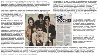
  • 1. The colour of blue has been chosen because of its link to the British flag and the indie genres association with British culture. Furthermore, connotations of blue include calmness, confidence and is stereotypically identified with males which links with the personality and presentation of indie bands. In the top right hand corner their is a box of text saying ‘The Radar Issue 2011’ This topic is unique to NME, showing that this is an NME double page spread. This topic contains articles about new up and coming bands and the text of ‘They’ve been together for under a year, but are already being talked up as the biggest guitar band of 2011’ supports this. The article is therefore about their recent success and rise to fame referencing their sold out gig at Oxford. It then talks about their songs more in depth and how hardly any of them are no longer than 2 minutes long compared to other bands music that takes 2 minutes to reach the chorus. Overall, the article gives the audience a good insight into the band's music and increased popularity. The main image is of the band ‘The Vaccines’ and they are positioned as a group together. They all have neutral facial expressions reflecting the indie-rock genre of music and are using direct address to connect with the reader, making the reader feel more connected to the magazine. The proxemics of the band show that they are close due to their close positioning, however each band member's position varies showing that they are independant. In addition, the presentation of the artists shows them slouching and their bad posture is used to emphasise their nonchalant attitude and linking to the traits of indie music which includes, calm, relaxed and chill. The main image spreads over the first page and a quarter of the second page representing the importance of the main image. The image features dull colours with a light but dirty backdrop, reflecting the genre of music. The main image uses the iconography of guitars to symbolise the indie-rock genre of music and attract the target audience. The costume of the artists are casual and dull reflecting their grungy music and by wearing casual clothes connects to the reader. The artists hair is scruffy and messy and they have stubble showing that they are laid back and further emphasising the genre of music. This is different to some issues as they have more than one image on a double page spread. On this double page spread there is a reasonable amount of text in comparison to other NME double pages where there is sometimes less and sometimes a lot more. To make it appear to be an NME magazine This is a standard double page spread in NME, featuring The Vaccines as the cover artists. The double page spreads layout and structure will tend to follow the same trends each week, however the artists featured changes. In this double page spread the body copy is presented in the same form as a newspaper whereas in other issues it has consisted of an interview layout. In this page spread the main image is very large and there are no other images featured on the page. The colours that dominate this double page spread include black, blue and white. They reflect the indie-rock genre of music and therefore represent the band. These colours are used throughout NME magazines to maintain brand identity. A similarity, however, that this double page spread shares with other page spreads is the use of coloured shapes splashed around the page and its text. I think that this makes the page look more intriguing and entices the audience to read it. There are various blue shapes used on this page to make it more attractive and fascinating, appealing to the reader. They have been used to add some colour to the dull background and make the reader more excited. The colour of blue has been chosen because of its link to the British flag and the indie genres association with British culture. Furthermore, connotations of blue include calmness, confidence and is stereotypically identified with males which links with the personality and presentation of indie bands. the brand name has been displayed in the bottom right hand corner along with the page number and the topic of ‘Radar’ is unique to NME magazines.
  • 2. The fonts and typefaces are very simple and easy to read. This links with the idea of the double page spread having a simplistic look and also makes it more enjoyable for the reader as they can easily understand it. The title of this double page spread is made to appear bolder than the other text. This is because it is very important as this piece of text introduces the band and gives the reader knowledge of what the article is about. Making the title appear bolder attracts the reader’s eye first and has therefore been purposely done to draw the reader’s eye. The typefaces and fonts used are usually very similar to the typefaces and fonts used in other NME double page spreads and therefore, maintains brand identity. The shot is a medium shot which is a convention of magazine images The double page uses large blue letters at the beginning of the article. This is similar to the layout of a book or gossip magazine. The large letter has been used to stand out and make the reader read the first sentence and ultimately the rest of the article. The article is not long in length as the target audience would prefer to look at images than read. The colour of blue has been chosen for its link to the British flag and its connotations. It has also been chosen to continue the colour scheme of the magazine and make everything link and flow. The text within the article is presented in the format of a newspaper article making it similar to what the target audience may be used to reading. The text is both black and blue making it more interesting and the blue has also been used to highlight an important quote from the band and the journalist's name ‘Jamie Fullerton’. Other quotes from the band have been used within the articles text. The main colours of blue, black and white have been used because they are represented in the british flag and therefore link to indie music. The title of this double page spread is ‘The Vaccines’ and is introducing the band featuring. The font is very plain and simple which links to the idea of this double page having that simplistic look and makes it appealing to its target audience of young men that, stereotypically, don’t care about their appearance. The black title colour also portrays the indie-rock genre and attracts the target audience.
  • 3. The title of this double page spread is ‘The Teenagers’ and introduces the band featured in this magazines issue. The teenagers are not a hugely known band so having them on the ‘Radar’ section of NME shows they are a new up and coming band in the music industry and this will appeal to the target audience who will be interested in reading about them. The word radar has been significantly chosen due to its meaning to detect and find something and in relation to music the target audience would understand that it’s based on new and upcoming bands that have been recognised by NME. Due to the topic of ‘Radar’ being used in every issue a loyal NME reader would understand the use of this word straight away. The title consists of bold, black text which is highlighted blue to give it an edgy look. The font resembles an old school style font and so links to the band as they are called ‘The Teenagers’ Overall, I like the title as I think the font relates to the band and the text stands out on the page but also blends in with the colour scheme making the double page spread attractive for the reader. The main image that has been used is an image of the band featured in the article and shows their youthful laidback approach to life. The band look young as they are in a bedroom all casually laying on top of a bed and there are posters of women sexually posing in the background depicting a typical teenage boys bedroom. The location of a bedroom has specifically been chosen because this is where teenage boys, stereotypically, spend all their time. The location of the bedroom therefore links to the band members and the band name. The artists’ costume is casual with the stereotypical image of skinny jeans, t-shirt, trainers and messy hair. The artist’s costume outlines their laidback behaviour and additionally with the position they are in shows their casual, scruffy look also relating to the fact that they are teenagers. The proxemics of the band show that they are close but not attached to each other. Their slouching posture and individual positioning shows that they are individuals, emphasising their independence as teenagers. The use of the colour black used within the band members costume links to the genre of indie-rock and adds to the shadow and dark lighting of the image, emphasising the dark, grungy appearance of the band. The main colour that dominates this double page spread is blue. This colour is an NME magazine convention, as blue resembles indie music and so links to the target audience of NME. The colour blue has also been used to attract the male target audience and 4 of the 5 images feature males signifying that this double page spread is aimed more at males than females. Some iconography that features in other images on the double page includes a mic, stage lights and graffiti. These features of iconography connote the indie-rock music as they symbolise music and the graffiti represents the grungy, messy look and sound of the genre of music. The graffiti also links back to the band being teenagers as this is an activity teenagers are commonly known to participate in. The main image is positioned on the first page to be the most eye-catching part of the double page spread and appeal to the target audience who will enjoy viewing images of their favourite bands. Having the image on the first double page is a convention of a double page. The other images have been put into a box and made a smaller scale. They have also been anchored with the text that states what bands are being shown in the images. The use of the bands names such as ‘The Rascals’ and ‘Crystal Castles’ is appealing to the target audience and draws their attention to the text. The text ‘Everyone's talking about...’ is an anchor for the images giving the reader an understanding that the following bands are very popular at the moment. The title is in capital letters, grabbing the reader’s attention and introducing the band as loud. Using capital letters is a convention of NME magazines when introducing the band featuring in the magazine. I like the use of capital letters as I think it makes the text look bolder and aesthetically pleasing.
  • 4. The messy/chaotic background of the main image connotes the lifestyle of the target audience as it is a convention that the readers are likely to be very easy going and have a ‘not caring’ attitude. This allows the double page to connect with the reader. There is a puff that reads ‘NME LOVES’ that is presented in a spiky bubble and makes the double page look more interesting and fun. The text in this bubble is also in a different font making it unique to the rest of the text and more intriguing. By saying ‘NME LOVES’ in the puff the reader will feel that they should also love the band as much as the magazine as they are a loyal customer of the NME magazine. double page. Within the box are other bands and information about them which will interest the general target audience of NME. I like the use of the box as I think it makes the double page look more busy and is aesthetically pleasing. This double page spread shares some similarities with other NME double page spread magazines but also has some unique aspects. The Title of the double page is usually the featured band and is always presented in capitals. Furthermore, the main image is always spread across the first page and occasionally across some of the second page. Furthermore, shapes and text boxes are used to highlight extra and key information such as the ‘NEED TO KNOW’ and ‘EVERYONE’S TALKING ABOUT’ boxes. In addition, key quotes are usually highlighted and enlarged in the middle of the articles text to draw the reader’s attention and tease them into reading the body copy. Lastly, the topic that the double page spread is within is always displayed in the top left hand corner of the first page and is always presented in bold capitals. All these aspects of the magazine are repeated each issue to maintain brand identity. Something that is unique about this double page includes the small puff containing the text ‘NME LOVES’. Furthermore, the body copy is usually larger than this body copy and uses up a large amount of the second page. The Teenagers are using direct address to connect with the audience. Direct address is also used in one of the other images to establish a connection with the reader There is a large boxed off section in this double page spread that gives it a clean, crisp look making it more digestible for the reader. The use of black connotes indie-rock music and draws the reader's eyes to this section of the The magazine also connects with the reader through the use teenagers which is the age group of a large section of the ta will feel they can identify with this article and the band featur band. We’re The Teenagers and that’s all they think about’ s the target audience. This is further established through the s as these are words used to associated with teenagers. Lastl giving us a warm feeling this week’ further develops the you text to connect with the young audience. The standfirst is the second largest piece of text underneath emphasise the characteristics of the band and making a con have been teenagers and can relate to the band. The standf the reader and establishing a connection between the reade In certain areas, including the puff and dark text boxes, this double page spread has been designed as different to other double page spreads. This is so that it stands out and is more intriguing for the reader. The uniqueness of this double page spread from others allows it to be less boring and more exciting for the reader. This will attract the readership to read the magazine which , ultimately, is the goal.