
Recommended
More Related Content
What's hot
What's hot (19)
Similar to Advert
Similar to Advert (20)
Recently uploaded
Recently uploaded (20)
Advert
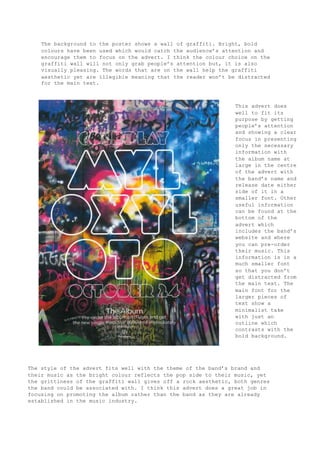
- 1. The background to the poster shows a wall of graffiti. Bright, bold colours have been used which would catch the audience’s attention and encourage them to focus on the advert. I think the colour choice on the graffiti wall will not only grab people’s attention but, it is also visually pleasing. The words that are on the wall help the graffiti aesthetic yet are illegible meaning that the reader won’t be distracted for the main text. This advert does well to fit its purpose by getting people’s attention and showing a clear focus in presenting only the necessary information with the album name at large in the centre of the advert with the band’s name and release date either side of it in a smaller font. Other useful information can be found at the bottom of the advert which includes the band’s website and where you can pre-order their music. This information is in a much smaller font so that you don’t get distracted from the main text. The main font for the larger pieces of text show a minimalist take with just an outline which contrasts with the bold background. The style of the advert fits well with the theme of the band’s brand and their music as the bright colour reflects the pop side to their music, yet the grittiness of the graffiti wall gives off a rock aesthetic, both genres the band could be associated with. I think this advert does a great job in focusing on promoting the album rather than the band as they are already established in the music industry.