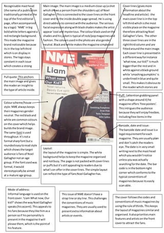
1. Pull quote: This anchors
the main image and gives
the reader an insight to
the type of article inside.
Main image: The main image is a medium close up (a shot
which shows a person from the shoulders up) of Noel
Gallagher. This is connected to the cover lines on the front
cover and to the inside double page spread. He is using
direct address to connect with the audience. The serious
facial expression along with black shades makes the artist
appear ‘cool and mysterious. The colour black used on the
shades and his jacket is typical of rock/pop magazines and
fashion. The colours used in the photo are also gender
neutral. Black and white makes the magazine simple and
attractive to the eye.
Recognisable mast head
(the name of a publication
traditionally printed at the
top of the first editorial
page, often accompanied
by a logo) ‘NME’ in big
bold white letters against a
red rectangle background.
This made the magazine
brand noticeable because
its in the top left third
which is on display in
stores. The logo stays
constant in each issue
which creates a strong
magazine identity for
example if the image
slightly covered the mast
head, you would still know
its NME.
Cover lines (gives more
information about the
headline and article) : the
main cover line is in the top
left third which is the most
visible place on the magazine
therefore attracting Noel
Gallagher’s fans. The other
three cover lines are in the
right third column and are
fitted around the main image.
Each cover line is presented in
a different way for instance
‘what now, our kid?’ is much
bigger than the rest and in
white against a black ground
while ‘smashing pumpkins’ is
underlined in blue and quite
small. This makes it obvious to
the reader which stories are
the main focus of the
magazine issue.
Puff: (attention grabbing panel
with a shape around it) he
magazine offers ‘free posters’.
This intrigues the audience
because they will enjoy freebies.
Including free items in the
magazine will make fans buy the
Bmaargcoazdien,e d matoer aen odft iessnu. e:
The barcode date and issue is a
legal requirement for each
magazine. They are usually plain
and don’t catch the readers
eye. The date is in very small
writing next to the mast head
which you wouldn’t notice
unless you was actually
searching for the date. The bar
code is in the bottom right
corner which conforms to the
typical conventions of
magazines because its easily
scan able.
Colour scheme/house
style: NME always keeps
their magazines gender
neutral. The red black and
white are common colours
on the cover which helps
builds the brand image.
The same font is used
throughout. It’s not a
formal sharp font but a
rounded easy to read style
which shows the target
audience is fans of Noel
Gallagher not an age
group. If the font used was
formal, it would
stereotypically be aimed
at a mature age group.
Layout:
the layout of the magazine is simple. The white
background helps to keep the magazine organised
and not busy. The page is not packed with cover lines
or puffs but it’s still appealing to readers due to
what’s on offer in the cover lines. The simple layout
can reflect the type of fans Noel Gallagher has.
Mode of address:
Informal language is used on the
front cover. ‘Liam What now, Our
kid?’ shows the way Noel Gallagher
speaks (his accent). This appeals to
his fans because they like him as a
person so if his personality is
present in the magazine it will
please them, which is the point of
his feature.
This issue of NME doesn’t have a
strap line or sky line. This challenges
the conventions of music
magazines. They are usually used to
present extra information about
artists or events.
The cover follows the codes and
conventions of music magazines by
using the rule of thirds. This keeps
the layout of magazines similar and
organised. It also priorities main
features and artists on the front
cover to attract the fans.