TEST BANK For Essentials of Negotiation, 7th Edition by Roy Lewicki, Bruce Ba...
Noel gallagher double page analysis
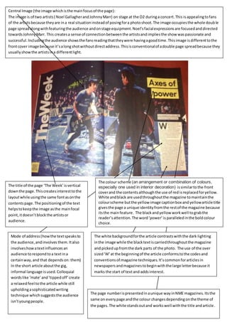
1. Central Image (the image which is the main focus of the page):
The image is of two artists ( Noel Gallagher and Johnny Marr) on stage at the O2 during a concert. This is appealing to fans
of the artists because they are in a real situation instead of posing for a photo shoot. The image occupies the whole doub le
page spread along with featuring the audience and on stage equipment. Noel’s facial expressions are focused and directed
towards Johnny Marr. This creates a sense of connection between the artists and implies the show was passionate and
successful. Including the audience shows the fans reading that they were having a good time. This image is different to the
front cover image because it’s a long shot without direct address. This is conventional of a double page spread because they
usually show the artists in a different light.
The title of the page ‘The Week’ is vertical
down the page. This creates interest to the
layout while using the same font as on the
contents page. The positioning of the text
helps to keep the image as the main focal
point, it doesn’t block the artists or
audience.
1. The colour scheme (an arrangement or combination of colours,
especially one used in interior decoration) is similar to the front
cover and the contents although the use of red is replaced for yellow.
White and black are used throughout the magazine to maintain the
colour scheme but the yellow image caption box and yellow article title
gives the page a unique identity from the rest of the magazine because
its the main feature. The black and yellow work well to grab the
reader’s attention. The word ‘power’ is paralleled in the bold colour
choice.
Mode of address (how the text speaks to
the audience, and involves them. It also
involves how a text influences an
audience to respond to a text in a
certain way, and that depends on: them)
In the short article about the gig,
informal language is used. Colloquial
words like ‘mate’ and ‘tipped off’ create
a relaxed feel to the article while still
upholding a sophisticated writing
technique which suggests the audience
isn’t young people.
The white background for the article contrasts with the dark lighting
in the image while the black text is carried throughout the magazine
and picked up from the dark parts of the photo. The use of the over
sized ‘W’ at the beginning of the article conforms to the codes and
conventions of magazine techniques. It’s common for articles in
newspapers and magazines to begin with the large letter because it
marks the start of text and adds interest.
The page number is presented in a unique way in NME magazines. Its the
same on every page and the colour changes depending on the theme of
the pages. The white stands out and works well with the title and article.