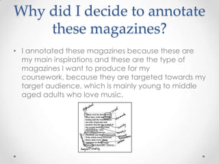
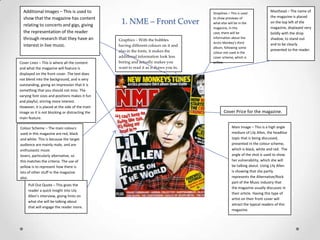
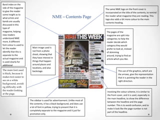
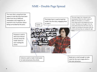
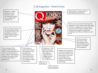
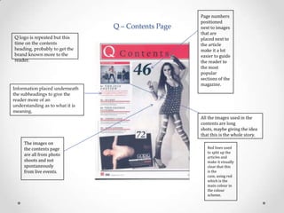
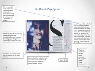
This is Tom's answer to question 1 of the evaluation for our music magazine. The question is, "In what way does your media product use, develop or challenge codes and conventions of real media products?".
This is my textual analysis of NME January 2012 front cover, contents page and double page spread. Click the full screen button to enlarge the presentation:)
The Indian economy is classified into different sectors to simplify the analysis and understanding of economic activities. For Class 10, it's essential to grasp the sectors of the Indian economy, understand their characteristics, and recognize their importance. This guide will provide detailed notes on the Sectors of the Indian Economy Class 10, using specific long-tail keywords to enhance comprehension.
For more information, visit-www.vavaclasses.com
How to Create Map Views in the Odoo 17 ERPCeline George
The map views are useful for providing a geographical representation of data. They allow users to visualize and analyze the data in a more intuitive manner.
2024.06.01 Introducing a competency framework for languag learning materials ...Sandy Millin
http://sandymillin.wordpress.com/iateflwebinar2024
Published classroom materials form the basis of syllabuses, drive teacher professional development, and have a potentially huge influence on learners, teachers and education systems. All teachers also create their own materials, whether a few sentences on a blackboard, a highly-structured fully-realised online course, or anything in between. Despite this, the knowledge and skills needed to create effective language learning materials are rarely part of teacher training, and are mostly learnt by trial and error.
Knowledge and skills frameworks, generally called competency frameworks, for ELT teachers, trainers and managers have existed for a few years now. However, until I created one for my MA dissertation, there wasn’t one drawing together what we need to know and do to be able to effectively produce language learning materials.
This webinar will introduce you to my framework, highlighting the key competencies I identified from my research. It will also show how anybody involved in language teaching (any language, not just English!), teacher training, managing schools or developing language learning materials can benefit from using the framework.
How to Split Bills in the Odoo 17 POS ModuleCeline George
Bills have a main role in point of sale procedure. It will help to track sales, handling payments and giving receipts to customers. Bill splitting also has an important role in POS. For example, If some friends come together for dinner and if they want to divide the bill then it is possible by POS bill splitting. This slide will show how to split bills in odoo 17 POS.
We all have good and bad thoughts from time to time and situation to situation. We are bombarded daily with spiraling thoughts(both negative and positive) creating all-consuming feel , making us difficult to manage with associated suffering. Good thoughts are like our Mob Signal (Positive thought) amidst noise(negative thought) in the atmosphere. Negative thoughts like noise outweigh positive thoughts. These thoughts often create unwanted confusion, trouble, stress and frustration in our mind as well as chaos in our physical world. Negative thoughts are also known as “distorted thinking”.
Operation “Blue Star” is the only event in the history of Independent India where the state went into war with its own people. Even after about 40 years it is not clear if it was culmination of states anger over people of the region, a political game of power or start of dictatorial chapter in the democratic setup.
The people of Punjab felt alienated from main stream due to denial of their just demands during a long democratic struggle since independence. As it happen all over the word, it led to militant struggle with great loss of lives of military, police and civilian personnel. Killing of Indira Gandhi and massacre of innocent Sikhs in Delhi and other India cities was also associated with this movement.
How to Make a Field invisible in Odoo 17Celine George
It is possible to hide or invisible some fields in odoo. Commonly using “invisible” attribute in the field definition to invisible the fields. This slide will show how to make a field invisible in odoo 17.
This is a presentation by Dada Robert in a Your Skill Boost masterclass organised by the Excellence Foundation for South Sudan (EFSS) on Saturday, the 25th and Sunday, the 26th of May 2024.
He discussed the concept of quality improvement, emphasizing its applicability to various aspects of life, including personal, project, and program improvements. He defined quality as doing the right thing at the right time in the right way to achieve the best possible results and discussed the concept of the "gap" between what we know and what we do, and how this gap represents the areas we need to improve. He explained the scientific approach to quality improvement, which involves systematic performance analysis, testing and learning, and implementing change ideas. He also highlighted the importance of client focus and a team approach to quality improvement.
The Art Pastor's Guide to Sabbath | Steve ThomasonSteve Thomason
What is the purpose of the Sabbath Law in the Torah. It is interesting to compare how the context of the law shifts from Exodus to Deuteronomy. Who gets to rest, and why?
2. Why did I decide to annotate
these magazines?
• I annotated these magazines because these are
my main inspirations and these are the type of
magazines I want to produce for my
coursework, because they are targeted towards my
target audience, which is mainly young to middle
aged adults who love music.
3. Additional Images – This is used to
show that the magazine has content
relating to concerts and gigs, giving
the representation of the reader
through research that they have an
interest in live music.
Cover Lines – This is where all the content
and what the magazine will feature is
displayed on the front cover. The text does
not blend into the background, and is very
outstanding, giving an impression that it is
something that you should not miss. The
varying font sizes and positions makes it fun
and playful, stirring more interest.
However, it is placed at the side of the main
image so it is not blocking or distracting the
main feature.
Colour Scheme – The main colours
used in this magazine are red, black
and white. This is because the target
audience are mainly male, and are
enthusiastic music
lovers, particularly alternative, so
this matches the criteria. The use of
yellow is to represent how there is
lots of other stuff in the magazine
also.
Pull Out Quote – This gives the
reader a quick insight into Lily
Allen’s interview, giving hints on
what she will be talking about
that will engage the reader more.
1. NME – Front Cover
Graphics – With the bubbles
having different colours on it and
also in the fonts, it makes the
additional information look less
boring and actually makes you
want to read it as it draws you in.
Straplines – This is used
to show previews of
what else will be in the
magazine, in this
case, there will be
information about the
Arctic Monkey’s third
album, following some
colour not used in the
cover scheme, which is
yellow.
Masthead – The name of
the magazine is placed
on the top left of the
magazine, displayed very
boldly with the drop
shadow, to stand out
and to be clearly
presented to the reader.
Cover Price for the magazine.
Main Image – This is a high angle
medium of Lily Allen, the headline
topic that is being discussed,
presented in the colour scheme,
which is black, white and red. The
angle of the shot is used to show
her vulnerability, which she will
be talking about. Using Lily Allen
is showing that she partly
represents the Alternative/Rock
part of the Music industry that
the magazine usually discusses in
their article. Having this type of
artist on their front cover will
attract the typical readers of this
magazine.
4. Band index on the
side of the magazine
to give the reader
some insight as to
what artists and
bands are usually
discussed in this
type of
magazine, helping
new readers
understand NME
more. A different
font colour is used to
let the reader
identify that this is
separate to the
actual magazine and
is used clearly for
additional
information.
The main font used
is black, because it
makes text easier to
see on a white
background, avoidi
ng difficulty with
the reader looking
at the page.
NME – Contents Page
Main image used is
not from a photo
shoot, showing that
they have interest in
things that happen
around places and
locations, and also
backstage.
The sidebar is used for advertisement. Unlike most of
the contents, it has a black background, and does use
a lot of font in yellow, trying to present that it is
completely separate to the magazine and it just for
promotion only.
The same NME logo on the front cover is
incorporated on the title of the contents, to remind
the reader what magazine they are reading. This
logo also adds a bit more colour to the main
contents heading.
The pages of the
magazine are split into
categories; to help the
reader decide which
category they would
prefer to look at, instead
of skimming
around, trying to find an
article which you like.
The use of the graphics, which are
the arrows, give the representation
that it is pointing the reader in the
right direction.
Involving the colour scheme, it is similar to
the front cover, and it is used, especially in
the main headline, to show the difference
between the headline and the page
number. This is to avoid confusion, and to
make it look like the page number is not
part of the headline.
5. NME – Double Page Spread
The main title is using fonts that
appear to look like they have been
taken from lots of different
newspapers and magazines, to
represent Lily’s frustration about
being surrounded by the press.
Gutter
The kicker here is used to lead the
reader into the story, engaging them
to read it.
The main image, Lily, is dressed as the
stereotypical indie star which readers of
NME are interested in, in a medium
shot, being used as the background for the
article. The photo on the page is from the
same photo-shoot from the front cover, so
readers can familiarise themselves with the
article and know they are reading the right
story.
Dropcap is used to
add visual interest
and also show the
reader where to
start reading the
article.
Columns used to make it look easier
to read and process the article.
Body text is small enough to make
room for the main image which is
the main attraction.
6. 2. Q magazine – Front Cover
Pull out quote – Giving readers a
quick taste of the interview.
Masthead – Simple
title but it is very
bold and a stand
out, letting the reader
know exactly what
magazine it is.
Main cover line is placed at the top of the
magazine to make room for the main image.
It is also in a bigger font to show that it is
the first one the reader recognises when
looking at the magazine, and so they
understand why Florence Welch is on the
cover.
The use of Florence Welch as
the model really represents
the age of the reader, as the
band ‘Florence and the
Machine’ appeals mostly to
people who are mainly
adults.
Close up image for the
magazine, being Florence
Welch, used to emphasise that
it is her on the front cover.
Also, it almost looks like she is
staring at the reader, which
can also tempt them to
purchase Q.
Cover lines are
placed at the side of
the magazine cover
therefore not
blocking the main
focus and drive for
the readers to buy
the magazine, which
is the music.
Selling line – This
helps encourage
the reader to buy
the magazine,
and is also very
simple and easy
to remember.
Barcode
Cover Price
The fonts used are
the same as in the
logo, giving a sense
that everything in the
article is associated
with Q magazine.
Graphics used to give the
cover more excitement. It
is also very unique as one
colour, blue, is not in the
usual Q logo colour
scheme, which avoids
repetition and making it
look boring.
7. Q – Contents Page
Q logo is repeated but this
time on the contents
heading, probably to get the
brand known more to the
reader.
Information placed underneath
the subheadings to give the
reader more of an
understanding as to what it is
meaning.
Page numbers
positioned
next to images
that are
placed next to
the article
make it a lot
easier to guide
the reader to
the most
popular
sections of the
magazine.
All the images used in the
contents are long
shots, maybe giving the idea
that this is the whole story.
The images on
the contents page
are all from photo
shoots and not
spontaneously
from live events.
Red lines used
to split up the
articles and
make it visually
clear that this
is the
case, using red
which is the
main colour in
the colour
scheme.
8. There is a model
credit on the top
right hand corner
to let readers
know who is being
interviewed if they
do not know who
Lana Del Rey is
already.
Q – Double Page Spread
Large ‘S’ is placed to make the
page not just be filled with
columns, but additionally to
make a statement; and make
it look visually interesting. It
is also placed behind the text
to avoid the colours of the
column blending in with the
large capital letter. The large
letter used could also create a
mystery meaning that could
entice the reader to look at
the article.
A medium shot of Lana Del Rey
taking the whole page
therefore it does not run onto
the next page making it too
confusing and difficult to read.
Ariel font is used so it does not
look too complex for the older
audience.
Gutter placed to make the text
not feel as heavy but instead
more spacious and more
comfortable to the eye.
Body Text
The drop
cap is used
for the
same
reason as
the large ‘S’;
to add
visual
interest.