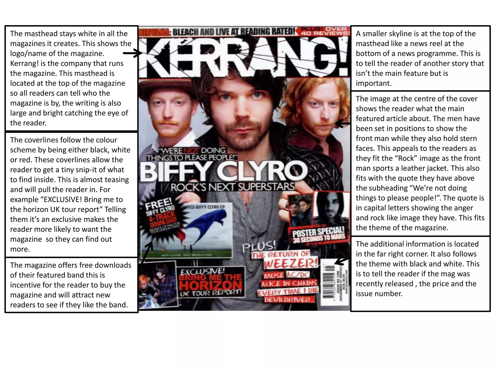
The masthead stays white in all the
magazines it creates. This shows the
logo/name of the magazine.
Kerrang! is the company that runs
the magazine. This masthead is
located at the top of the magazine
so all readers can tell who the
magazine is by, the writing is also
large and bright catching the eye of
the reader.
The coverlines follow the colour
scheme by being either black, white
or red. These coverlines allow the
reader to get a tiny snip-it of what
to find inside. This is almost teasing
and will pull the reader in. For
example “EXCLUSIVE! Bring me to
the horizon UK tour report” Telling
them it’s an exclusive makes the
reader more likely to want the
magazine so they can find out
more.
The magazine offers free downloads
of their featured band this is
incentive for the reader to buy the
magazine and will attract new
readers to see if they like the band.
A smaller skyline is at the top of the
masthead like a news reel at the
bottom of a news programme. This is
to tell the reader of another story that
isn’t the main feature but is
important.
The image at the centre of the cover
shows the reader what the main
featured article about. The men have
been set in positions to show the
front man while they also hold stern
faces. This appeals to the readers as
they fit the “Rock” image as the front
man sports a leather jacket. This also
fits with the quote they have above
the subheading “We’re not doing
things to please people!”. The quote is
in capital letters showing the anger
and rock like image they have. This fits
the theme of the magazine.
The additional information is located
in the far right corner. It also follows
the theme with black and white. This
is to tell the reader if the mag was
recently released , the price and the
issue number.
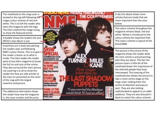
The colour scheme throughout the
magazine remains black, red and
white. Yellow is introduced to the
colour scheme for important title.
This colour scheme is typical of the
brand NME.
The masthead on this mag cover is
located in the top left following the
mages colour scheme of red and
white. This is to tell the reader who
owns the magazine with the logo.
The title is behind the image trying
to show the featured article.
A bubble shows the readers the Jack
White’s new album is out.
Coverlines are in bold red catching
the readers eyes and following
NME’s colour theme. This is to give
the reader a teaser as to what is
inside. This then makes the reader
want to buy their magazine to know
the full ins and outs of the article.
They also surround the main picture
not covering it at all to show the
reader the they are side articles to
the main on presented on the cover
of the mag with the largest
coverline and picture.
The picture in the centre of the
magazine shows the reader what
the main article is and presenting
who they are about. The fact the
picture covers a little bit of the
masthead shows the importance of
the selected people they have
interviewed. The covering of the
masthead also allows the picture to
take a more centre stage on the
mags cover making them the
centre of attention and easy to
spot. They are also looking
sophisticated to appeal to an older
audience. They are also dressed in
black to match the colour scheme.
A sky line above shows more
articles that are inside that are
more important than the ones
below.
The additional information shows
the reader how new the magazine
is, the issue number and the price.
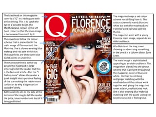
The Masthead on this magazine
cover is a “Q” in a red square with
white writing. This is to catch the
eye of a possible buyer. The
Masthead also remain in the left
hand corner so that the main image
is not covered too much by it.
The coverlines follow the colour
scheme that is presented in the
main image of Florence and the
Machine. She is shown wearing blue
makeup and has pale white skin.
The coverlines are white with blue
bullet points or underline.
The main image is sophisticated
appealing to an older audience. This
image then blends into the colour
scheme that is present throughout
the magazines cover of blue and
white. Her hair is a striking
red/ginger matching with the
masthead so all the colours work
together well giving the magazine
cover a clean, sophisticated look.
She is also wearing blue make up
matching with the quote stating her
loneliness so she is feeling blue.
Additional info sits to the side at the
bottom of the mag to tell the reader
the price, issue number and day of it
being published.
The main coverline is at the top
beside the masthead in large
lettering to tell the reader that this
is the featured article. Also the “I
feel so alone” allows the reader a
quick insight into a personal feeling
of the star making the reader more
curious as to why a big musician
could be lonely.
The magazine keeps a set colour
scheme not drifting from it. The
colour scheme is mainly blue and
white but with the masthead and
Florence’s red hair also join the
theme.
The magazine, even with a young
Florence main image, appeals to an
older audience.
A bubble is on the mag cover
showing or advertising something.
In the one it is a column about Zane
Lowe.

Music magazine front cover deconstructions

  • 1.
    The masthead stayswhite in all the magazines it creates. This shows the logo/name of the magazine. Kerrang! is the company that runs the magazine. This masthead is located at the top of the magazine so all readers can tell who the magazine is by, the writing is also large and bright catching the eye of the reader. The coverlines follow the colour scheme by being either black, white or red. These coverlines allow the reader to get a tiny snip-it of what to find inside. This is almost teasing and will pull the reader in. For example “EXCLUSIVE! Bring me to the horizon UK tour report” Telling them it’s an exclusive makes the reader more likely to want the magazine so they can find out more. The magazine offers free downloads of their featured band this is incentive for the reader to buy the magazine and will attract new readers to see if they like the band. A smaller skyline is at the top of the masthead like a news reel at the bottom of a news programme. This is to tell the reader of another story that isn’t the main feature but is important. The image at the centre of the cover shows the reader what the main featured article about. The men have been set in positions to show the front man while they also hold stern faces. This appeals to the readers as they fit the “Rock” image as the front man sports a leather jacket. This also fits with the quote they have above the subheading “We’re not doing things to please people!”. The quote is in capital letters showing the anger and rock like image they have. This fits the theme of the magazine. The additional information is located in the far right corner. It also follows the theme with black and white. This is to tell the reader if the mag was recently released , the price and the issue number.
  • 2.
    The colour schemethroughout the magazine remains black, red and white. Yellow is introduced to the colour scheme for important title. This colour scheme is typical of the brand NME. The masthead on this mag cover is located in the top left following the mages colour scheme of red and white. This is to tell the reader who owns the magazine with the logo. The title is behind the image trying to show the featured article. A bubble shows the readers the Jack White’s new album is out. Coverlines are in bold red catching the readers eyes and following NME’s colour theme. This is to give the reader a teaser as to what is inside. This then makes the reader want to buy their magazine to know the full ins and outs of the article. They also surround the main picture not covering it at all to show the reader the they are side articles to the main on presented on the cover of the mag with the largest coverline and picture. The picture in the centre of the magazine shows the reader what the main article is and presenting who they are about. The fact the picture covers a little bit of the masthead shows the importance of the selected people they have interviewed. The covering of the masthead also allows the picture to take a more centre stage on the mags cover making them the centre of attention and easy to spot. They are also looking sophisticated to appeal to an older audience. They are also dressed in black to match the colour scheme. A sky line above shows more articles that are inside that are more important than the ones below. The additional information shows the reader how new the magazine is, the issue number and the price.
  • 3.
    The Masthead onthis magazine cover is a “Q” in a red square with white writing. This is to catch the eye of a possible buyer. The Masthead also remain in the left hand corner so that the main image is not covered too much by it. The coverlines follow the colour scheme that is presented in the main image of Florence and the Machine. She is shown wearing blue makeup and has pale white skin. The coverlines are white with blue bullet points or underline. The main image is sophisticated appealing to an older audience. This image then blends into the colour scheme that is present throughout the magazines cover of blue and white. Her hair is a striking red/ginger matching with the masthead so all the colours work together well giving the magazine cover a clean, sophisticated look. She is also wearing blue make up matching with the quote stating her loneliness so she is feeling blue. Additional info sits to the side at the bottom of the mag to tell the reader the price, issue number and day of it being published. The main coverline is at the top beside the masthead in large lettering to tell the reader that this is the featured article. Also the “I feel so alone” allows the reader a quick insight into a personal feeling of the star making the reader more curious as to why a big musician could be lonely. The magazine keeps a set colour scheme not drifting from it. The colour scheme is mainly blue and white but with the masthead and Florence’s red hair also join the theme. The magazine, even with a young Florence main image, appeals to an older audience. A bubble is on the mag cover showing or advertising something. In the one it is a column about Zane Lowe.