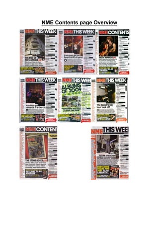
2. All contents pages are from the front cover of NME magazine and so they have all been
designed with the intention of attracting fans of metal/heavy rock/pop punk music. Through
carrying out an investigation of them and by comparing them to each other, it is possible to
identify shared features within them and to establish repeated patterns.
The eight contents page all feature typical magazine contents page conventions. We see
expected general and layout conventions, such as the inclusion of a main image that dominates
the content page, features articles that are in the magazine, subscribe section for the audience to
subscribe and receive the magazines at a cheaper prices and a masthead designed in an
appropriate font.
In addition to this, we see other repeated patterns. Each of the contents page features a band as
the main image. Obviously, we expect to see some kind of music artist in the middle of the page,
but the consistent appearance of a band on NME indicates that solo artists are rare in the world
of indie rock. This is likely to be due to the kind of sound that is synonymous with these genres of
music, a powerful, sound that is generated by heavy drums, loud guitar solos and ‘live’
performances from a band. In each of the contents page, we can see a main image that covers
most of the page this features the main topic of the magazine, for example one of the pages
features The Arctic Monkeys, and this is an exclusive interview from a recent gig. This
composition is repeated consistently as each month will features something that is so important
that the readers will get attracted to when opening the magazine for the first time. This idea is
taken a step further on the contents page with 4 out of the 8 featuring a band image and an
exclusive interview or about backstage scenes.
We can see other similarities in the mise-en-scene elements that are presented on each front
cover. In terms of costume, the artists are united by the fact that they are all wearing dark, muted
colours and costume that is fairly low key and relaxed (T-shirts, motif T-shirts, hoodies, etc).
This is a look that is fairly synonymous with bands within the genre of indie-rock. On one front
cover, the members of Arctic Monkeys are wearing the normal clothing of dark t-shirts and dark
jeans that refers to the conventions.
Another shared feature across the eight contents page is that they all include subscription
section. Generally, these tend to showcase, in a smaller form, the magazines recent that have
been created or magazines that are being produced at this present time. The fact that space on
the contents page is devoted to presenting to the audience to show that they can save money on
their favourite music magazine.
On each content page, the signature NME masthead appears in exactly the same distressed font
and in exactly the same place. Each time, the masthead is either red on a black background or
vice versa, establishing a dark, masculine mood. Without exception, the head of one or more
band members is placed on top of the masthead so that it is not fully visible. This suggests the
success and popularity that NME has achieved as a publication, as it would be too much of an
unwise move if the magazine was new, unestablished or did not have a loyal fanbase. Another
feature that occuactionally comes in the form strap-lines that sometimes sits directly across the
entire NME masthead.
Each time, this is used to draw attention to the bands that will feature inside or to promote a
giveaway or competition. On one of the contents page featuring ‘Benicassim’, the audience is
3. informed of the fact that they could win tickets and flights. A giveaway like this, of course,
reminds us that the readership of NME is likely to be an aspiring musician themselves.
Over the eight contents page above, we see the main sell-line in bold, large and display font
across the centre middle, to show that the main topic of the magazine is about the main sell-line.
The audience also see that the less main sell-lines are smaller than the main and are closer to
the edge of the page, and most of the smaller sell-lines are in smaller font and run over two lines.
Colour-wise, NME tends to stick to a similar colour scheme in each issue. Red and black feature
most consistently and these two colours are accompanied by either white, yellow and, in the
case of one front cover, blue. Being primary colours, these will appeal to a male readership,
while the use of red and black captures the dark nature of metal and rock music.
Layout is consistent across the eight contents page too. As mentioned earlier, the placement of
the bands featured is similar in each. In seven out of eight of the contents page, the main sell-line
is placed in the centre of the frame, under the main image. The remaining one cover features the
main sell-line top between the artist and below the masthead. Meanwhile, this is a key area for
audience to look on contents page as that is where the audience’s eye goes first. subscription
section are generally placed at the bottom, where they will not cover the main image or main
sell-line, but where they can be seen next by the audience.
Having carried out this overview, it is obvious that NME has its own brand identity and signature
look that can be easily recognized by its target audience. This is maintained through the
repetition of stylistic and layout features from issue to issue and is a wonderful of helping the
magazine to sell and be a success.