
Recommended
More Related Content
What's hot
What's hot (18)
Similar to Hip Hop Magazines Target Male Music Fans Ages 16-30
Similar to Hip Hop Magazines Target Male Music Fans Ages 16-30 (20)
Recently uploaded
Recently uploaded (20)
Hip Hop Magazines Target Male Music Fans Ages 16-30
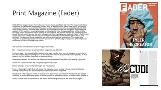
- 1. Print Magazine (Fader) Both of these magazines are themed around music, more specifically hip hop. The purpose of these magazines is to entertain (interviews, posters, etc), as well as inform (about new music, upcoming music events, lesser known artists). They also contain advertisements for associated products. The main target audience is mostly male, from 16-30, with interest in the hip hop genre. The magazine appeals to this audience by using language such as popular slang that young people utilise and by including artists who have a similar overlap in fan base that are popular for this age. The design and layout focuses mostly around the artist’s image, and their own signature style (see Fader’s Tyler cover, where the colour scheme follows the pale and pastel aesthetic expressed through his music and clothing). The layout of these magazines are both very simple and minimalistic. This makes the magazine as a whole easier to read (mostly black text on white backgrounds), along with helping to emphasise certain articles by using colour. The technical considerations of print magazines include: Size – magazines sizes are important. Most magazines use A4 or A5. Contents page – this should tell the viewer what page number they need to navigate to in order to find the content they’re looking for. It is also important for articles to include running heads, so that readers can find articles they want to read at a glance. Bleed line – without this around the magazine, certain elements may be cut off when it is printed Gutter line – this will make the navigation experience easier Colour settings – ensures that all images are in full colour Fonts – choosing the right font will stylise the magazine more, making it more unique and better looking. Fonts should also be consistent throughout the entire magazine Distribution– the magazine needs to be sold in an appropriate place so that it will sell to the target audience. It should be placed where it can be spotted by people who might be interested in buying it. Layout – there must be continuity in the layout and headings should be the same on all pages
- 2. Digital Magazine (Crack) The technical considerations of digital magazines include: Colors/fonts – might not look the same on every device. Some stylistic features could be lost Support – not all devices work well with digital magazines. They might display wrong and certain elements may not be viewable Rotation – when rotating to landscape from portrait, the reader will need to scroll across the screen to view the full page. This can feel unnatural and be a nuisance. Distribution – digital magazines can be distributed in a lot of different ways. The main services used for this are Amazon and Barnes and Noble. However, certain distributers require you to utilise their templates, causing the magazine to look less stylised and more generic Losing files – some audio and videos might be redacted from the internet, causing the magazine to lose some of its meaning Zooming – if the viewer has to zoom in and out to read certain portions of the magazine, it can be discouraging
- 3. Double Page Spread (Fader) The dominant image of the artist takes up the entire left page, with the artist’s name appearing across the pages using two different text styles and colors going from white to black. This creates a contrast between the pages, from dark to light. The image of Kid Cudi is a medium close up and uses low key lighting to create a dark image, allowing the white text to pop out more. He has his arms folded with a serious expression on his face, making him look more “matter of fact”. This signifies to the reader that his music is his main focus in life, and that he takes it very seriously, refusing to go back. The medium close up and dark lighting has been used to create intimacy with the reader, almost as if you were sitting down and having a interesting conversation with him. He is wearing gold chains and a dark striped T shirt. The chains show that he has already made it within the industry, and can enjoy luxuries. The shirt is not particularly flashy, and embodies his humble, yet proud persona. On the right page, there is a pullquote from the artist’s interview. This draws in the reader, as what he’s saying makes him more relatable to the average person. The main body of text does not take up a lot of space, with just two columns, the first of which is over half of the size of the longest. Both the byline with the author’s name and the quote fit nicely between the dominant image and the columns of text. Small lines have also been used to split up the different elements of the article nicely, making it more readable and easier to navigate. At the bottom, there is small black folio stretching the length of both text columns containing the name of the magazine along with the release date. This also fits in with the consistent black/white color scheme of the article. The main target demographic for this style of magazine would be around 16-25, but an article like this contains a lot of text, and may be best suited to a more patient, mature audience.
- 4. Front Cover (Fader) The cover is minimalistic, focusing primarily on only two colors (the orange background and Tyler’s blue hoodie). The main focus of this issue is Tyler the Creator, with no other artists or selling points appearing on the cover, giving all of the space and attention to Tyler. The largest text on the cover is the magazine title at the top, which is next to the short but to-the-point phrase “The Now Issue”. This tagline is used on all new covers and signifies that Fader is up to date on the latest music and artists. There is also the artist’s name up front, which may help identify him to those who can recognize the name but not the face. Tyler’s face is covered by a blue hood and his hands, giving a sense of mystery behind him. The colors that he is wearing along with the background color signifies his personal style (lots of pastel and pale colors, very basic but vibrant and bright design), and this helps to make the cover more personalized to Tyler. Direct address is used as Tyler is looking directly forward at the viewer with an unsure expression on his face, this creates a level of interest and draws more people in. In terms of lighting, there isn’t a complex setup involved here. Lights are pointed towards his head and his face shining out of the blue hoodie. The formula is quite standard in terms of layout, but there is a lack of sell lines, relying only on Tyler and the Fader name to sell the magazine.