FULL ENJOY - 9953040155 Call Girls in Gtb Nagar | Delhi
Media pop mag annotation
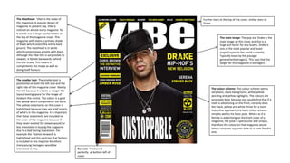
1. The Masthead- ‘Vibe’ is the make of
the magazine. A popular design of
magazine in present day. Vibe is
noticed on almost every magazine for
it stands out in large capital letters at
the top of the magazine cover. This
magazine with stains a primary shade
of black which covers the entire back
ground. The masthead is in white
which compromises greatly with black.
Although the Vibe title is very visible to
viewers, it blends backwards behind
the star Drake. This means it
compliments the image as well as
doing itself favours.
Barcode- Positioned
perfectly at bottom left of
cover.
The smaller text- The smaller text is
positioned on both the left side and the
right side of this magazine cover. Mainly
the left because it creates a margin like
layout leaving space for the image of
Drake in the centre. The colour is a gold
like yellow which compliments the black.
The yellow statements on this cover is
highlighted because they are brief inserts
of what's in this magazine. It is important
that these statements are included on
the cover of the magazine because if
they never existed the viewer would be
less interested in buying the magazine
due to a bad boring impression. For
example the ‘fashion forward’ is
highlighted and this portrays that fashion
is included in this magzine therefore
many young teenagers would be
interested in this.
The main image- The pop star Drake is the
main image on this cover and this is a
huge pull factor for any buyers. Drake is
one of the most popular and loved
singer/rapper in the world currently.
Typically loved by the younger
generation(teenagers). This says that the
target for this magazine is teenagers.
Further stars at the top of the cover, similar stars to
Drake.
The colour scheme- The colour scheme seems
very basic, black background, white/yellow
wording and yellow highlights. The colours are
purposely basic because you usually find that if a
male is advertising on the front, not only does
the black, yellow and white thrive for a more
masculine approach, the basic colour scheme
mingles well to his basic pose. Where as if a
female is advertising on the front cover of a
magazine, the pose is spectacular and unique,
therefore the colour on that magazine would
take a complete opposite style to a male like this
one.
2. Masthead- Billboard logo. The font of the
Masthead can be accumulated as quite plain
and simple. Yet this is done this way for an
important and particular reason. Billboard is
usually directed at the younger generation of
people for pop music is loved and listened to
stereo typically by teenagers. It holds a mix of
colours such as red, yellow, and a blue. This
frames that the magazine is not directed at a
particular gender.
The main image- The character on the front of this
magazine is Beyoncé, a famous and easily recognised
pop star. This is a huge pull factor, Beyoncé has a wide
fan base and those who view this magazine has instantly
been encouraged to buy it judging by the front cover.
The feature headline- The feature head
line is Beyoncé(the character on the front
cover) with a quote just below it in black
and a smaller size.
Barcode- should be positioned here for
purchasing purposes.
Quote- This Beyoncé quote, “I want to be an icon” is
directed at all of her fans. This means to say that all
who follow her will have someone as inspiration and
Beyoncé will be a role model. Many will read this and
understand an important insert of this magazine.
The colour scheme- The colour scheme appears to a
rather revealing black and white shade as the back
ground. This is approached intentionally to contrast the
other bright colours, for example, the red, yellow, blue
and green inserted precisely into the lettering of the
Masthead. Black goes with any colour however it
compliments its opposite shade white the most. Hence
why it is effective with the dark image of Beyoncé on the
right hand side. One can clearly see the obvious over
powering black. On the left hand side there is the light
white where the red text is high lighted to a unique
significance.
The smaller text- The smaller text is
positioned perfectly on this
Billboard magazine cover, for the
smaller text slays its best position
on the left side of the cover, giving a
margin like form it specifies exactly
to the viewer where to read from.
The smaller text accumulates this
near perfect position also because
the smaller text holds less
prominence compared to the Mast
head, the header, the sub heading,
or the star in which the magazine is
about. The smaller text is more out
of the way on this magazine sort of
fading away behind the image and
the mast head yet still filling in the
spaces giving no boring impressions.
There exists a change in font and
bold here. Even though the smaller
text is supposedly all together and
all summarising clipets of this
magazine. They are still labelled in
use of colour, baldness, size and
font on this magazine.
3. The Masthead- The masthead grasps basic
colouring and is not entirely detectible.
However it holds a large size with a capital ‘Q’
in the top left corner therefore it is visible.
The ‘Q’ the has a blending effect to it where it
fades behind the sentence at the top. This
caption is all in capitals therefore when any
viewer comes to reading the Masthead, they
are immediately pulled in by “THE STORIES OF
THE YEAR”. Not many people wouldn't be
interested in that headline. Also, the
masthead is found at the top of the cover
almost on every magazine. This one is no
different and is positioned perfectly. The
writing being at the top of the cover creates
an immediate portrait like layout, this lets the
reader know where to start reading from.
Naturally, with this masthead standing at the
top of the page it releases an instant great
first impression due to the attractive quote.
Barcode- The
barcode
supposedly found
on the bottom left
hand corner of the
front cover. This
magazine is a
perfect example
of that.
The header- The header can be
found anywhere on the front
cover of the magazine. But it is
always found on the front cover of
a magazine and no where else for
it is a brief summary of what is
involved in the magazine. The
header holds one purpose, to
attract and excite viewers in
everyway possible. This header for
fills that purpose because it is
awarding the viewer a quick yet
thrilling incite to the magazine.
This useful bit of information may
be the conclusion to whether or
not this magazine will make a sell
to someone.
The main image- The main image clutches great
importance when it comes to the front cover of the
magazine because it is 9/10 the first item that people
notice. This magazine centres Ed Shearon, a famous
and loved pop star there fore he can be noticed by
people from all ages and this will almost immediately
attract any viewer. As one could clearly see it states
his name printed across the image in a bright colour
of red and a rather unique font so this will also help
captivate the viewers attention. Thirdly, Ed Shearon
is famous for his splendid guitar skills, both
extremely classical and dance. On this magazine Ed is
clutching onto his guitar and this is done to target
those of a more classical instrumentalist.
Colour scheme- The
colour scheme with
this magazine is
extremely clever
because of how the
powerful shade of
black in the
background emerges
with the light white
behind the figure of
Ed Shearon. It is a
very masculine
approach however it
is targeted for bot
genders. This is
portrayed by the use
of the elements of
red inserted. The
white wording
compliments the red
giving a bold
highlighted affect
portraying the
importance of key
statements. Eg, ‘50
albums of 2014’.
The smaller text- The smaller
text is noticed largely on this
magazine even though the
smaller text around the sides
holds the reputation of being
less important in comparison
with items such as, the
Masthead and the header.
However that point is not held in
this case. The smaller text helps
spice up this magazine and
without the smaller text this
magazine would come across as
plain, bland, and boring. Not
very eye catching to the public
at all. The smaller text states its
position well filling in the spaces
of this magazine due to its bold
capitals and large in size
considering it is ‘smaller text’.
The text reveals supposedly
intriguing information so
imaginable this a huge pull
factor to many readers.
4. The masthead- This magazine
is produced by ‘seventeen’ as
the Masthead clearly states.
The style to the masthead on
this magazine is unusually
clever. It fades behind the
image of Shawn Mendes to
the point where ‘n’, ‘t’, and
half of the ‘e’ isn't visible
therefore some may find it
hard to read. However due to
the extensive use of the colour
pink, it designs the magazine
to be more eye catching. The
mass amount of pink
especially being at the top of
the page where every viewer
tends to look first, gives off a
feminine approach. Everyone
can peer to this magazine and
realise that its main target is
females.
Barcode positioned
correctly with a
price.
The header- Positioned great as it is the first or second caption
one viewer shall read when observing this mag. Of course, the
header has a key purpose when implanted on a magazine
cover and that is to draw in buyers through temptation. For
the header shall hold interesting information about what's
inserted with in the magazine. ‘Bonus’ in white on a blue back
ground stands out and the designer of this magazine has done
that intentionally for ‘bonus’ is a powerful, positive adjective
to draw in members of the public. “BONUS POSTERS INDIDE!”
With an explanation mark to frame that this line is a fact and
something to be exited about, plus it also creates a sudden yet
dramatic stop which forces the reader to wander through
deep thoughts of what they have just read creating further
excitement. Using the power of persuasion and bribery,
basically if you buy this magazine you get posters as well. It
doesn’t state how many posters but if there is any Shawn
Mendes fans that read this they shall almost straight away
want these posters as well as the magazine.
The main image- The
main image on this
magazine cover is the Pop
star Shawn Mendes,
loved by all ages and both
genders. A real
inspiration to so many
young artists. All of the
above states already why
Shawn Mendes is perfect
for a magazine cover. A
massive pull factor
especially to those
viewers of the younger
generation. As it stands
Shawn Mendes is one of
the best solo pop artists
in the world.
The smaller text- The smaller text is mainly on the left hand
side of this cover in all different eye catching forms. The use
of colour, the different fonts used, different sizes for
important key words and phrases, the significant words are
all in bald and in capitals. For example, ‘SHINE FREE SKIN’.
The smaller text such as these are all imperative to
magazines. They play a huge role in a successful layout of
the cover(usually in cases such as this, it creates a margin
like structure which makes the readers job really easy.)
Further more the smaller text around the sides are all brief
inserts of the magazine which allows the reader to
experience a quick insight of this magazine. Therefore these
positives persuades any viewers to buy.
The colour scheme- The colour scheme releases a
rather feminine method behind its structure with
mostly pink writing with a light blue to compromise
with. This magazine does target the younger generation
because Shawn Mendes’s fan base is widely around the
teen years. However, pink is associated with females
instantly. The shade in the back ground is successfully
affective due to its different techniques. For example,
the blue is white around the edges complimenting the
bright white and pink small text… Yet then towards the
central image of Shawn Mendes, the colour blends
towards a darker type of blue. This creates a silhouette
like figure in the near back ground of the image.